Note: This website was automatically translated, so some terms or nuances may not be completely accurate.
Focusing on "Essential Appeal" Succeeded in Creating Buzz ― The Rebranding Strategy of the New Koikeya ―
The "Koikeya Rebranding Project" launched in October 2016. Initiated with the appointment of Koikeya's new president, the project saw the release of "KOIKEYA PRIDE POTATO," a product symbolizing the rebranding. Its unprecedented innovative packaging and impactful communication strategy generated significant buzz, leading to sell-outs within a month of its February 2017 launch.

The creator driving this project was Shintaro Suzuki of Dentsu Inc. This next-generation creator, who devised the buzz-worthy campaign, shared his personal dedication and insights on this rebranding strategy.
Interview Cooperation: PR Table
※You can also read the story behind this promotional case study on PR Table.
Seeking a beloved product name that forges a strong connection between the product and consumers
──What led to the start of the "Koikeya Rebranding Project" as a comprehensive snack manufacturer?
Suzuki: In 2016, Mr. Akira Sato, newly appointed as president, publicly declared, "We will renew Koikeya." He contacted us asking for help developing a logo mark, slogan, and symbolic products to create this new "Koikeya," and that's how the project began.
At the first meeting, President Sato himself spent two to three hours thoroughly explaining his vision for the new Koikeya. The concept of this project was not to discard the past and be reborn as something new, but to return to our roots and reconsider what truly makes delicious potato chips. After confirming our position, we aimed to become a company capable of developing the snacks demanded today.
Koikeya had hit products like "Karamucho," "Scon," "Polinky," and "Don Tacos," but developing the next long-selling product was a challenge. They felt that creating quirky, PR-worthy products through in-house planning alone wouldn't effectively convey Koikeya's quality and brand.

── "KOIKEYA PRIDE POTATO." It's a product name that makes you want to ask, "What's the story behind this?"
Suzuki: Initially, President Sato gave me a sketch of the concept under the working title "Koikeya Japan 100 Potato Chips." Along with it was the vision: to return to our roots and create the absolute best potato chips without compromise, symbolizing a premium line of potato chips.
When I heard this, it felt almost too straightforward. I hate to say it, but it seemed... ordinary. It would get lost among the many premium snacks flooding the market these days. If we went all out with something like "We're putting our long-established reputation on the line!!" with a straight face, consumers would probably think, "It's just potato chips, why go that far...?" and be put off.
Rather than blatantly expressing how serious we are, conveying it with a bit of charm makes for a product people will love. With that idea, I presented over 100 concepts to President Sato. Among them, he chose this one, saying, "It's perfect because it will be a product we stake our pride on."
While it was an idea we'd thought through thoroughly, I was honestly surprised he chose a pun like "fried potatoes" for a product he said would make or break the company (laugh).
──The packaging design is unlike anything seen before in potato chips. What was the goal there?
Suzuki: We knew anything half-hearted would just look like ordinary premium potato chips. So we aimed for packaging that instantly conveyed it was a product staking Koikeya's reputation on it – we went all out with the concept.
When you think from a manufacturer's perspective, it's easy to fall back on something like "it's just potato chips" – lacking playfulness, worrying about the lack of sizzle, and inevitably playing it safe. So, I kept proposing ideas to avoid that. Choosing white instead of the usual primary colors like yellow, red, or green was also for that reason.
Initially, there was a request to fill the package surface with lots of copy detailing product information like "Made with this material/process" or "The key point is its rich flavor despite being lightly fried." But that approach obscures what truly needs to be communicated, right?
I presented to President Sato that we should pare it down and focus on making "KOIKEYA PRIDE POTATO" memorable. I'm glad he agreed. The result was a simple, clean package that stood out from the competition.
As a result, we created a product that received positive feedback from distributors. The packaging apparently went over well, and it seems to have secured a decent amount of shelf space in convenience stores.

Video Production is Time Design ― A TV Commercial Pursuing the Essence of "What Needs to Be Communicated"
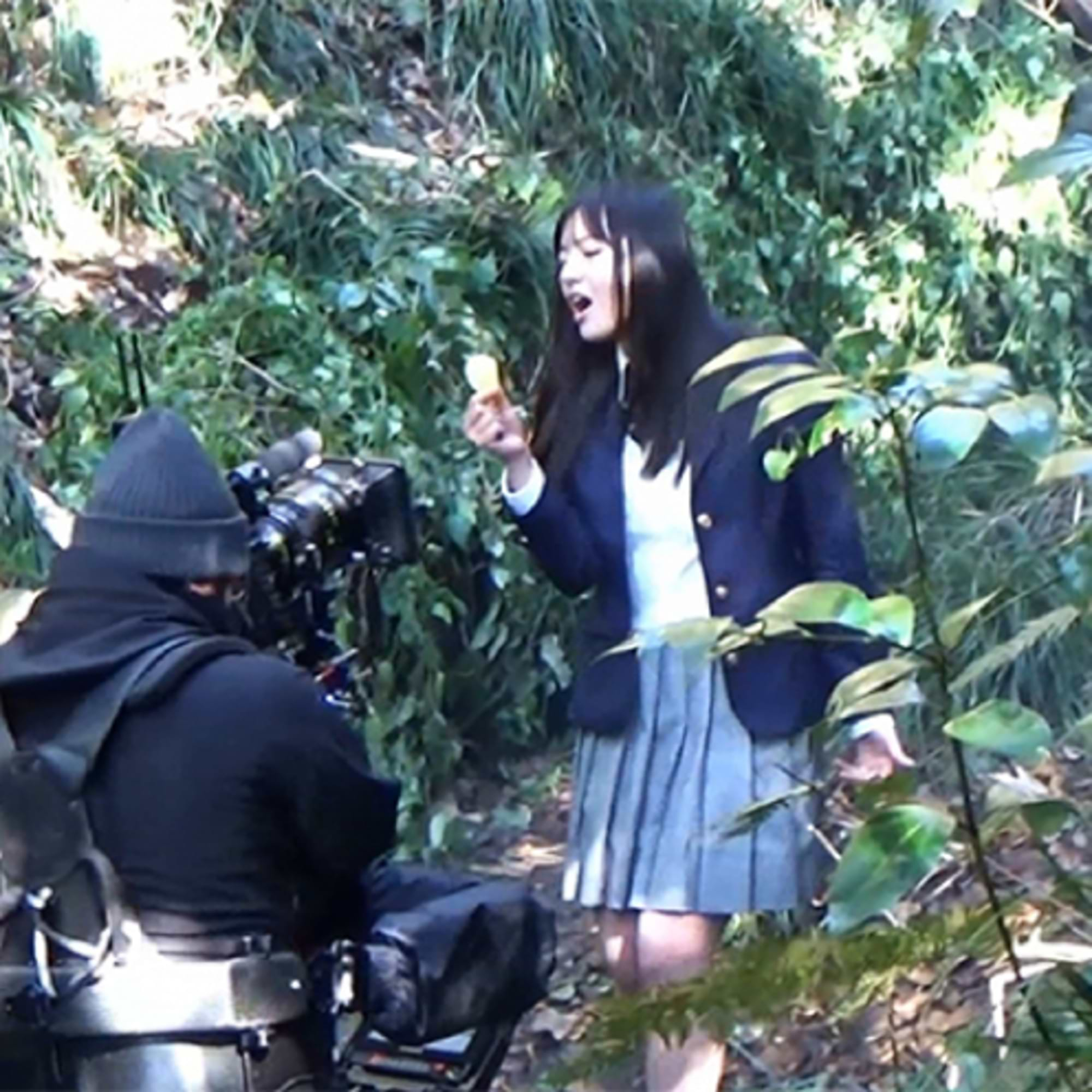
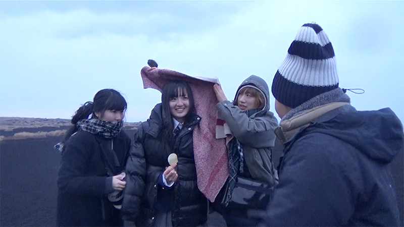
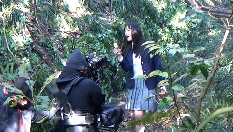
──A girl who looks like an ordinary high school student in uniform walks through a wilderness, singing a solemn song with overwhelming vocal power. Yet the lyrics simply state, "We use 100% Japanese-grown potatoes." What was the intent behind this TV commercial full of such gaps?
Suzuki: When I tried the prototype, it was genuinely delicious. I was moved, thinking, "Can they really make something this tasty?" I felt that if it just left an impression, it would sell. So for the TV commercial, I aimed for something with a strong presence, avoiding complexity, and focusing on leaving a simple, memorable impression of the product.
Based on our previous hit TV commercial where an ordinary person singing earnestly created an interesting effect, we incorporated the idea of conveying the message through an impactful song into this proposal too. We cast Emiko Suzuki, a high school girl who had won a gospel contest. Actually, President Sato happened to spot her singing on TV and decided to cast her. When I was told it would be Suzuki-san, I was just as surprised as when the product name was decided.


──This TV commercial also generated significant buzz. What specific creative approaches did you take during the production process?
Suzuki: We aimed to create an impactful concept, so we focused on producing a TV commercial with a grand musical score, simple lyrics, and an unusually eye-catching design. It's actually a surprisingly classic approach to TV commercial planning, but since few companies are doing this kind of thing now, it probably stood out more as a result.
Every time it aired, many people posted on social media asking, "What was that just now?" The full four-minute version, which we designed as a catalyst for viral spread without mentioning the product, received nearly twice as many views as the 30-second version. Also, just by posting the full song version on our site, we got TV coverage requests from about 11 different programs.
Thanks to this, with just a simple campaign of TV commercials and videos, we achieved tremendous success exceeding sales projections immediately upon release on February 6, 2017.


──What do creators need to keep in mind to make an impact within a short timeframe?
Suzuki: I believe "video is the design of time," so I prioritize designing the time. In this case, designing the "song" becomes the design of time. What kind of music, what kind of lyrics to use, where to create the interest, and so on. For that reason, I always carry a stopwatch, muttering lines to myself in cafes and such, meticulously crafting everything without cutting corners (laughs).
By focusing on "words" and "visuals," we proved it could reach a wide audience
──This massive project launched in just six months from kickoff. Wasn't that incredibly demanding?
Suzuki: It was a whirlwind (laughs). Things got decided at a pace that made me think, "Doesn't logo selection usually take much longer?" I felt respected creatively, so the work was enjoyable. Also, because the planning phase wrapped up quickly, I could dedicate more time to the music composition, which I really wanted to take my time on.
──Beyond the increased sales, were there any unexpected outcomes from this rebranding project? Like specific reactions or changes you didn't anticipate?
Suzuki: I hear that the huge success of "KOIKEYA PRIDE POTATO" has energized the entire company, with new projects launching one after another. Starting this major project so soon after the new president took office apparently surprised everyone internally. But now, there's a sense that we can trust the new president, and the company seems incredibly motivated.
──That's wonderful to hear. It's great that sticking to simplicity and believing in your approach paid off.
Suzuki: This outcome feels like proof that sticking to the "words" and "visuals" I've always believed in can truly reach many people. No matter how many techniques exist, I think the messages that can be conveyed remotely are "words" and "visuals." That's what we have to rely on. That's why I don't want to cut corners with words. Right now, my projects tend to have a strong flavor (laughs), but I want to keep refining "words" and "visuals" that reach even more people.

Was this article helpful?
Share this article
Newsletter registration is here
We select and publish important news every day
For inquiries about this article
Back Numbers

Author

Shintaro Suzuki
Dentsu Inc.
Third CR Planning Bureau
Joined Dentsu Inc. in 2007. Worked in the Information Systems Bureau and Sales Bureau before becoming a CM Planner. Received numerous awards including the TCC Newcomer Award, Dentsu Award, and Galaxy Award.