Note: This website was automatically translated, so some terms or nuances may not be completely accurate.
How the Suica Penguin Came to Be (Part 1)
Sakazaki Chiharu
Picture book author
Tomotomo Tanaka
Dentsu Inc.

Hideki Kuribayashi
Dentsu Inc.

Tatsuya Yamamoto
Dentsu Inc.
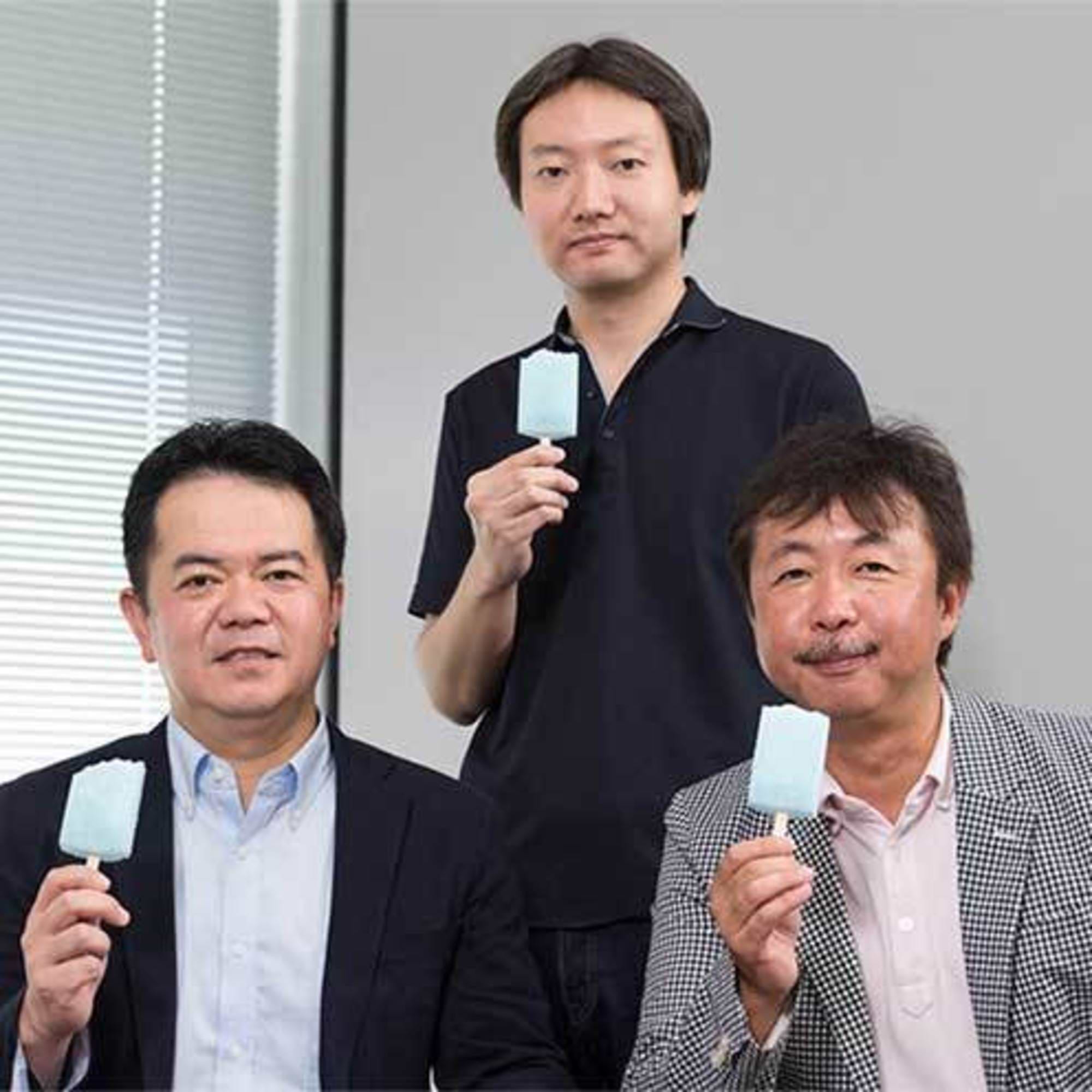
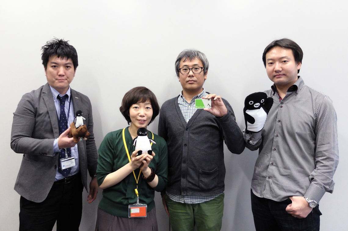
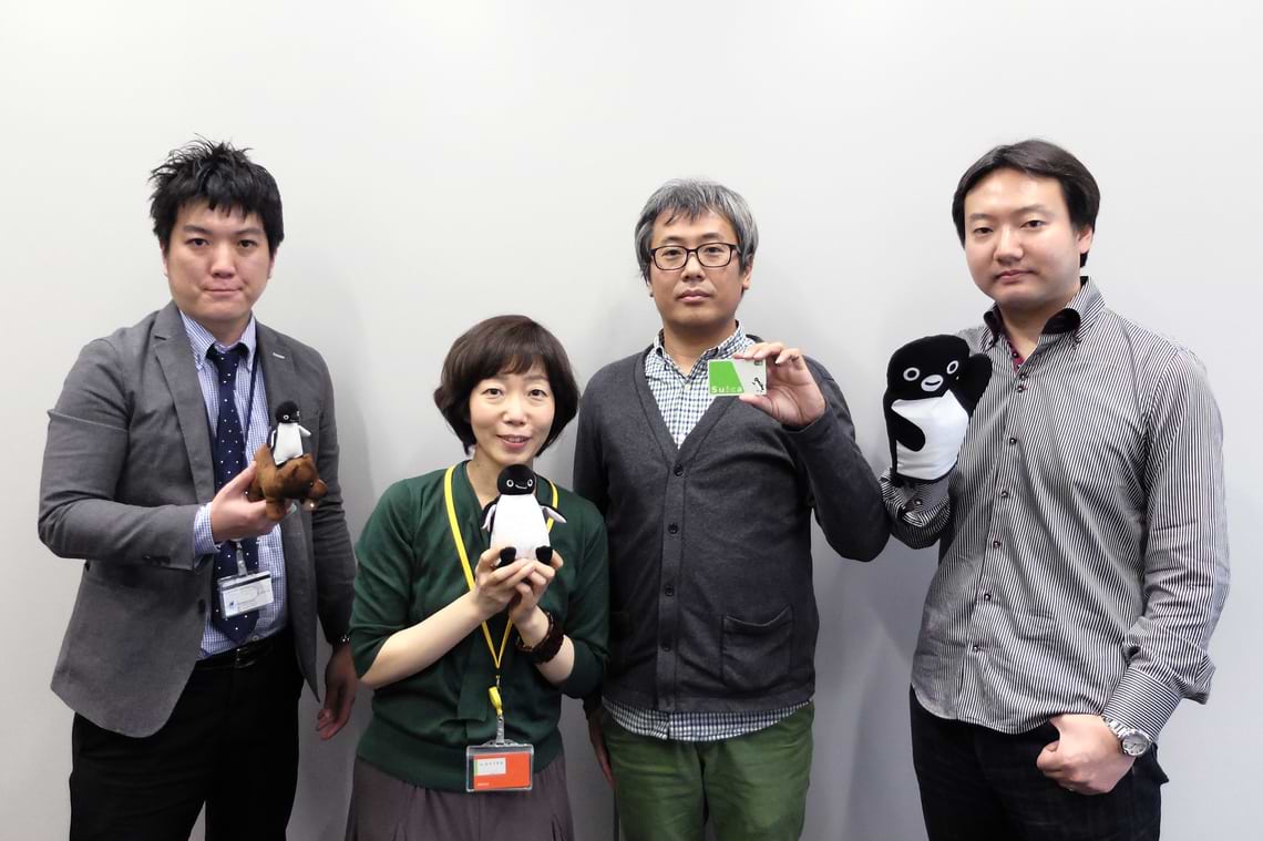
JR East's beloved corporate mascot, the "Suica Penguin," celebrates its 13th anniversary. Originally a penguin living within the pages of a picture book, how did Japan's most famous penguin come to be and grow? This time, we invited the original creator and picture book author, Chiharu Sakazaki; Art Director Tomotomo Tanaka; and Hideki Kuribayashi, who oversees licensing, to hear the secrets behind the corporate communication strategy using the "Suica Penguin".
[Facilitator]
・Tatsuya Yamamoto, Dentsu Inc. Marketing Design Center
【Panel Participants】
・Picture Book Author: Chiharu Sakazaki
Tomotomo Tanaka, Dentsu Inc. Marketing Design Center
・Mr. Hideki Kuribayashi, Dentsu Inc. Radio, TV & Entertainment Bureau
How a Picture Book Penguin Became the Face of a Company
Yamamoto: It seems quite unusual for a character originally from a picture book or other source material to become a corporate mascot, symbolizing a service as if it were developed from scratch. Could you first tell us how this came about?
Tanaka: The Suica Penguin was first used in 2001. At the time, we were searching for something that could become the face of our advertising. It was my senior art director who discovered Mr. Sakazaki's penguin picture book and decided to adopt it. I wasn't involved in the early stages. Mr. Sakazaki, how was it for you?
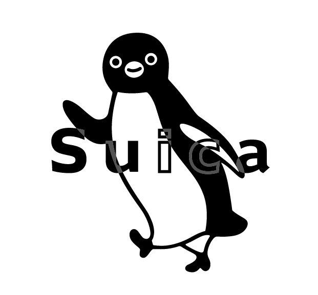
Sakazaki: That's right. I recall the very first request was to use the penguin illustration for a Suica launch campaign poster. It wasn't intended to be the official Suica PR character at that point.
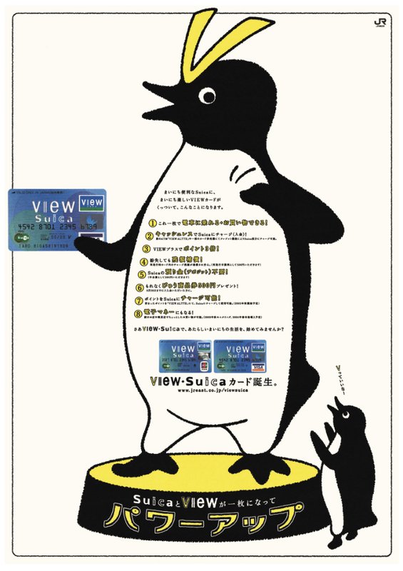
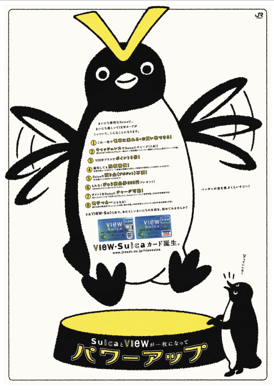
Tanaka: Then, in July 2003, a little while after its debut, our new team was tasked with launching the new "View Suica" card. That's when we introduced the penguin with the "V" on its head. That marked the start of Phase 2. Almost simultaneously, thanks to the client's bold decision that "if it's this cute," the penguin character was also incorporated onto the Suica card face. With this, exposure increased dramatically. Suica's communications also began fully utilizing the penguin as a character, marking the start of its official role as the symbol of the service.
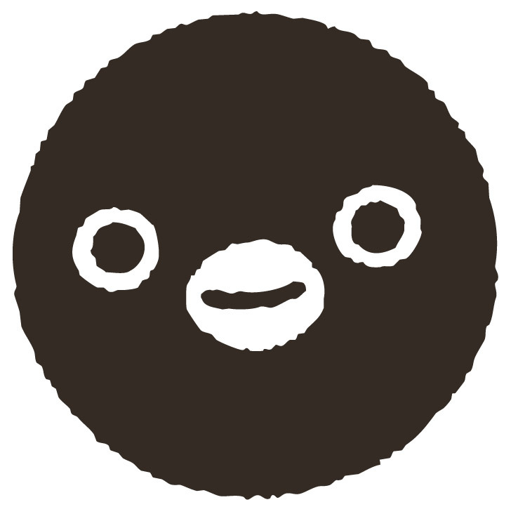
Sakasaki: It was also around this time that the penguin's face facing straight ahead, which hadn't existed in the original picture book, started being used.
Tanaka: Right. When "View Suica" launched, we created both angled and straight-on faces. Then someone pointed out that the straight-on face, when cropped, could look like a logo mark. So for a while, we unified everything to the forward-facing design and decided to develop the character design more systematically than before. After that, we did things like upside-down poses, or dressing it in a "jersey" because it had a "charge" function (laughs). Sakazaki-san, sorry for always asking you to do the impossible (laughs).
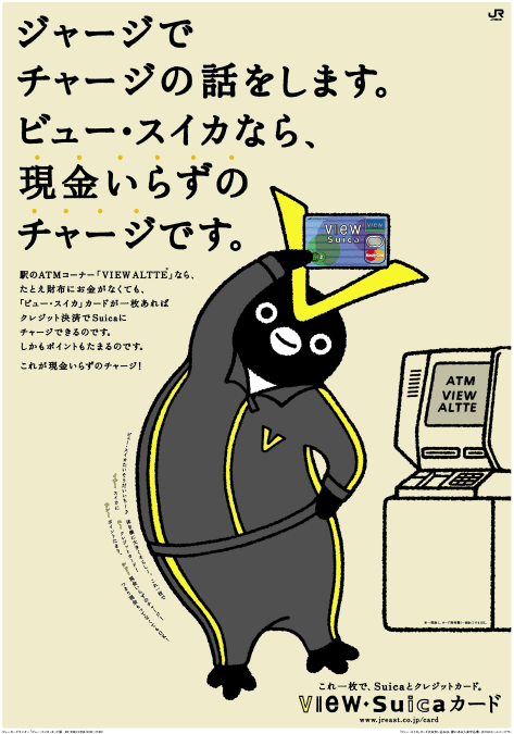
AD: Tomotomo Tanaka + Yosuke Kojima
CW: Hirokazu Ueda
Yamamoto: It's true that the front-facing penguin now functions very strongly as the Suica icon. But when Mr. Sakazaki started getting all these production requests at once, including designs not in the original work, weren't there times when he thought, "I can't do this!"?
Sakazaki: It wasn't so much that I couldn't do it, but I found myself fixated on the penguin's movements. Everyone else, however, seemed to approach it with a sense of freedom, treating it more like a character. That was really interesting.
Yamamoto: You mentioned it was interesting, but I imagine that as the character you originally drew freely for your own creative work started needing to align its expression with companies and services, there were more situations where it felt like it was drifting away from your own vision.
Sakazaki: Since I originally leaned more toward design than being an artist, I've always felt like I draw for a purpose rather than just for myself. I don't really feel uncomfortable about changing things as needed. When collaborating with others, I find it interesting to try out directions that seem promising.
Tanaka: I think this team has relatively few "no-go" areas, based on the trust with Mr. Sakazaki and including the trust with clients. Beyond that, it's probably important that the whole team knows each other's vibe like this.
Yamamoto: Building relationships with clients is also crucial for nurturing corporate characters, right?
Tanaka: Everyone involved on the client side absolutely loves the penguins. They always have this sense of anticipation, like, "What kind of cute thing will it be this time?"
Yamamoto: That's truly crucial. Of course, ultimately, the public's affection is key, but first, the client—especially the person in charge—has to become a fan. If only the creators are excited, but the client representative doesn't feel attached, it just won't work out.
We deliberately chose not to give the character a name.
Yamamoto: There's something I really wanted to ask you about this time. The Suica penguin actually has this big feature where it doesn't have a name, right? Like, no typical name like "○○-tarō." Was there some intention behind that?
Tanaka: If you look at Mr. Sakazaki's picture books, there are all kinds of penguins. Put a hat on it and it becomes a girl, add a beard and it's an old man, there are kids too. If you named it something like "J-tarou," it would become male at that point, right? Instead, this penguin is a "genre."
Yamamoto: "Genre" is a fresh take. Um... so what exactly does that mean (laughs)?
Tanaka: These penguins are the alter egos of the IC cards owned by each user. If you watch the early commercials, you'll see—for example, a penguin is always beside the user, saying "Let's go out with Suica." When they reach out and tap, the penguin transforms into an IC card. Since they're each card's alter ego, wouldn't it be weird to give them all the same name? We thought neutrality would also lead to versatility and expandability. So, the "Suica Penguin" genre—essentially, a classification—was just right.
Yamamoto: I see. From character development theory, having a name would make consumers more attached, but "Suica Penguin" is a genre (laughs). Yet it really captures consumers' hearts.
Tanaka: That's probably because Mr. Sakazaki's original worldview was already established. If this were a request to create a corporate character from scratch, you wouldn't normally think of it as a genre. The power of the original worldview is huge. Regarding the design too,
it's precisely because of that established world that it can be seen as a single character consistently, even across significant variations like flat art, 3D models, and logo marks.
Yamamoto: That's a major characteristic unique to adapting a character from an existing work into a corporate mascot. Speaking of worldview, when turning illustrations into characters, you absolutely need to humanize them—starting with personality traits—so consumers can emotionally connect. Actually, the penguin's original setting in the picture book is strangely human-like, isn't it?
Sakazaki: Well, it was anthropomorphized from the start... Especially the first picture book, Penguin Heart, was a story about projecting oneself onto a penguin.
Yamamoto: Oh, so does that mean you were the model for the penguin, Mr. Sakazaki?
Sakazaki: (laughs)
(※Part 2 will be updated on 1/22.)
Was this article helpful?
Share this article
Newsletter registration is here
We select and publish important news every day
For inquiries about this article
Back Numbers
Author
Sakazaki Chiharu
Picture book author
Picture book author
Picture book author and illustrator. After graduating from the Design Department of the Faculty of Fine Arts at Tokyo University of the Arts, worked as a designer in the production department of a stationery manufacturer. Has been working as a freelance illustrator since 1998. Recent publications include "Let's Count" (Hakusensha).
Tomotomo Tanaka
Dentsu Inc.
First Integrated Solutions Bureau
Creative Director/Art Director
Creators who generate diverse business creations centered on visualization. They produce integrated creative work spanning proposals in development and business domains to outputs in marketing and communication.
Hideki Kuribayashi
Dentsu Inc.
Content Business Design Center
Specializing in character content and possessing deep expertise in rights holders, he handles numerous content tie-ups and promotional projects. He also produces corporate characters where copyright is jointly held by clients and Dentsu Inc. Affiliated with Dentsu Character Consulting Inc. and Dentsu Robot Promotion Center.
Articles by this person
Tatsuya Yamamoto
Dentsu Inc.
Second CR Planning Bureau (on secondment to Dentsu Inc. Isobar)
Joined Dentsu Inc. in 2001. Creative. Specializes in corporate character communication, responsible for developing corporate characters for domestic and international companies, formulating deployment strategies, and rebranding. Representative of Dentsu Character Consulting, a specialized planning and consulting organization for corporate character communication established in October 2013. Also advocates for the strategic use of corporate characters based on facts and logic through lectures at universities, marketing associations, and companies.