Note: This website was automatically translated, so some terms or nuances may not be completely accurate.
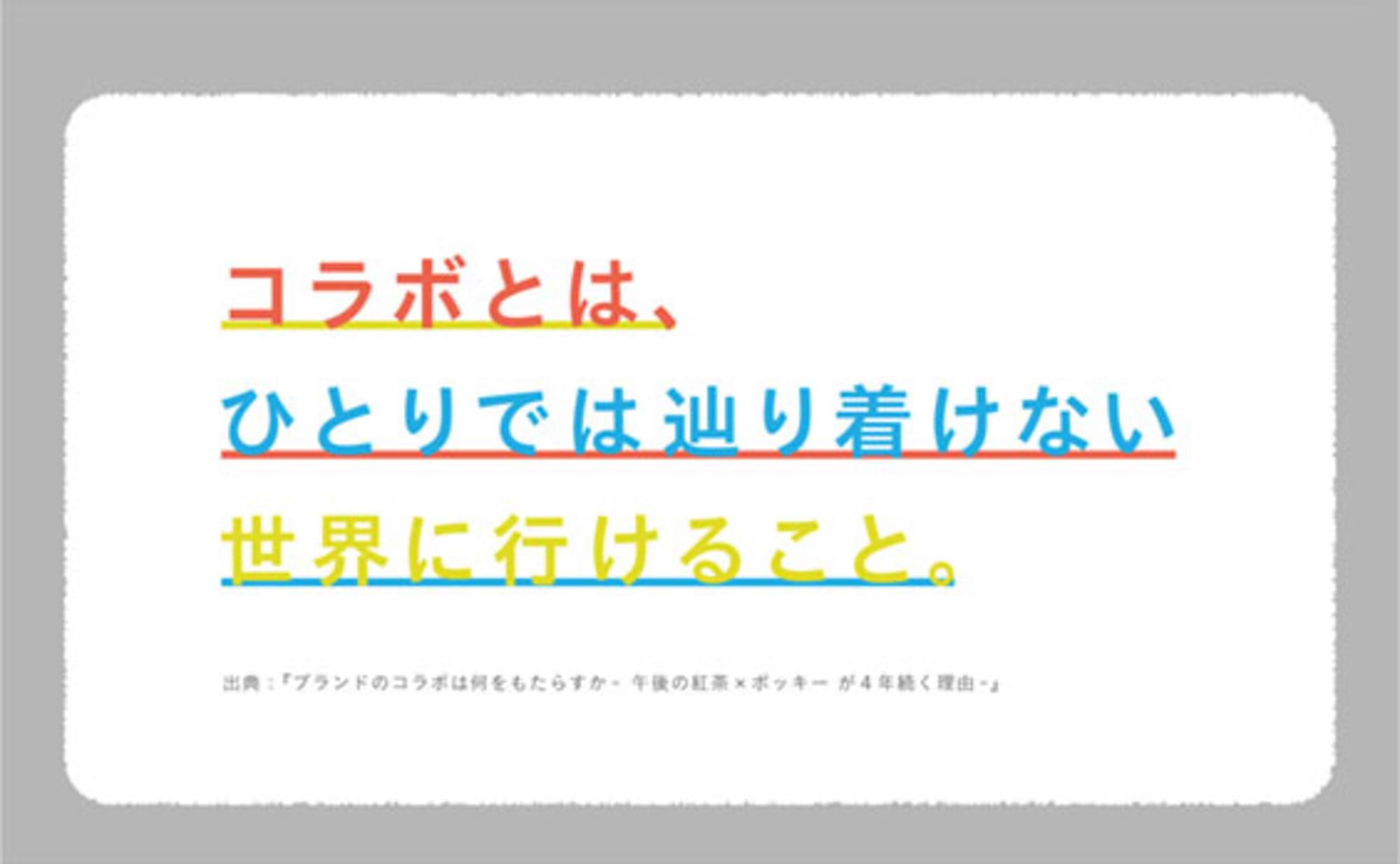
Room for collaborative design
Collaboration design, often called a creator's nightmare. With twice the brand tone to protect and twice the regulations to clear, how much surprising output can we create? This time, I'd like to talk about the creative side of such collaborations.
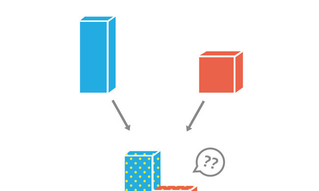
The strange phenomenon where simply placing logos side by side makes it look like a collaboration
Bringing together multiple brands, products, or services to launch a single project. As you develop such a collaboration, you inevitably hit a fun yet challenging wall: the design of the output.
The first thing everyone imagines is a design featuring the logos of the collaborating brands lined up side-by-side in the center. This approach is effective for quickly conveying the news and certainly looks the part. Considering the biggest benefit collaborations offer—sharing each other's fan bases—it's a perfectly valid method.
However, whether it's truly compelling is another matter entirely. If it lacks any real hook, it might fail to spark any attitude change, become just another piece of news that flows by unnoticed. Worst of all, it risks descending into a "could have been done by anyone" design. In that sense, it's perhaps no wonder it's considered a creator's nightmare.
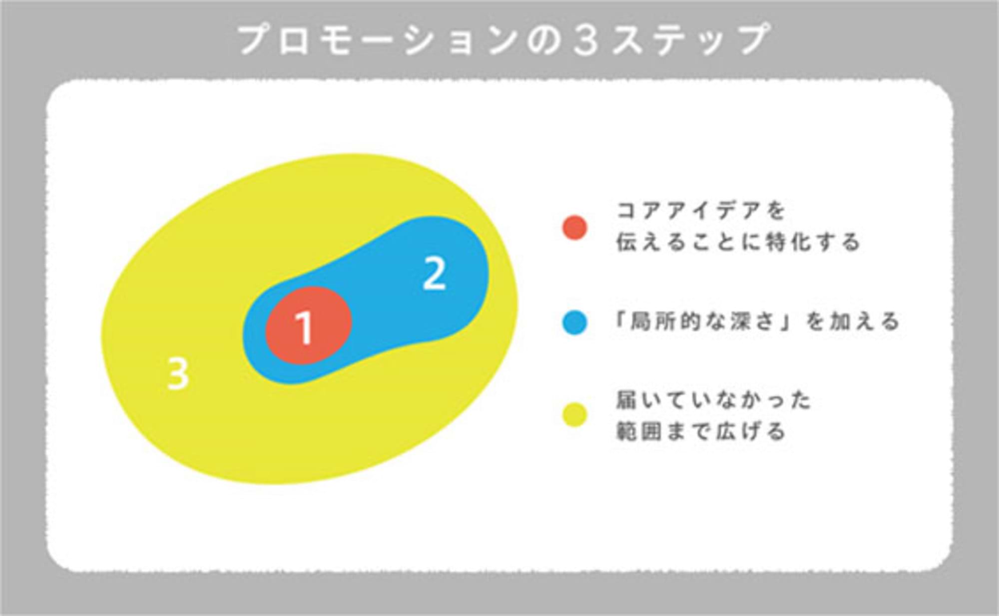
Where to Design
So, how can we generate creative output? The first place to look is likely each brand's established VI (Visual Identity). Select and extract the design elements that define the brand: theme colors, tone and manner, textile impressions. Arrange them and consider how to combine them. In a way, it's a straightforward approach.
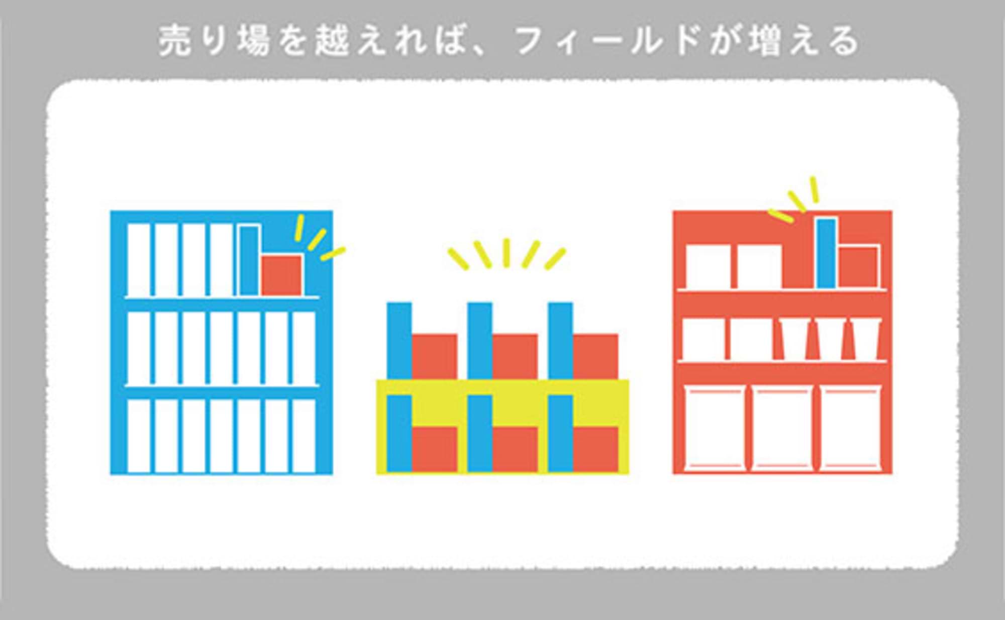
However, trying to cover everything can lead to a dead end: "There's no room left to design!" Aiming for the middle ground is extremely difficult, and overly valuing each brand's image risks ending up with a patchwork, half-baked design.
In such cases, I recommend setting aside all those elements for a moment. Then, using just one shared element—like a single color common to both brands, or a deliberately omitted tone and manner—as your anchor, consider a completely new brand tone.
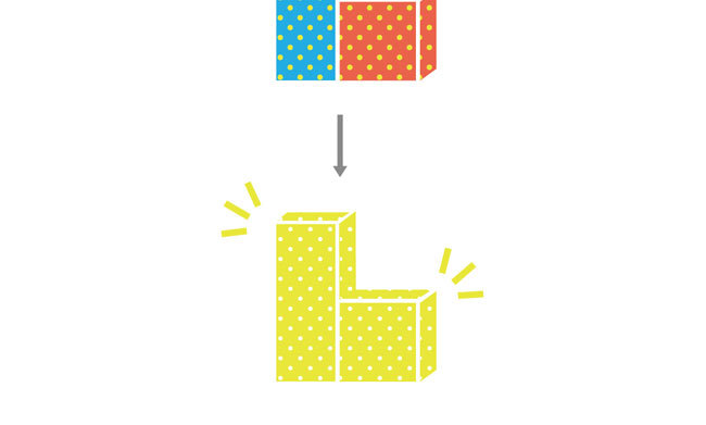
This approach is closer to creating a bold, unified "single canvas" than making piecemeal design adjustments between two distinct products or brands.
As they say, 80% of the information people take in is visual. Consumers are sensitive to visual changes. If your goal is to create news, it's no exaggeration to say the outcome is often determined by the visual design.
Objective Understanding of the Brand
So far, I've discussed this from the perspective of designers and creators. However, as a marketer responsible for the brand, I'd like to touch on (if I may be so bold!) the role we should play during the design phase.
If I had to name one thing, it would be to reconsider the meaning of borrowing the name of another company, brand, or product for the collaboration. In other words, recognize that half of what you create belongs to the collaborating company, and treat their product as your own.
Doing so might free you from being shackled by your own resources and brand theory, potentially offering a chance to think with a different set of criteria than usual.
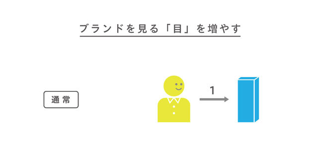
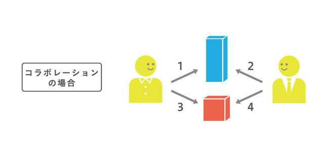
Brand managers typically engage with their brand on a one-to-one basis. However, collaborations become a union of four one-to-one relationships, as shown in the diagram above. When considering how the partner perceives their own product, you're engaging at a level beyond that of a mere consumer, yet below (or on par with) your own marketer. This allows you to discover new product appeal or deepen your understanding. Whether you can leverage this is entirely up to you.
The Photogenic Trap
Moving slightly away from collaborations, I'd like to touch on the trap lurking within photogenic appeal.
As the buzz around "Instagrammable" has shown in recent years, expectations for "visual design" – the point of contact between products/services and consumers – are accelerating. It's now commonplace for people to buy something, visit a place, or attend an event specifically to post photos on Instagram. Companies, wanting to ride this wave, sometimes go beyond mere advertising and actually alter their service offerings.
However, consumers are becoming increasingly sensitive to products where such corporate ulterior motives are obvious. If the underlying strategy is transparent—like targeting young people = wide reach on SNS! Let's get them to post on Instagram with photogenic packaging!—the product gets completely ignored (unless it's exceptionally cute).
You must understand that these products are tools to fulfill self-affirmation desires: "I found something stylish and want to show it off," "I want likes," "I want friends to share it."
If you still want photogenic sharing, give consumers control. Beyond just being cute or pretty, incorporating playful elements or designing experiences that make people want to try them out significantly boosts the chance of grabbing attention.
In the increasingly saturated "photogenic market," we need to rethink our approach, prioritizing depth over reach.
This means creating the right distance between brand and consumer. To achieve this, collaborations that offer a little surprise or enjoyable experience might actually be one effective approach.
(To be continued)
Was this article helpful?
Share this article
Newsletter registration is here
We select and publish important news every day
For inquiries about this article
Author

Sakamoto Yako
Dentsu Inc.
Business Production Bureau (on secondment to CACDO)
Copywriter/Interactive Art Director
After studying product design, joined Dentsu Inc. in 2012. Specializes in creative work spanning multiple fields including advertising production, product development, design, and branding. Currently on assignment at cacdo, a joint venture between nendo and Dentsu Inc.