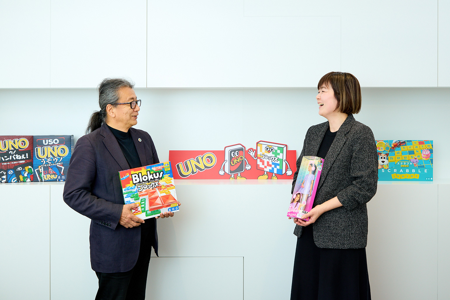
From left: Koichi Iga (Color Universal Design Organization) and Miho Kobayashi (Mattel International)
This series explores tips on “how to cultivate a DEI-focused corporate culture” by speaking with companies that are actively pursuing DEI initiatives and fostering an inclusive corporate culture. The fifth installment features Mattel International, which continues to convey the importance of diversity and individuality through its toy series rooted in universal design.
In this article, we speak with Miho Kobayashi of Mattel International and Koichi Iga of the Color Universal Design Organization—who reviewed the company’s products from the perspective of color vision diversity—about the current state and future prospects of “DEI for Children” initiatives.
Interviewees: Miho Kobayashi (Associate Marketing Manager, Mattel International Co., Ltd.), Koichi Iga (Vice Chairman, Color Universal Design Organization, a Specified Nonprofit Corporation) Interviewer: Ayaka Kaido
Expanding the Circle of Play—The Redesign of UNO and BLOX
—First, could you tell us about Mattel International’s (hereinafter “Mattel”) main DEI initiatives?
Kobayashi: While our toys are sold worldwide under uniform specifications, we are working to improve and update those specifications with the goal of making them accessible to as many people as possible. As part of this effort, starting in 2024, we have updated the designs of 80% of the games we offer—including “UNO” and “Blokus”—to accommodate color vision diversity.
――What exactly do these design changes to accommodate color vision diversity entail?
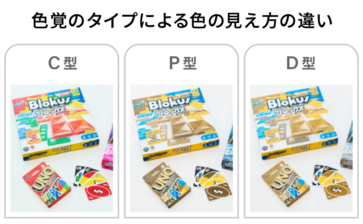
Kobayashi: For example, UNO and Blokus consist of cards and blocks in four colors—red, blue, yellow, and green. However, from the perspective of color vision diversity, some people found it difficult to play because they had trouble distinguishing between red and green, among other issues.
Simulation images showing how colors appear. For people with P-type or D-type color vision characteristics, it can be difficult to distinguish between red and green. *P-type and D-type vision involve differences in how light and dark shades of red and other colors are perceived.
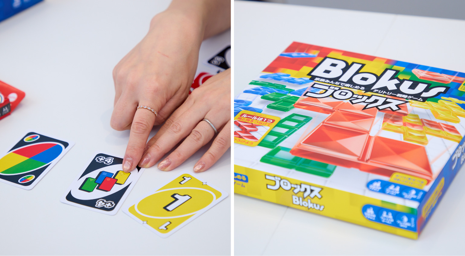
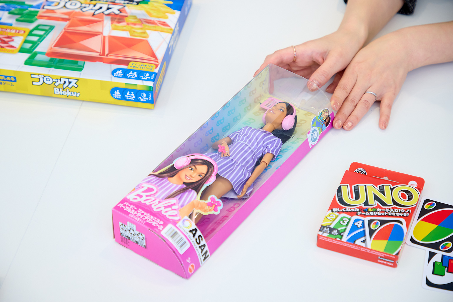
Kobayashi: So, for Uno, we added symbols corresponding to each color—a circle on red cards and a triangle on green cards. For Blocks, we changed the shape of the blocks for each color. By incorporating these “non-color” elements, we made it easier to distinguish between them.
Additionally, to make it immediately clear that these games are designed for color vision diversity, we’ve added our own unique icons to the packaging of the compatible games.
(Left) “UNO” with symbols added for each color; (Right) “Blocks” with block shapes varying by colorMattel products designed to accommodate color vision diversity feature a globally standardized mark (the Universal Design mark) developed independently by the company.
――Regarding this design change, what kind of collaboration did you have with the Color Universal Design Organization (hereinafter CUDO)?
Iga: CUDO verifies the color schemes of various products and structures to assess whether they meet Color Universal Design standards. When the specifications for Uno and Blocks were about to change, Mr. Kobayashi approached us to discuss CUD certification.
Kobayashi: I first learned about Color Universal Design at my previous job at a home appliance manufacturer. In fact, we received CUD certification at that time, so when the decision was made to change the game’s specifications, CUDO was the first organization that came to mind. I believe one of the criteria for obtaining certification is whether anyone can play the game equally, and Blocs received a positive evaluation stating that players can instantly distinguish blocks based on differences in color shade and shape, which allowed us to obtain CUD certification.
*CUD Certification = Third-party certification conducted by the Color Universal Design Organization (abbreviated as “CUDO”). Products that have obtained CUD certification may display this as proof that they accommodate color vision diversity.
Considering color vision diversity means increasing understanding and communication
—Some readers may not be familiar with the term “color vision diversity” that came up in our conversation. Could you please explain color vision diversity and CUDO’s activities once again?
Iga: The way humans perceive color is an innate sense that varies from person to person. Recent research suggests that the reason for this diversity is a result of human evolution—specifically, that “having a variety of ways of seeing was advantageous.” Here, we refer to people whose color vision differs from that of the most common group—those with normal color vision (Type C)—as “people with color vision deficiency.” This condition is particularly common among men, and there are also differences based on region and ethnicity (*).
*At CUDO, we use the term “people with color vision deficiency” as a general term for individuals who have difficulty receiving information in a society where color schemes (color combinations) are not adapted to accommodate their needs. Color vision types are broadly divided into five categories. The most common type is “Type C,” while “Types P and D”—which are classified as color vision deficiencies—are estimated to affect approximately 1 in 20 Japanese men and 1 in 500 Japanese women. For more details, please refer to the CUDO website. https://cudo.jp/?page_id=84
Iga: Color vision diversity, like blood type, is a result of genetic diversity and is not a disease. It simply means that people have different strengths and weaknesses; for example, someone who sees red and green as the same color may be good at distinguishing between blue and green.
However, these differences in perception can sometimes prevent information from being conveyed accurately. For example, warnings are often written in red to make them stand out, but people who have difficulty distinguishing between black and red may not notice them unless they get up close. On one subway line, it is said that some passengers initially took the wrong train because the signs were color-coded only, and they could not distinguish the colors. In some cases, colors used with the intention of conveying information clearly may not function effectively as design elements.
Mr. Iga, Color Universal Design Organization (CUDO)
Iga: Through our color scheme consulting services, our organization works to adapt the various designs found in society to accommodate color vision diversity. The impetus for launching CUDO came in 1998, when we participated in a survey on color perception as many traffic signals nationwide were being converted to LEDs. From there, we expanded our activities in collaboration with people with color vision deficiencies, those with normal color vision, color experts, and doctors, and have certified over 10,000 items to date.
Among the items we’ve certified are hazard maps and car navigation systems—products where failure to distinguish colors correctly can lead to danger. Meanwhile, in the gaming industry, there are cases where players cannot play a game if they cannot distinguish colors. In one popular game, simply making a slight adjustment to a color—such as shifting red slightly toward orange—allowed some players to finally distinguish the colors and understand how to play. Color plays a very significant role in determining whether someone can play a game or not.
Kobayashi: As Mr. Iga mentioned, it’s true that warning labels are often written in red. We also aim to continuously update our toys by adopting communication methods and design approaches that take diversity into account.
――So, a single difference in color scheme can completely change the accuracy of information transmission, right? Is awareness of this kind of Color Universal Design spreading within the toy industry?
Kobayashi: While there’s a high level of interest in the environmental impact of the materials we use, I get the impression that color vision diversity isn’t yet widely understood. When explaining the specification changes for Uno and Blocks to our internal teams and business partners, for example, many people are surprised to hear that about one in 20 Japanese men has a color vision difference.
I’ve even heard stories from parents who only realized their child had color vision differences when the child drew a picture of an apple in a color other than red. Perhaps people rarely have the opportunity to learn about this unless someone with the condition is in their immediate circle, and I imagine that even when such a child is in the same classroom, their condition may go unnoticed because they never have the chance to speak up about it.
Iga: I’ve been open about my color vision deficiency since I was a child, but there are still many people who cannot bring themselves to disclose it at school or in the workplace. This stems from Japan’s long history of using color vision tests to restrict educational advancement and career choices. In fact, until the early 2000s, color vision tests were mandatory for school health checkups and pre-employment medical exams, and there were many cases where this directly affected students’ and job seekers’ future paths.
Based on these experiences, I believe many people have hesitated to speak openly about their color vision differences out of concern that doing so might lead to disadvantages. Because those affected have hidden their color vision deficiency, they have been unable to voice their concerns regarding products and services designed with normal color vision as the standard. That is precisely why reexamining the “colors” that people with normal color vision take for granted will help prevent misunderstandings and difficulties caused by differences in how we perceive color.
Continuing to Express Individual Diversity Through “Everyone Is a Barbie”
――When it comes to Mattel’s iconic toys that express individual diversity, Barbie is indispensable. The company’s diverse lineup of dolls representing various races, professions, and body types is truly impressive—what brand philosophy guides this initiative?
Kobayashi: Based on the concept of “You Can Be Anything,” Barbie has represented the diversity of women throughout its long history since its launch. A major shift in recent years was the addition in 2016 of dolls with shorter, taller, and curvier body types.
This series, known as “Fashionista,” includes dolls in wheelchairs and with prosthetic legs. However, they are not “Barbie’s friend, Ms. X in a wheelchair”—every single one of them is “Barbie.” By giving all these dolls with diverse characteristics the name “Barbie,” the brand conveys more strongly that Barbie is not a specific individual, but rather a symbol of the diversity of beauty and the core message that “you can be anything.”
The wheelchair-bound Barbie comes with a ramp, allowing her to move freely in and out of a dollhouse equipped with an elevator accessible to wheelchairs. The company also focuses on realistic depictions, such as meticulously recreating the design of the Joyo wheelchair with the help of experts. The dress worn by the Barbie with Down syndrome features yellow and blue butterflies, which are symbols used to raise awareness about Down syndrome. Whenever new dolls are released, the company collaborates with relevant organizations and experts to seek advice on their design.
The Barbie with autism was developed in collaboration with ASAN, an advocacy group led by people with autism. She wears headphones that help block out external noise.
Kobayashi: Barbie is also widely used in various awareness and educational events. Just as with the color vision diversity symbol and the Down syndrome symbol I mentioned earlier, interacting with these toys sparks conversations like, “What is this?” I feel that toys play a very significant role in allowing children to naturally encounter diversity and providing them with opportunities for conversation.
――If such conversations take place within families, they can lead to new insights not only for children but also for adults.
Kobayashi: That’s right. I myself sometimes use the knowledge about color vision I’ve gained through my work to explain things to my own children. When my child asks, “Can everyone see that color?” I’ll look it up again, and over time, my understanding of diversity has continued to expand. It would be great if parents could adopt an attitude of learning alongside their children.
On the other hand, when I explain the diverse Barbie line—such as the Fashionista series—to customers, I sometimes sense the potential danger of how parents’ reactions can influence their children. Since parents’ attitudes directly affect children’s emotions and reactions, I once overheard a parent say, “She’s so pitiful,” referring to a Barbie with a prosthetic leg. The words and reactions of the adults around them really do leave a lasting impression on children, don’t they?I heard from a researcher at a university who has been studying Barbie for many years that adults can also learn from children’s reactions—such as when they say, “A prosthetic leg is cool!” or “She looks like she can run fast!” Since these encounters with diversity often serve as a “first” experience for children, having conversations without preconceptions helps foster an unbiased perspective. I, too, intend to continue cherishing that perspective moving forward.
Ms. Kobayashi, Mattel International
Turning Insights into Action—Expanding DEI for Children
—Looking ahead, what are your goals for promoting DEI, including color vision diversity?
Iga: To increase public understanding, we’ve undertaken various initiatives—including collaborating on the development of a color simulator that allows people to experience “color discrimination,” as well as establishing color-matching guidelines and certification systems. One area where I feel there’s still room for improvement is creating a system where children with color vision deficiencies can learn about “color” based on their own visual experience.
In many situations, children are taught based on the assumption that “this is how this color is supposed to look,” and there aren’t many opportunities for children who see things differently to learn how to understand color itself. That’s why I believe that if we can convey “color as knowledge”—explaining it not just through sensation but also by accounting for differences in perception—children will be able to understand it without confusion. I’m currently working on this little by little as a personal initiative.
Another initiative is organizing art exhibitions featuring works by people with color vision differences. Some people might look at paintings by artists with color vision differences and think, “The use of color is strange,” but I find that unique use of color to be a truly captivating form of expression unlike any other. When we held an exhibition previously, we were able to welcome many participants who had stopped painting because of their color vision differences. I hope to hold another exhibition as a platform for expressing color vision diversity.
――Finally, please share a message for our readers.
Iga: Color Universal Design (CUD) aims to “create things that are easy for everyone to understand” and has been spearheaded by government agencies and companies. CUDO has been active in supporting these efforts. To increase the number of accessible examples in society—even if it’s just one more—we’d like to continue supporting your activities, so please feel free to reach out to us.
Kobayashi: If reading this article makes you think, “Come to think of it, are our company’s products designed to accommodate color vision diversity?” I recommend taking a moment to check. While it’s difficult to completely overhaul products or services from scratch, I believe that by sharing observations from our daily lives and making small adjustments, we can foster a growing, spontaneous movement to bring about change in society. I would be delighted if you could apply what you’ve learned to initiatives in your own community.
Vice Chairman of the NPO CUDO (Color Universal Design Organization). For over 20 years, he has promoted the creation of a society that accommodates diversity in color perception, engaging in research, certification, and public awareness campaigns. Member of the Japan Society of Color Science. He is also involved in community activities and the restoration of classic cars.
Miho Kobayashi
Mater International Co., Ltd.
Associate Marketing Manager
Joined Mattel International Co., Ltd. in 2016. Has held marketing roles for multiple brands, including Hot Wheels, Uno, Barbie, and Fisher-Price. Handles all marketing processes comprehensively, from localization strategies based on market research and product selection to promotions and PR activities covering both ATL and BTL.
Ayaka Kaido
Dentsu Inc.
Creative Planning Division 3
Communication Planner
As a Communication Planner, I am involved in brand strategy, advertising planning and production, corporate consulting, product development, and training program development. I am a member of dentsu DEI innovations, where I write articles and develop solutions centered on DEI. Additionally, I am responsible for planning and conducting LGBTQ+ surveys, developing corporate training programs such as "Ambass-Dialog," and creating "GAP MIKKE," a program focused on developmental disabilities. My hobbies include playing with my dog and researching dog-related social media.