Note: This website was automatically translated, so some terms or nuances may not be completely accurate.
We want to deliver those moments that move the heart.
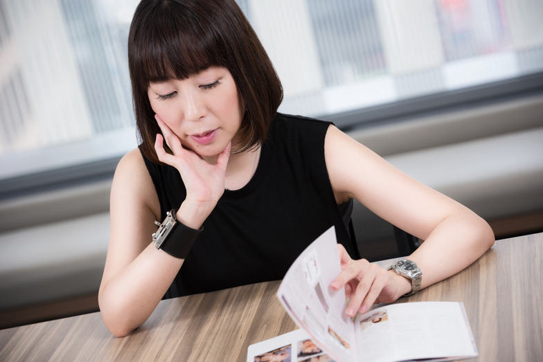
Rika Eguchi is a female creator currently gaining attention for her versatile art direction across all fields, from apparel brands to book and photo collection designs. With a uniquely feminine, supple sensibility, she consistently creates distinctive designs that resonate with viewers, possessing a certain allure. Her work is currently exhibited at the "Graphic Trial 2016" event at the Printing Museum in Bunkyo Ward, Tokyo (until September 11, 2016). We spoke with her about the themes and concepts behind her work, the sources of her ideas, and the passion she pours into her craft.

From "Pressed Cats" and "Peeling Print" to "Mosaic Art with Diverse Textures"
――"Graphic Trial" is an event where leading creators challenge themselves with new expressions using various printing techniques. This time, Eguchi-san tackled a mosaic painting resembling patchwork, expressed through printing with varying three-dimensionality and textures. What kind of "experimentation" led you to this theme?
Eguchi: This time, I first aimed to create a poster that anyone could enjoy, one that makes you want to stop and look. On top of that, I thought about creating a visual that could only be expressed using Toppan Printing's unique technologies.
"Graphic Trial" provides an opportunity to work with Toppan Printing's excellent printing directors and project managers, allowing me to lavishly experiment with printing techniques beyond my usual work. Since this is likely a once-in-a-lifetime trial, I consulted them about everything I wanted to try.
My first idea was something like pressed flowers: printing raised ink and then crushing it to finish. I thought we could create something never seen before, like "pressed cats" or "pressed Mount Fuji" (laughs). We also brainstormed other ideas, like using flock printing to reproduce textures like fine hair or wrinkles on a human face.
Amidst these discussions, we arrived at the theme of "peeling prints." Posters are fundamentally designed to resist deterioration, but over time, they can get dirty or damaged. It's common for older paintings to reveal even older works beneath them, and I thought it would be fascinating if something similar could happen with posters.
So, I consulted with Printing Director Hasegawa, saying, "I want to create a poster where two visuals are printed on top of each other, and the top visual gradually peels away, blending the two visuals together." We tried various approaches, but it just wouldn't work as envisioned. My idea was a print where powder would stick to your fingers when touched, gradually peeling away. But printing is so well-made that it wouldn't peel unless you scraped it hard with a coin or fingernail, like a scratch-off ticket. Scraping away at a poster stuck on a wall felt unnatural, so we ultimately abandoned this direction.
That's when I had a complete shift in thinking and came up with the idea of using mosaic as a textural expression. While trying the "peeling print," I saw many interesting textured prints—like silk-screens mixed with glass beads or thickly applied varnish... Just looking at them, I found the textures themselves fascinating. That's when I wanted to gather various textures like a patchwork to create a single image.

What is the allure of mosaics that sparks the imagination?
――Why did you decide to combine nude women with mosaics?
Eguchi: Mosaics often give the impression of being used to partially cover female nudes. By covering the entire figure instead, I thought it would spark more imagination—questions like "Who is she?" "Is she cute?" "Where is this place?"—making the expression more captivating.
At first glance, it resembles a Cubist painting with its beautiful color palette of contrasting textures. As you move closer or farther away, you gradually realize it depicts a nude woman.
The mosaic incorporates printing techniques like pearlescent ink, which we don't often use due to cost. However, the way the color and sheen change depending on the angle creates a piece that can't be fully conveyed on a monitor—it's something only print can truly express.
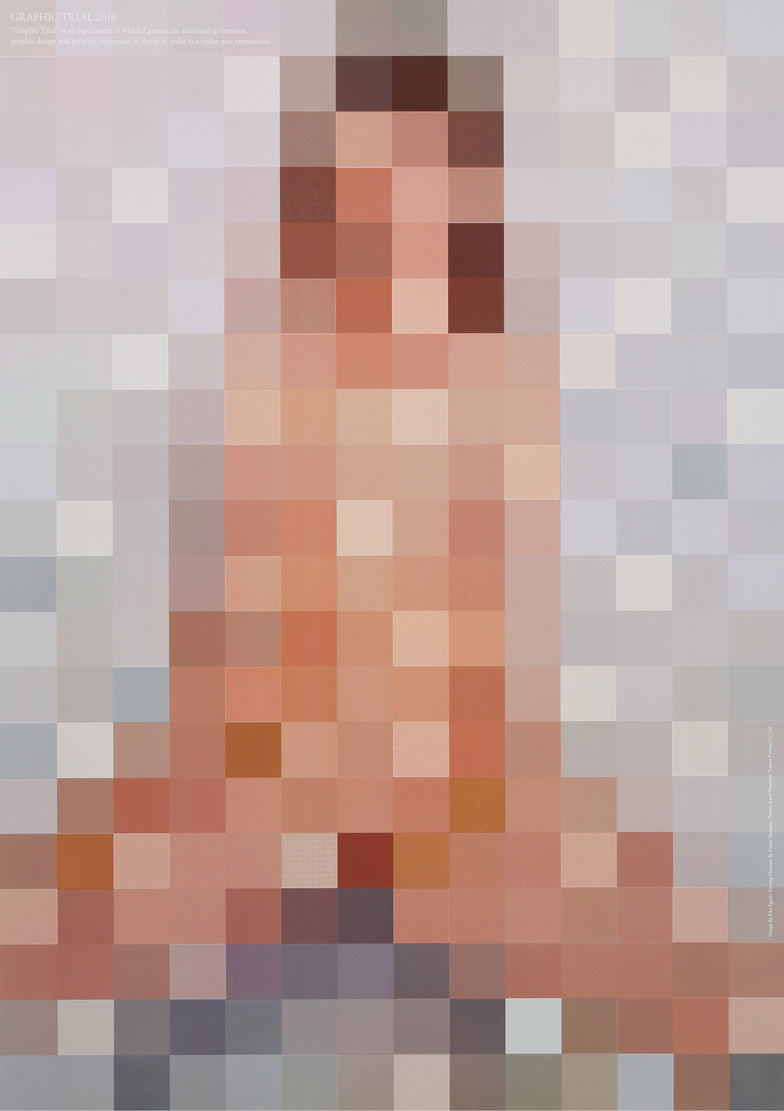
As an aside, while working on this in-house, many people stopped by asking, "What kind of work is this?" or "What are you making?" Even people who usually just walk by without a second glance paused and showed interest (laughs). Maybe mosaics stir curiosity precisely because they're not immediately clear.
Whether it's advertising or art, I place great importance on that "What is this?" feeling. Especially with ads—they're not something people actively seek out. To get them to look anyway, that instant impact, that hook, is crucial. Then, to help them understand and grow to like it, I carefully design everything from the concept and details to the aftertaste.
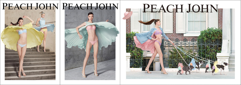
Eguchi's work for PEACH JOHN's spring ad. With the theme "Spring Breeze's Mischief," it uses edgy expressions to convey that these are lingerie so captivating, you won't flinch even if someone sees you. It achieves a cute and refreshing image, never sleazy.
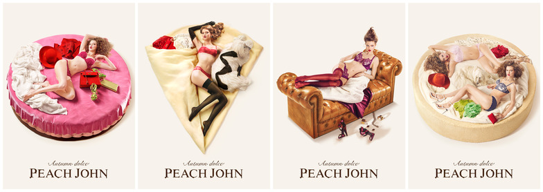
The bottom section shows PEACH JOHN's autumn ad. Under the theme "AUTUMN DOLCE," it portrays a woman relaxing at home wearing PEACH JOHN lingerie, likening her to 12 different dolce treats.
Delivering "Moments That Move the Heart"
――Is there anything you always keep in mind when creating your expressions?
Eguchi: In any work, I want to deliver "moments that move the heart." Personally, I absolutely love those moments that completely shift my perspective. That's why I love art and travel—seeing things from a different angle can reveal unexpected beauty in familiar things, making you gasp. Those are the moments I feel happiness and joy.
The motifs of mosaics and nude figures we explored in "Graphic Trial" can sometimes carry an impression of vulgarity rather than being purely positive images. However, by adding the three-dimensionality and texture achieved through printing, we elevate them into something beautiful. In the "PEACH JOHN" ad, we take the universally recognized act of "lifting a skirt" and transform it into something beautiful through the movement of billowing fabric and colorful lingerie.
I believe things that startle you or move your heart are hard to forget. So, aiming for those moments when such values shift dramatically, I make a point to remember the triggers that made me notice each individual thing in daily life, and I try to view things from as many angles as possible.
Graphic Trial 2016
Period: Until Sunday, September 11
Hours: 10:00 AM - 6:00 PM
Venue: Printing Museum P&P Gallery (Toppan Koishikawa Building, 1-3-3 Suidobashi, Bunkyo-ku, Tokyo)
Admission: Free
Closed: Mondays
Graphic Trial 2016 in Kanazawa
Period: Thursday, October 6 - Sunday, October 9
Hours: 10:00 AM - 6:00 PM
Venue: Kanazawa College of Art (5-11-1 Odireno, Kanazawa City, Ishikawa Prefecture)
Admission: Free
Also scheduled to be held in Sendai, Osaka, and Fukuoka (Nishi-Nippon Institute of Technology)
Was this article helpful?
Share this article
Newsletter registration is here
We select and publish important news every day
For inquiries about this article
Author

Rika Eguchi
Dentsu Inc.
CDC
Art Director
While working as an art director at Dentsu Inc., he also exhibits his work as an artist both domestically and internationally. His picture book "The Bread King" was published in 2014. His activities span various fields including advertising, art, product design, and costume design—such as designing costumes for figure skater Daisuke Takahashi in 2012.