Note: This website was automatically translated, so some terms or nuances may not be completely accurate.
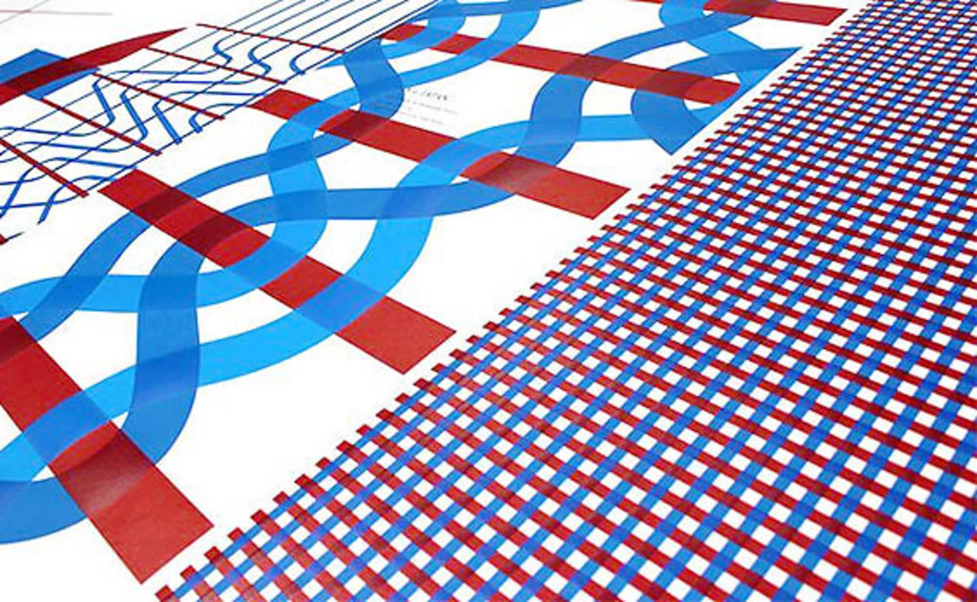
"One plus One." displayed at the SDGs event. The creators' dedication woven into two threads.
The SDGs (Sustainable Development Goals) represent the unified global objectives under the United Nations, aiming towards 2030. Progress reports from each nation are submitted regularly. The Japanese government also announced its goals in 2017, and the image posters created for that occasion have actually received high praise.
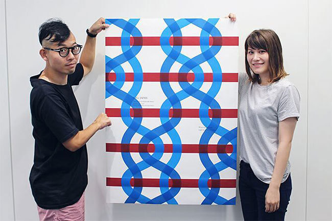
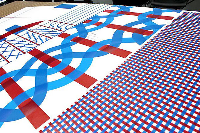
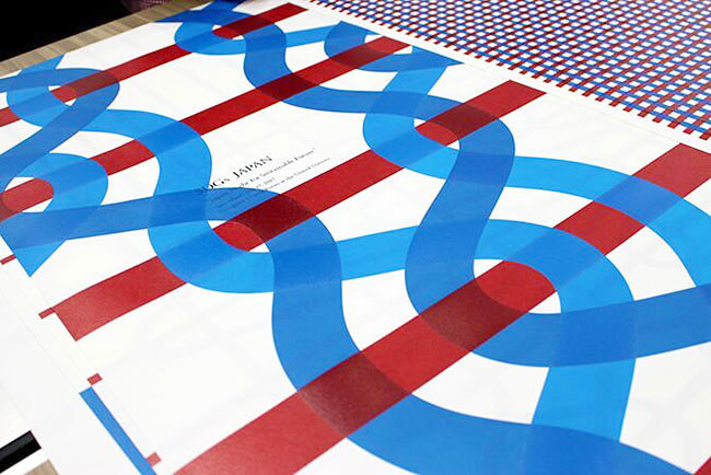
Named "One plus One," the poster series features a simple design of overlapping red and blue lines. Japan's SDG theme emphasizes "public-private partnerships," with the two lines representing "different threads." Their union signifies increased strength, forming a fabric that embraces everyone. A key feature is the thick ink layering at the overlapping points, creating a three-dimensional effect.
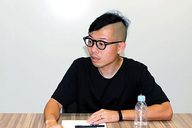
This poster won awards including a Silver Lion in the Design category at Cannes Lions 2018 and a Gold Award in the Design category at The One Show. How did this work, which captured the world's attention, come to be? Speaking with its creators, Yusuke Koyanagi (Dentsu Inc. Creative Planning Division 4) and Maya Kinoshita (Dentsu Inc. PR Planning Bureau), revealed the dedication and attention to detail characteristic of true creators.
The "Hand in Hand" Expression Born from Brainstorming
—The design centers around two threads. How did you arrive at this concept?
Koyanagi: Public-private collaboration is a major theme for Japan's SDGs. So we thought of expressing the government and private sector joining hands using the warp and weft threads in textiles.
Kinoshita: We started by brainstorming what motif could represent public-private collaboration, right? We gathered a huge number of photos and shared ideas while looking at them. The photos were incredibly diverse—we randomly looked at about 100, including pictures of stones and spirals.
Koyanagi: We thought it would be great to find something that could express "Japan's SDGs are ○○." That's why we gathered photos and brainstormed. That's when the idea of thread and textiles came up. It's part of Japanese culture, and we thought it was clear and effective.
Since this poster isn't a typical advertising project, we started from scratch with no foundational motif. In cases like this, we begin by brainstorming together, looking at various things to find a motif.
Kinoshita: It's like gathering imagery, right? As the copywriter involved, I brought a lot of copy to this brainstorming session. Through that process, the visual of thread and the theme "One plus One." were decided.
—What's particularly striking about the poster is how the overlapping threads are rendered three-dimensionally, right?
Koyanagi: The design for this project is extremely simple, deliberately avoiding flashiness or decoration. We wanted to clearly convey the message embedded in the poster. Because the design is simple, we decided to focus on the details. That's why we aimed for an expression that truly looks like threads are overlapping.
Technically, we used UV inkjet printing with thick layers. It dries quickly and sets instantly, allowing us to achieve that sense of depth. We used Japanese paper. Since this is an event Japan is promoting, we wanted to incorporate elements rooted in Japan as much as possible.
I wanted the design and copy to multiply, not just add.

—A total of five posters were created, featuring various designs using red and blue threads. What is the meaning behind this?
Koyanagi: We aimed to show different weaving techniques to express several messages. Every design on the posters represents an actual weaving method. Before designing, we first studied various weaving and knitting techniques.
Kinoshita: I recall that when Koyanagi-san drafted the designs, you added keywords to each one. For example, the design with red and blue threads crossing in a cross pattern was labeled "Beginning," right?
Koyanagi: Was that so? My memory's a bit fuzzy (laughs). But I often use that approach. I write words that seem to connect meaningfully to my design concepts and pass them to the copywriter. Then they expand on those words.
For posters, the ideal is when the design and the words multiply together to express the concept. If the copy just repeats what the design shows, it becomes mere illustration; if it's just addition, it's insufficient. We want it to be multiplication. To achieve that, I believe it's best to create it through a back-and-forth with the copywriter.

Kinoshita: This time, we wrote the copy based on keywords from Koyanagi-san's rough drafts. We aimed for copy that would push people toward achieving the SDGs, copy that viewers could translate into their own actions. For a design with "Beginnings" as its concept, the copy became "Beginnings don't happen. We create them." For a poster evoking "Innovation," it was "What's rejected today, might be praised tomorrow."
It's not just about conveying each concept, but helping people imagine the next step. We want people around the world to see it and feel new inspiration welling up inside them. In that sense, these posters embody not just public and private sectors joining hands, but Japan and other countries joining hands too.
—Most of the copy overlaps the threads, making it somewhat difficult to read. Was there a reason for this?
Koyanagi: One reason is that I wanted the words to truly exist within the fabric itself. I wanted them to be part of the poster's very spirit. Another reason is that by making it harder to read, I hoped viewers would be drawn closer to the poster. Since it's a piece crafted with such care, I wanted people to see it up close.
"Meeting and talking," "seeing the end-user." What are the benefits?
—Do the principles you both prioritize in your work, or your personal rules, reflect in this poster?
Koyanagi: Yes. What I consciously prioritize is meeting people and talking. I avoid making decisions via email whenever possible; I insist on meeting in person. The initial brainstorming session about motifs was one example. Even when sharing materials, I deliberately print them out and deliver them in person.
Meeting and talking with people produces vastly better results than thinking alone, so I stick to this approach. Even when reviewing materials, touching the paper while discussing creates a different kind of memory. However, it's also crucial to make decisions on the spot when meeting. Otherwise, it becomes inefficient.
Kinoshita: I enjoy thinking about the end user and always keep that in mind. That's also why I'm currently part of a team that approaches creative work from a PR perspective.
When crafting the copy for this poster, I considered the viewer's perspective. Since executives from various countries would see it, I adopted a grand, global viewpoint. I imagined myself as an executive of a nation (laughs). Also, since SDGs are about influencing the planet, I believed the end-user includes the Earth itself, so I consciously incorporated that perspective too. Of course, a poster alone won't change everything, but I hoped it could express even a little hope for the planet.
—Finally, could you share the kind of creators you aspire to be?
Koyanagi: I want to work with great ambition. Since I'm fortunate to be at this company, I want to feel like I'm advancing Japanese creativity. People who truly hold that role probably wouldn't say something like this (laughs). But I think working with that level of ambition is probably best.
Kinoshita: For me, it's just a hope... but I'd be happy if I could become a creator who inspires others. Not just creatively, but as a person. I want to be someone who can encourage young people and other women.
Was this article helpful?
Share this article
Newsletter registration is here
We select and publish important news every day
For inquiries about this article
Author

Yusuke Koyanagi
Dentsu Inc.
4th CR Planning Bureau
Art Director
Born in 1982. After studying stop-motion animation for eight years at Tokyo University of the Arts' Department of Design and its graduate school, joined Dentsu Inc. in 2010. Art Director. Recipient of numerous awards including the Ars Electronica Honorable Mention, Japan Media Arts Festival Recommended Work, Cannes Lions Silver, One Show Gold, London International Awards Gold, The Clio Awards Silver, and adfest Gold. Currently interested in the ratio of strong flour to weak flour in gyoza wrappers.

Kinoshita Maya
Dentsu Inc.
PR Planning Bureau
Copywriter
Born in North Carolina in 1988 → Innocent childhood in California → Days of comedy and youth in Osaka → Inspired by Will Smith's romantic comedies, attended university in the U.S. → Joined Dentsu Inc. in 2012 → Copywriting and commercials at 1CRP Bureau → PR Planning Bureau (← Current position)