Note: This website was automatically translated, so some terms or nuances may not be completely accurate.
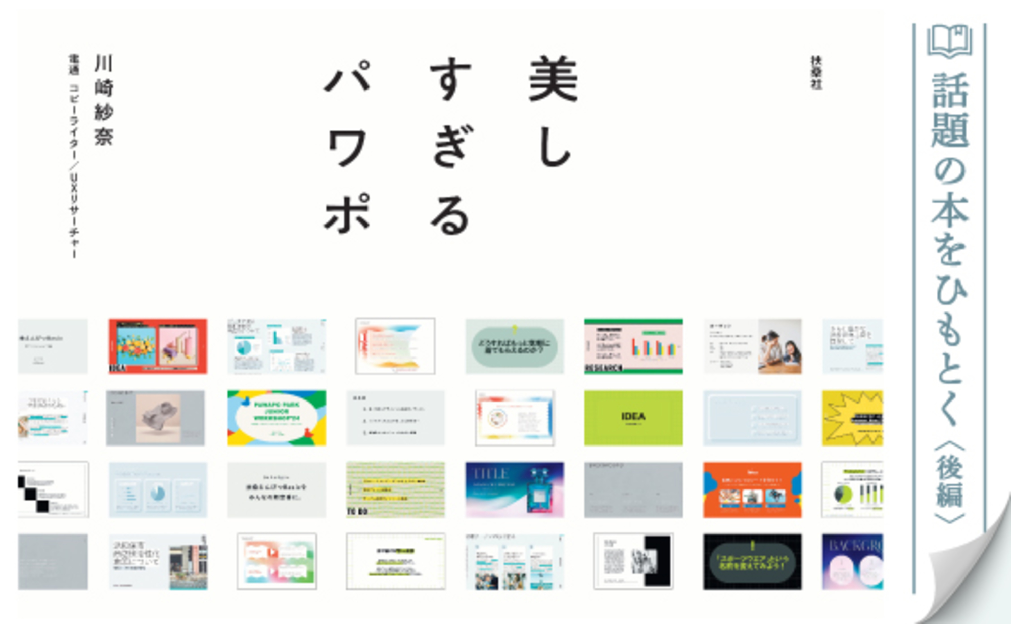
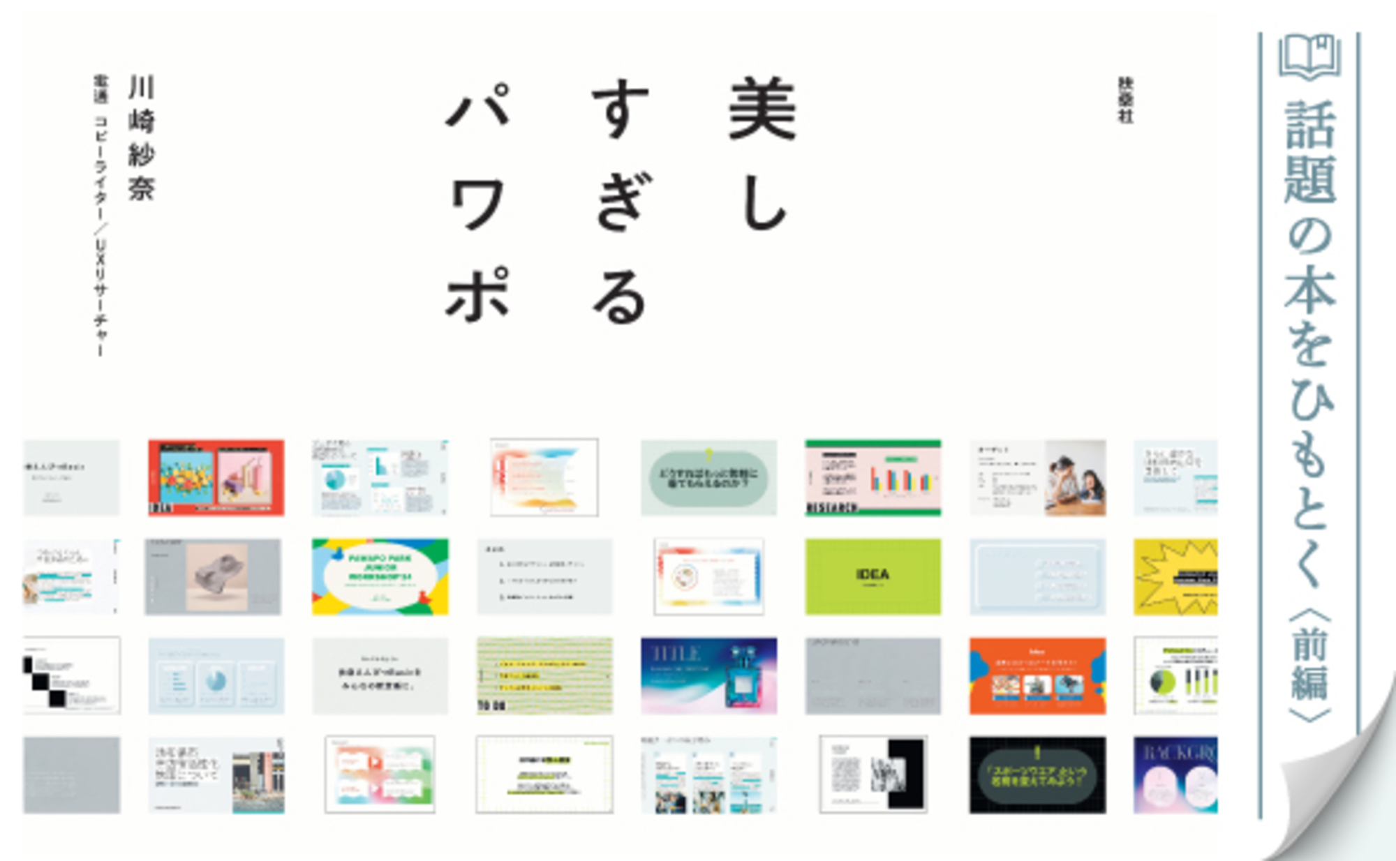
Art Directors Make Your Work Beautiful Too: "PowerPoint That's Too Beautiful" (Part 1)
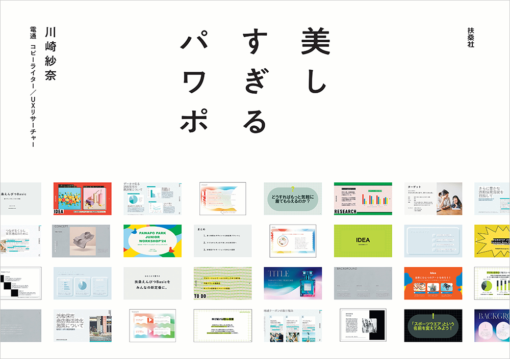
A book titled "PowerPoint That's Too Beautiful " (Fusosha), featuring template designs created by ten active art directors from Dentsu Inc., is generating buzz. How did this book, which stands apart from the many PowerPoint books already in the world, come to be? What insights and skills of the art directors are packed within it?
This article interviews Sana Kawasaki, the Dentsu Inc. copywriter who conceived the book, and Shinya Inoue, the Dentsu Inc. art director who designed the templates. What emerged was the power of design—not merely creating beautiful templates, but holding the potential to beautify the way users work and think.


Are you spending too much time formatting your materials?
──First, could you tell us about the background behind publishing "PowerPoint That's Too Beautiful"?
Kawasaki: It originated as a project born from the relationship between Fusosha Publishing and Dentsu Inc. If I had to name it, I'd call it the "Let's Create a Bestseller Project." We solicited ideas within my division, Creative Planning Division 1, intending to actually publish the best ones. We received many submissions. The idea ultimately selected was the one later published as "The Beautiful PowerPoint."
As an aside, I was completely stuck for ideas at the time and ended up hitting the deadline without any solution. What's more, I was swamped with work that day... When I got home later than usual, it suddenly hit me: "There's just not enough time to think of ideas. Could it be that formatting materials takes too long? What if there were pre-designed PowerPoint templates you could just fill in? For example, templates designed by Dentsu Inc.'s art directors..." In that instant, the idea sparked, and I rushed to write up a proposal and submit it.
I later learned that a reader survey on PowerPoint conducted by the magazine "Weekly SPA!" (Fusosha) had also received many complaints like "I cram too much text in" and "It doesn't look polished." While this project was born from my personal grumbling, it made me realize there are many people out there with similar frustrations.
Before actually publishing the book, we released four prototype templates as a test marketing effort in a feature article in SPA! magazine. The unexpectedly strong reader response pushed us toward book publication, and it was released this August.
A book that leverages the skills of Dentsu Inc.
──Tell us about the concept behind "PowerPoint That's Too Beautiful."
Kawasaki: The most important thing was to make it incredibly simple, usable the very day you buy it. As a consumer myself, I often buy PowerPoint design books, but most are textbook-like, explaining layout tips and such. You have to actually work through the book yourself to learn the techniques—otherwise, you're not getting anywhere. Even knowing that, it's hard to find the time to read an entire book cover-to-cover and practice... Right? I often just buy them and feel satisfied (laughs).
"Beautiful PowerPoint" is fundamentally different from those textbook-style technique guides. This book showcases PowerPoint templates meticulously designed down to the last detail by ten art directors using their full range of skills. Buyers can download these templates for free. Once downloaded, it's like filling in a Drill Inc. – just complete the text boxes. You can easily get beautiful PowerPoint presentations.
──Was it decided from the start to feature Dentsu Inc. art directors?
Kawasaki: Yes. Since the project began as a collaboration between Fusosha and Dentsu Inc., I felt it wouldn't make sense unless it leveraged skills unique to Dentsu Inc. Dentsu Inc.'s greatest strength is undoubtedly its people. I thought it would be ideal to use the "book" as a medium to give back to society the skills possessed by Dentsu Inc.'s art directors. So, I approached ten Dentsu Inc. art directors, starting with Mr. Inoue.
──What were your thoughts when approached about this project, Inoue?
Inoue: When I heard the concept, I really connected with it. I often use PowerPoint for meetings and presentations myself, and there are always moments where I need to adjust things like character spacing or line spacing. I always felt that time spent on that was wasted. I'd much rather spend my time on the visual design of the actual advertising proposal than on the presentation materials. So, I had a strong feeling this book would definitely meet a need.
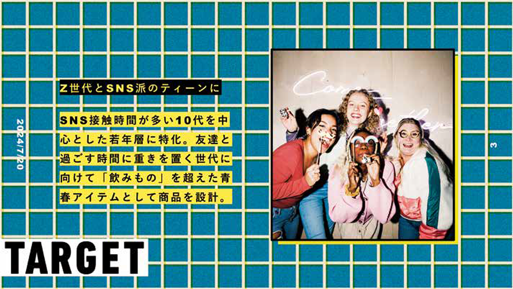
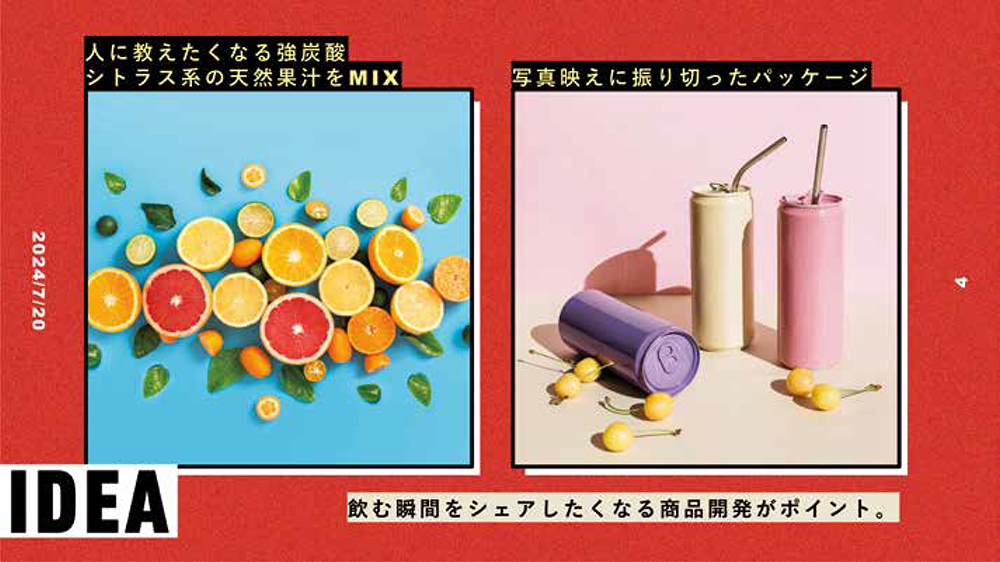
──What kind of templates did you handle for "PowerPoint That's Too Beautiful"?
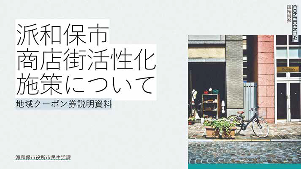
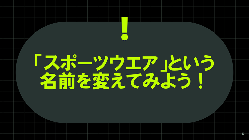
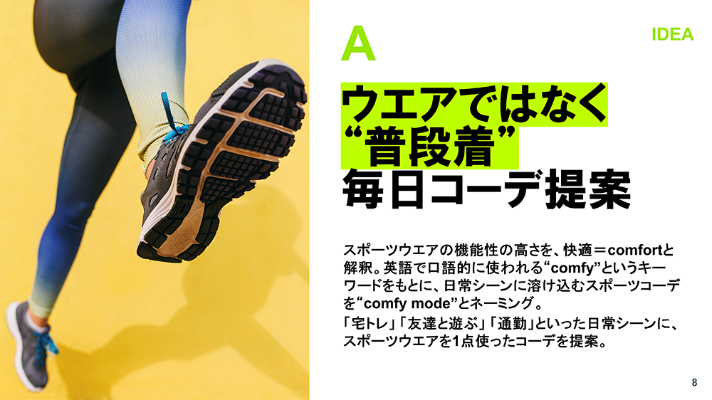
Inoue: I handled the template that ensures readability even when text volume increases significantly. It's designed for scenarios like materials used in municipal briefings, where you inevitably need to fit a lot of text onto a single slide.
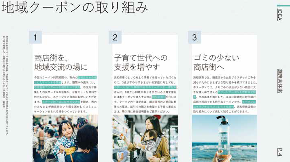
Kawasaki: When dealing with large amounts of text, people often try to cram all the information onto a slide by listing text densely. But doing that makes the key points unclear and creates a hard-to-read impression. In the template Inoue-san designed, he consciously considered the flow of the viewer's eyes. He varied font sizes based on the importance of the information and added appropriate white space. This creates a completely different impression even with the same amount of text and reduces stress for the reader.
Inoue: While many might associate design with decoration, the real priority is establishing a hierarchy for information. The more text there is, the more crucial it becomes to clearly define what's primary and what's secondary, otherwise it becomes chaotic. That's why I made the main heading extremely large, the subheading medium-sized, and the body text quite small. Furthermore, I aimed for a smart-looking template by incorporating techniques that minimize the feeling of text pressure.
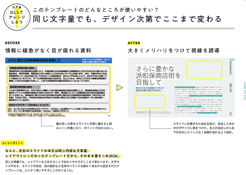
──From the user's perspective, it might not only save time but also naturally organize the hierarchy of information in your mind as you fill in the template.
Inoue: That could very well be the case.
Kawasaki: I'd be thrilled if readers of this book gained not just "beautiful PowerPoint," but also "beautiful ways of working."
10 Themes and 10 Art Directors
──What other templates are included?
Kawasaki: "PowerPoint That's Too Beautiful" offers a total of 10 different templates. Each template is designed around a theme addressing common PowerPoint user concerns or specific purposes. For these 10 themes, we engaged 10 art directors, carefully selected based on their strengths and signature styles. In other words, each template has one theme and is designed by one art director. Readers can choose their preferred template from the 10 available based on what kind of presentation they want to deliver in their daily work and what impression they wish to leave on their audience.
Let's explain a few of them.
First is the template designed under the theme "For a bold, powerful, and confident presentation." Visually, it features a restrained color palette, with key messages presented boldly and prominently, creating a solid impression. While PowerPoint materials with large, bold text can easily appear clumsy if not executed well, this template showcases the art director's skill in avoiding that pitfall.
At the opposite end of the spectrum is the template that "gently accompanies, leaving a calm impression." Every corner of the motifs is designed with rounded edges. Rather than aggressively asserting itself, it exudes softness and tranquility, allowing even first-time audiences to listen without wariness, feeling at ease.
Next is the "Bright, Fun, and Playful Pop" template. While it's common to use the same background pattern on every slide, this template changes the background colors and patterns entirely. It's carefully designed so that combining various backgrounds throughout the slide sequence doesn't disrupt the overall cohesion, creating a pop and fun impression.
Other distinctive templates include one that "attacks from the right brain to build a worldview" and an "ethical PowerPoint that creates vivid materials using less ink," designed to save ink when printed.
──What's innovative is how it goes beyond simply "making things look beautiful." It strategically considers what impression to leave on the audience, what worldview to create, and even ventures into the realm of ethical consumption, as seen in the ink-saving approach.
(Continued in Part 2)
PowerPoint That's Too Beautiful (Fusosha)
【Author】
Kawasaki Sana (Copywriter/UX Researcher, Dentsu Inc.)
[Template Design]
Kanako Ichimori (Art Director, Dentsu Inc.)
Asuka Tada (Dentsu Inc. Art Director)
Riko Ishizaki (Dentsu Inc. Art Director)
Hiroyuki Kato (Dentsu Inc. Art Director / Graphic Designer)
Shinya Inoue (Dentsu Inc. Art Director)
Emi Kubota (Art Director, Dentsu Inc.)
Midori Manda (Art Director, Dentsu Inc.)
Yoshimori Taisuke (Dentsu Inc. Designer / Art Director)
Yoshiki Harada (Dentsu Inc., Art Director)
Yu Hirata (Dentsu Inc. Art Director / Painter)
【Production Support】
Nobuaki Hattori (Dentsu Inc., Creative Planning Division 1)
Keisuke Okuno (Dentsu Inc., Creative Planning Division 1)
Koji Miyanaga (Dentsu Inc. Publishing Bureau)
Tomoko Shima (Bless You Inc.)
Naoki Mitsuzumi, Masashi Sugiyama (J.C. Spark)
【Design】
Mitsunobu Hosoyamada, Satoshi Senbon (Hosoyamada Design Office)
【Editing】
Shinnosuke Kudo (Fusosha Publishing)

Was this article helpful?
Share this article
Newsletter registration is here
We select and publish important news every day
For inquiries about this article
Author

Kawasaki Sana
Dentsu Inc.
Creative Planning Division 1
Copywriter / UX Researcher
As a copywriter, I handle creative production for domestic and international companies, from concept development to final output. Major awards include the Asahi Advertising Award / Jury Prize, ACC Gold Award, Busan International Advertising Festival YOUNG STARS / BRONZE, and Japan Tourism Poster Contest / Inbound Award.

Shinya Inoue
Dentsu Inc.
Creative Planning Division 1
Art Director
Centered on art direction driven by visual concepts, I focus on brand-oriented art direction for graphic advertising, commercials, VI (visual identity), and character design—ensuring companies and products are cherished for the long term. Major awards include the Asahi Advertising Award, Yomiuri Advertising Grand Prize, ADFEST, and the Dentsu Advertising Award.