Note: This website was automatically translated, so some terms or nuances may not be completely accurate.
Art Directors Make Even Your Work Style Beautiful: "PowerPoint That's Too Beautiful" (Part 2)
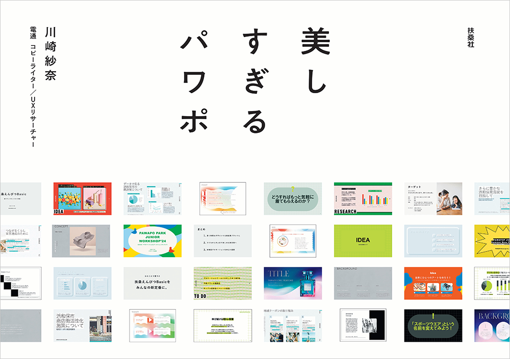
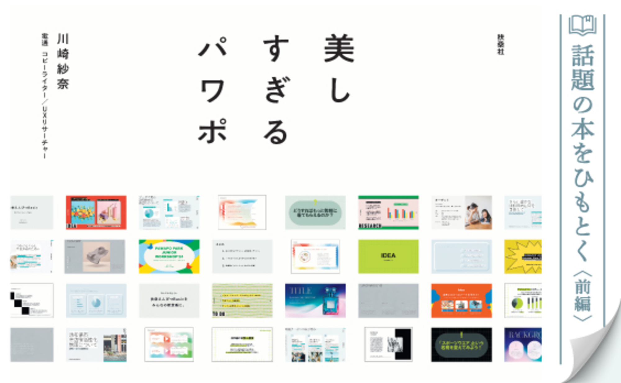
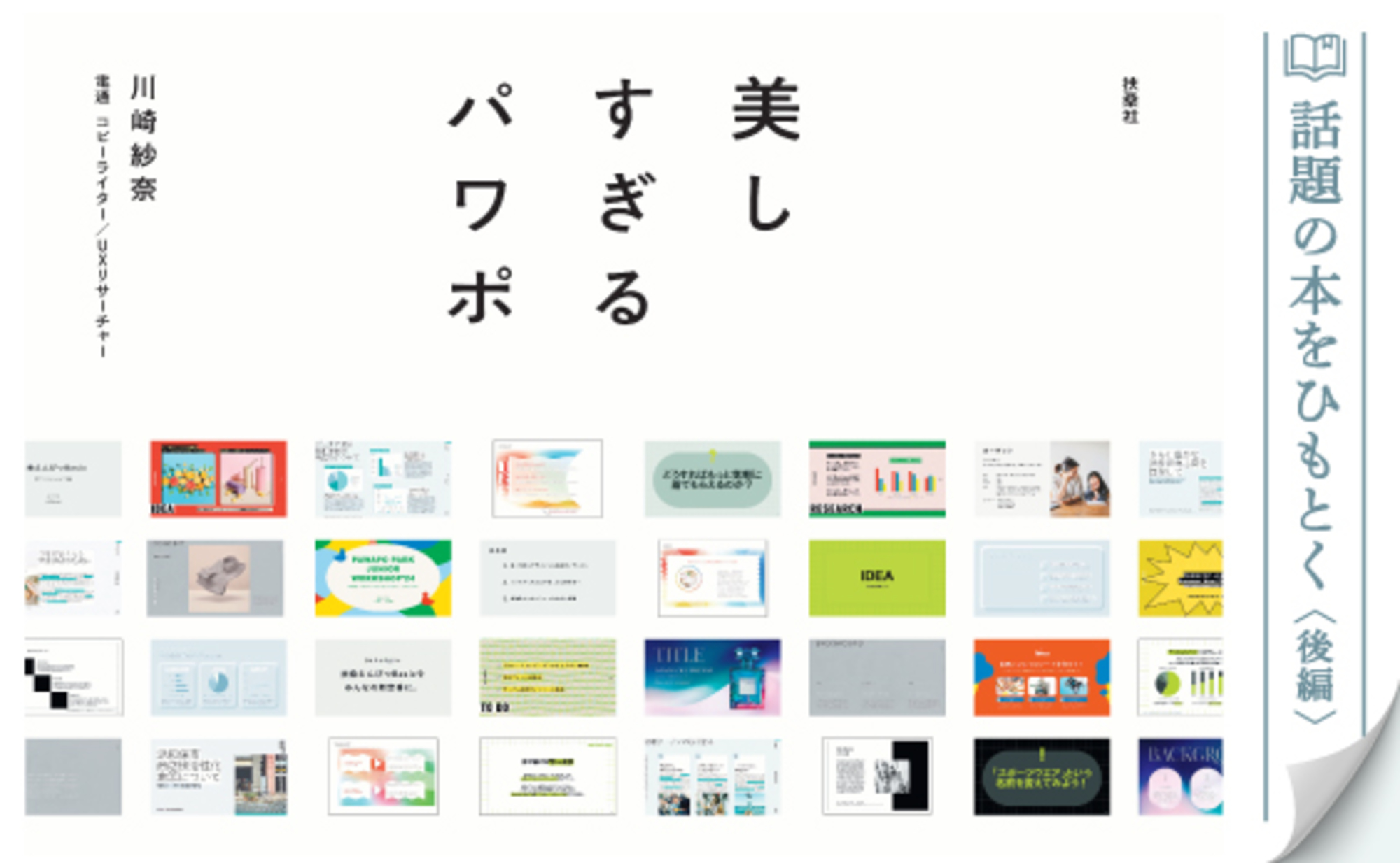
The book "Beautiful PowerPoint Templates" (Fusosha), featuring template designs by ten active art directors from Dentsu Inc., is generating buzz. Part 1 of this article introduced the book's concept, which sets it apart from the many PowerPoint books available, and the insights and techniques of the art directors embedded within it.
Continuing from Part 1, Part 2 features interviews with Sana Kawasaki, the Dentsu Inc. copywriter who planned the book, and Shinya Inoue, the Dentsu Inc. art director responsible for the template designs. What aspects did the art directors focus on during the design process? What is the significance of spreading the design skills possessed by art directors beyond the world of advertising and into society at large?


The difference from advertising design is "where you put down your brush."
──In "PowerPoint That's Too Beautiful," ten art directors each designed their assigned templates. Was there any cross-communication among the art directors?
Kawasaki: The basic approach was to propose to each of the 10, "Given your style, how about this theme?" Once agreement was reached, they focused on their own work. However, producing a book takes a lot of time, so we divided it into phases and held "progress review meetings" where everyone gathered to share their current status. For me, this timing allowed me to get an overview of all ten templates. For example, if I saw many gray-toned templates side-by-side, I'd ask for adjustments to avoid color overlap.
──Inoue-san, after designing these templates, did you feel any difference compared to designing advertisements? Were there any challenges unique to template design?
Inoue: In terms of designing according to a given theme or purpose, template design and advertising design are the same. However, I felt the finishing approach differs significantly between the two. In advertising design, the copy is already finalized. You typeset it and perform meticulous finishing work, adjusting character spacing and line spacing down to the millimeter.
In template design, however, the user ultimately inputs text to complete the slide. Naturally, the art director ends up designing using dummy text. Yet, the more you refine the design using dummy text, the more it paradoxically loses its versatility. Even if the design looks beautiful with dummy text, the moment a user inputs text with a different word count, the balance can break, potentially ruining the aesthetic. So, it wasn't about "where to stop," but rather anticipating various scenarios and knowing when to halt the refinement.
Additionally, PowerPoint isn't necessarily designed with design-first principles in mind, so it lacks the precision for text adjustments compared to software like Adobe Illustrator. The work was demanding, involving constant trial and error. Still, exploring it led to discoveries like "Wow, PowerPoint can do this too," yielding insights unattainable in routine tasks.
──Could you share any points you were particularly particular about while designing the templates?
Inoue: As mentioned earlier, the amount of text is determined by the user, which is beyond our control. Precisely because of that, I focused on "strictly specifying every aspect we could control."
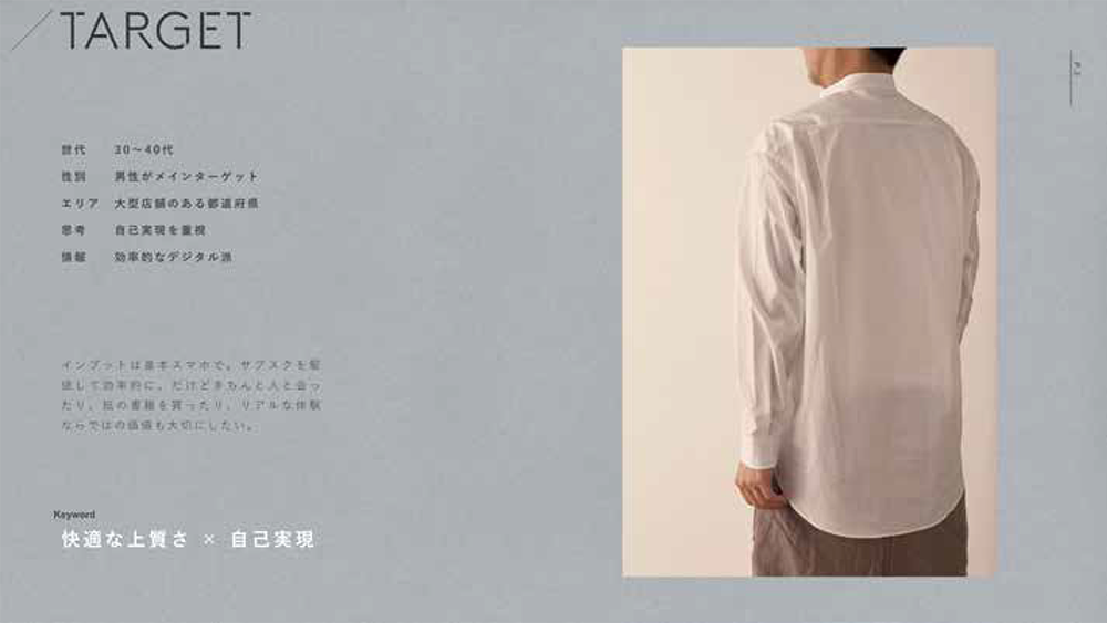
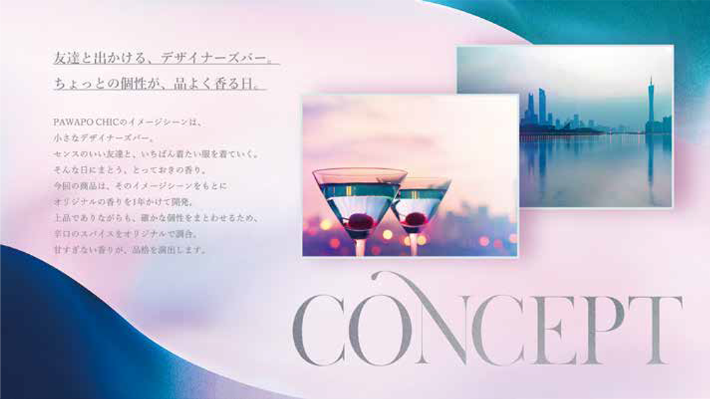
A clear example is layout. We can pre-determine where headings and body text are placed on the slide. After testing, for instance, in this template (see below), we placed a large heading in the top-left corner of the slide, balanced by substantial body text in the bottom-right corner. This creates space in the top-right to maintain balance. As long as users input text within the recommended character count, the slide's "center of gravity" stays near the center, maintaining visual stability.
Kawasaki: The recommended character counts Mr. Inoue just mentioned are displayed as guides within each template's text boxes. For example, this headline can be one line, that headline can be up to three lines, and this body text can be up to 500 characters. Users simply download the template and input text while adhering to the recommended character counts displayed in the text boxes. This is one feature designed to be as simple as possible for users, and I believe they'll be impressed when they use it.
Inoue: It really makes good use of PowerPoint's native functionality, doesn't it? The guides appear when the cursor isn't positioned over the text box and disappear when it is.
Books are the creator's inquiry to society
──In an era where "people are turning away from books" and "reading is declining" are often pointed out, what has been rewarding about actually creating a book? Also, what potential do you see in the medium of books?
Kawasaki: Actually making a book reaffirmed how functionally superior physical books are. This book has a landscape format, so when working on a computer, you can spread out the page you want to see on your desk or lap. Flipping back and forth between pages is still faster with a physical book than with an e-book, I think. It might seem trivial, but I don't think you can overlook that functionality of books.
Books also excel in durability. While e-books can be stored digitally, if it's a book I want to keep for ten years, I'd prefer to own it in physical form rather than as data. Opinions might differ on this point, though.
Inoue: Holding the finished book in my hands, I felt that making it a physical book actually increased its persuasiveness. By taking the form of a book, readers likely feel a stronger sense of the creator's statement, or a question posed to society. In that sense, I feel books are still a medium with a strong presence.
Kawasaki: While this project started with the goal of "creating a book that sells," one reason Fusosha believed it "might sell" was that its approach to readers fundamentally differs from previous PowerPoint books. "Beautiful PowerPoint" isn't a book for honing design techniques; it's a book that saves you the effort of designing. If you could spend the time you used to spend formatting materials on other things, it might even change how you work.
Combining a "paper" book with the purchaser-exclusive "digital" templates might also set it apart from conventional books. The rise of e-books and the diversification of digital content have expanded consumers' choices. While "paper" and "digital" are indeed competitors, with the right ideas, combining them could create synergistic effects.
I want to spread the skills of art directors throughout society
──What significance and potential do you see in Dentsu Inc. art directors working outside the realm of advertising?
Kawasaki: Art directors at Dentsu Inc. typically use PowerPoint to create materials, but they don't design with it. There are plenty of other software programs better suited for design. However, when publishing a book—especially one destined for bookstores nationwide—I thought it made sense for art directors to apply their design skills using PowerPoint, a tool accessible to many people, rather than software used only by a select few designers.
Dentsu Inc. art directors mostly handle corporate advertising projects. That's "to B," or business-to-business. Meanwhile, a book like this one, accessible to the general public, is "to C," or business-to-consumer. Personally, I want the knowledge and skills possessed by art directors and other Dentsu Inc. employees to benefit not just the business world, but society at large. If this book can be one answer to the question of how we can spread the expertise and skills of art directors beyond the confines of advertising, I would be delighted.
──Finally, let me ask again: What is the appeal of "PowerPoint That's Too Beautiful"?
Kawasaki: While designing the templates, I got a barrage of questions from ten art directors. "If we tweak this feature, we should be able to set more graph colors..." "You should be able to create color palettes within PowerPoint itself..." and so on. It's precisely because these design professionals, the art directors, took the time to understand PowerPoint and gave it their all that we were able to properly finish this book.
"Beautiful PowerPoint" advertises itself as "No sense or technique required—just download." While that's a huge benefit for readers, I believe the real charm of this book lies in the passion and skill of the art directors who made it possible.
Inoue: Ultimately, there's no single "correct" way to design PowerPoint templates. The ten diverse templates for each theme are the result of ten art directors leveraging their individual strengths to pursue both functional and emotional beauty. I believe the book's appeal lies in showing readers what PowerPoint can achieve and the variety of approaches possible.
PowerPoint That's Too Beautiful (Fusosha)
【Author】
Kawasaki Sana (Copywriter/UX Researcher, Dentsu Inc.)
[Template Design]
Kanako Ichimori (Art Director, Dentsu Inc.)
Asuka Tada (Art Director, Dentsu Inc.)
Riko Ishizaki (Dentsu Inc. Art Director)
Hiroyuki Kato (Dentsu Inc. Art Director / Graphic Designer)
Shinya Inoue (Dentsu Inc., Art Director)
Emi Kubota (Dentsu Inc., Art Director)
Midori Manda (Art Director, Dentsu Inc.)
Yoshimori Taisuke (Dentsu Inc. Designer / Art Director)
Yoshiki Harada (Dentsu Inc., Art Director)
Yu Hirata (Dentsu Inc. Art Director / Painter)
【Production Support】
Nobuaki Hattori (Dentsu Inc., Creative Planning Division 1)
Keisuke Okuno (Dentsu Inc., Creative Planning Division 1)
Koji Miyanaga (Dentsu Inc. Publishing Bureau)
Tomoko Shima (Bless You Inc.)
Naoki Mitsuzui, Masashi Sugiyama (J.C. Spark)
【Design】
Mitsunobu Hosoyamada, Satoshi Senbon (Hosoyamada Design Office)
【Editing】
Shinnosuke Kudo (Fusosha Publishing)

Was this article helpful?
Share this article
Newsletter registration is here
We select and publish important news every day
For inquiries about this article
Back Numbers
Author

Kawasaki Sana
Dentsu Inc.
Creative Planning Division 1
Copywriter / UX Researcher
As a copywriter, I handle creative production for domestic and international companies, from concept development to final output. Major awards include the Asahi Advertising Award / Jury Prize, ACC Gold Award, Busan International Advertising Festival YOUNG STARS / BRONZE, and Japan Tourism Poster Contest / Inbound Award.

Shinya Inoue
Dentsu Inc.
Creative Planning Division 1
Art Director
Centered on art direction driven by visual concepts, I focus on brand-oriented art direction for graphic advertising, commercials, VI (visual identity), and character design—ensuring companies and products are cherished for the long term. Major awards include the Asahi Advertising Award, Yomiuri Advertising Grand Prize, ADFEST, and the Dentsu Advertising Award.