It's been a while since our last post. This time, I'd like to discuss "Usability Regarding Owned Media."
"Usability" is a tricky term to handle
If you're involved in web-related work, including owned media, you've surely heard the term "usability" at least once. It's commonly translated as "ease of use" or "user-friendliness."
However, not everyone shares the same definition or interpretation. I believe usability is one of those tricky terms where the scope it refers to varies significantly from person to person.
This column won't attempt the grand task of defining it. If you're interested, searching for "usability history" or "usability definition" will lead you to many fascinating articles where you can deepen your understanding.
This time, I'll share my personal thoughts on usability in a conversational style, drawing from my experiences across various projects.
To understand usability intuitively
The web is fundamentally an active medium. Especially for owned media—the media owned by companies and organizations—most users visit with some active purpose. And users cannot achieve their goals without "operating" based on some form of "understanding." It may sound cliché, but ensuring "quick comprehension" and "comfortable operation" is the very essence of usability for owned media.
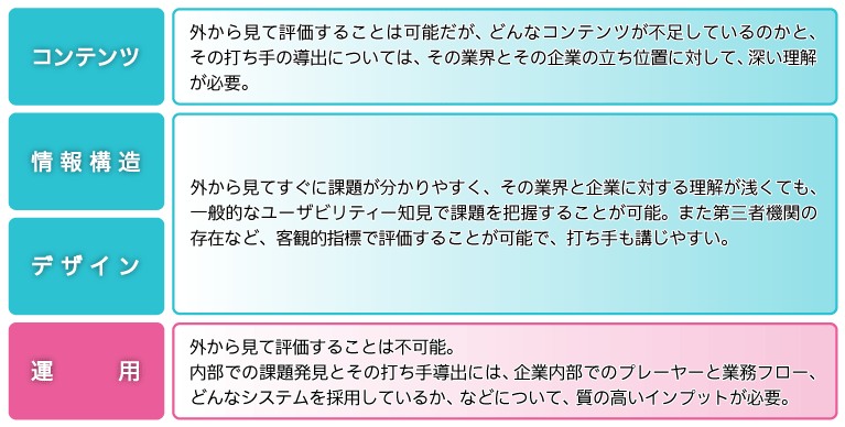
Systematically understanding usability is challenging. While many books exist on the subject, the more you read, the more you'll be struck by its depth. That said, finding the time to delve deeply is often difficult in practice. Therefore, to quickly grasp the key points of web usability, examining sites against established criteria is a useful approach. For example, Tribeck Strategy, our business partner, offers a usability diagnostic program based on 5 evaluation axes and 96 criteria, and annually publishes a usability ranking of corporate websites. Thoroughly familiarizing yourself with such detailed criteria and extensively testing sites ranked highly is a fast track to learning usability.
Even without launching a major project, knowing these standards allows you to systematically address each issue one by one, which is excellent practice. Paradoxically, while implementing these symptomatic fixes, you'll also gain insight into the difficulty of maintaining high usability across an entire site. This process helps you intuitively understand that major overhauls (redesigns) are sometimes necessary to ensure high-level usability, and what operational points become critical during the next redesign. In this sense, such improvements are invaluable.
Usability is a means. But it's "truly important."
Corporate site renewals often set goals like "Rank within the top ●● usability rankings!"
However, while usability is a crucial element, it is by no means a panacea. As I wrote previously, users visit seeking the company's "original content." They do not come to experience the company's usability. "What needs to be communicated" is the primary goal, and usability exists to make that communication "easier to understand." This priority is vital.
That said, experience clearly shows usability is "truly important." While this contradicts what I stated earlier, it's also true that even the highest-quality content can't deliver half its value if usability is poor. In fact, there are numerous examples where projects focused solely on improving usability without re-editing content achieved not only the top rankings mentioned earlier, but also increases in the key performance indicators they truly pursued (such as conversion rates) and enhanced brand value.
What's the difference from "accessibility"?
Incidentally, the term "accessibility" also exists. This is often translated as "ease of access." Accessibility is frequently used interchangeably with usability. It's better to think of "accessibility" as "usability for people with disabilities." In other words, when considered as a set, accessibility is a concept encompassed within usability. For more detailed information on accessibility, you should refer to the Web Accessibility Infrastructure Committee.
Two Points That Complicate Usability Discussions
In the web world, usability has been a subject of debate since its early days. This remains true today. I believe the following two points make discussions about web usability complex (this is not meant negatively):
- Web usability varies based on each user's individual literacy. For example, vehicles like cars require training to operate, but once trained, users' literacy levels are largely the same. Those who have received training can discuss usability from a unified perspective. However, the web presents significant differences in literacy depending on which sites users encounter, making it difficult to discuss usability from a unified viewpoint.
- The web offers high freedom (perhaps too much) when designing interfaces. While you could theoretically create any interface for the car example, deviating from the standard would be pointless since all users have received the same training. On the other hand, because web literacy varies, the standards set by creators also differ from site to site. It's hard to even define where the boundary of deviation lies. Even if consensus is reached, it cannot be denied that new possibilities in interface design may lie within that "deviation."
What these two points imply is the "potential for debate to expand endlessly." This is also the reason for the "difficulty" mentioned earlier.
The usability of an unusual interface cannot be judged as good or bad until at least a prototype is created. Working with clients, I've noticed that perceptions of what makes an interface easy to use vary astonishingly from person to person. And every opinion seems to have its own validity. In such cases, two approaches are effective for synthesizing opinions—perhaps unsurprisingly: ① identifying best practices and actually experiencing them, and ② deepening discussions about the intended main users and their goals.
Experiencing sites with excellent usability often helps align opinions. People simply can't comment on things they haven't experienced, so it's crucial to first create a shared experience among the discussion members.
Another aspect often overlooked in discussions is "the intended main users and their goals." For example, the optimal interface and usability vary depending on the user's purpose. This could be a visually-focused design to attract casual visitors, or a text-based list format to quickly guide users with clear search-based goals to the information they need. Whether considering the entire site or individual pages, keeping the main users and their goals in mind undoubtedly leads to improved usability. After all, ease of use means ease of use "for achieving their goals."
Is pragmatism necessary for "company content on external sites"?
Owned media is precisely "the company's own media." As mentioned earlier, its usability can be approached with a unified perspective, building company standards and approaching the ideal with sufficient time and effort. However, real-world projects sometimes require compromises. This applies to "external sites hosting the company's content."
E-commerce and card payment services are prime examples. There are cases where you must redirect users to another site to purchase your products or integrate systems. In such instances, you may have to disregard the standards you've carefully discussed and established.
Even so, users may still perceive these "third-party sites hosting your company's content" as part of your company's owned media experience. While it's frustrating because there's often little you can do, it's crucial to face this reality of user experience. If surveys reveal significant dissatisfaction in such cases, it's worth considering improvements within your capabilities.
This time, I've written about various aspects of usability based on experiences from different projects. Next time, I'll try writing about something a bit different. Until next time.