Note: This website was automatically translated, so some terms or nuances may not be completely accurate.
 A Few Things I Know About Owned Media [4/4]
Multi-Device Compatibility for Owned Media
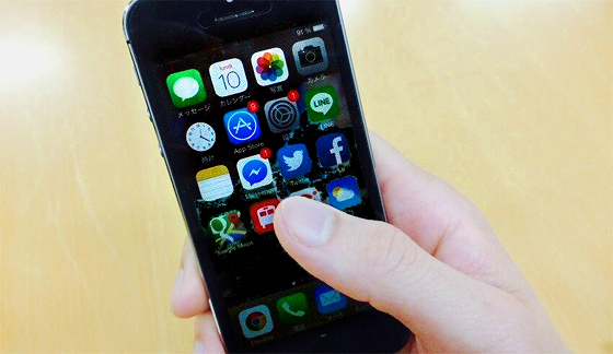
Hello. It's been quite a while since my last update, but this time I'd like to write about multi-device compatibility for owned media.
I imagine there are many of you reading this: some already implementing multi-device support, others thinking "I really need to start now." Whether or not to implement multi-device support depends heavily on your site's target users and its nature. For example, if you run a corporate site for a pure B2B company, and your logs show smartphone or tablet access rates are only a few percent, it might not be an urgent priority yet. However, even for such companies, this topic will eventually become an issue, so I hope you'll read on.
First: Avoiding Dual Maintenance
When considering multi-device support, the operational challenge inevitably arises first. Specifically, the desire is to avoid the duplication of operations that comes with creating dedicated mobile pages alongside desktop pages.
This is a natural concern given resource constraints, so we'll proceed under the assumption of avoiding dual operations.
Furthermore, considering site power factors like traffic volume, having a single URL is preferable. Taking these conditions into account, the main approaches become "Full Responsive Design" and "Converters".
First, full responsiveness. Simply put, this technology determines the optimal display based on screen size, not by detecting the device type. It adapts based on screen size, not individual device types. Since it uses one source, operations aren't duplicated, and there are no extra running costs. However, the design work is typically more complex, and testing tends to require more effort. Furthermore, as will be discussed later, it often targets desktop computers as the primary device. Consequently, common issues include images, image-based text, organizational charts, and tables becoming difficult to view on smartphones.
A converter is a tool that transforms a desktop site into a mobile site. It's a good option if you need mobile compatibility quickly, but the quality of the mobile site heavily depends on the original desktop site's quality. There's also a monthly fee for using the converter. Furthermore, depending on the tool, the URLs might change between the desktop and mobile sites.
Which should be the target device: desktop or mobile?
And a common issue with both approaches is that these methods "don't necessarily provide the optimal experience on the device the user is actually using." Even when aiming for multi-device compatibility, since operation is based on a single source, setting (or assuming) a target device is necessary to create that single source. Historically, that target device has almost always been the desktop computer. This means that if you design for desktop optimization, even if you implement full responsiveness, the design philosophy will inevitably be influenced by desktop considerations.
The choice of target device depends on the scope of the owned media. For instance, if a site integrates everything—corporate content and e-commerce—it might see a lower percentage of mobile access compared to a site focused solely on e-commerce. Consequently, the target device becomes the desktop, and mobile usability gets pulled in that direction.
Recently, those who have become aware of this issue have started implementing responsive design with smartphones as the target device. Industries like telecommunications are one example. Even among manufacturers, products like household goods that are checked using smartphones in front of supermarket shelves have seen mobile access ratios on brand sites reach around 70%, creating momentum for mobile-first design.
A potential issue with designing for mobile first is that, due to the reduced number of elements, the site can feel sparse compared to the desktop version users are accustomed to. This is precisely where web designers' skills shine. It's crucial to advance the mobile design while considering how to effectively utilize white space, skillfully employ grid lines, and ultimately achieve a design that functions well on desktop.
A New Problem
We've discussed the dilemma of choosing a target device to provide the best possible experience across devices while avoiding duplicate maintenance. However, an even more perplexing problem has emerged over the past year: adapting for large-screen smartphones.
Smartphones are steadily moving towards larger screens. While further significant enlargement seems unlikely, the proportion of access from large-screen smartphones will undoubtedly increase over the next few years. Simply applying the existing smartphone user experience to large-screen smartphones is likely to cause problems.
When designing for smartphones, we typically assume one-handed use with thumb-based operation. However, on large-screen smartphones, the areas out of reach for the thumb increase. Specifically, when holding the phone in your right hand, your finger often can't reach the left edge. Similarly, if you use the home button as a reference point, the top portion of the screen becomes increasingly out of reach. This is expected to significantly impact the design of common elements used across the entire site, such as navigation and menus. These elements are often placed in high-impact areas like the top of the screen or one of the sides, rather than within the standard content area.
Furthermore, left-handed users are expected to face even greater difficulties than before. While interfaces have predominantly been optimized for the majority of right-handed users, left-handed users have likely encountered usability challenges even now. However, they could generally manage because their thumbs could reach more of the screen. When targeting right-handed users on large-screen smartphones, how to prevent significant usability issues for left-handed users will likely become a future challenge. It might sound far-fetched, but we might even see sites emerge that let users choose interfaces based on their dominant hand (lol).
Until next time.
Was this article helpful?
Share this article
Newsletter registration is here
We select and publish important news every day
For inquiries about this article
Back Numbers

Author

Kazuki Fukuyama
Dentsu Digital Inc.
Owned Media Division
Group Manager
Joined Dentsu Inc. in 1999. After joining, worked in the creative department on advertising production. Later, worked in the sales department handling the automotive, apparel, and entertainment industries. Assumed current position in 2009. Has worked on large-scale projects ranging from thousands to tens of thousands of pages across industries including energy, transportation, telecommunications, pharmaceuticals/medical devices, food, finance, entertainment, and universities. <Co-authored> Owned Media Communication: 21 Rules for Success (Softbank Creative/2012)
