Note: This website was automatically translated, so some terms or nuances may not be completely accurate.
Spikes Asia: Introducing Dentsu Group's GOLD Award-Winning Works
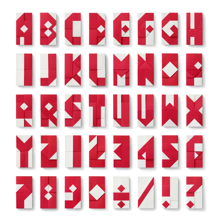
Two GOLD awards in the Design category: Ministry of Finance's "International Monetary Fund/World Bank Annual Meetings"
The International Monetary Fund and World Bank Annual Meetings were held in Japan for the second time since 1964. Half a century later, Japan's decision to bid again to host the meetings stemmed from a desire to achieve a "new beginning" once more. Dentsu Inc. provided communication consulting services for these meetings.
The assembly logo incorporated characters created using "origata" – a traditional Japanese paper-folding technique used for decorative paper wrappings like noshi. This font system was circulated as the foundational design infrastructure for the entire assembly. The origata wrapping method involves folding the paper's left and right edges together while leaving the top and bottom open. This wrapping symbolizes guiding two opposites—heaven and earth—toward fusion, embodying how even the thoughts and feelings of nations that sometimes stand in opposition can ultimately come together as one. This design concept earned high praise from the international jury.
Film Category GOLD, Murata Kampo's Baika Gofuku-gan "Batting Center"
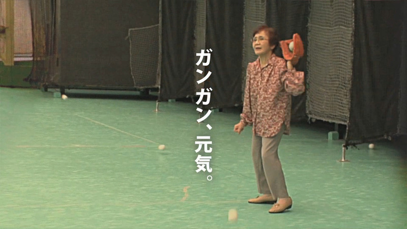
Murata Kampo is a company that provides traditional Chinese medicine on a subscription basis. They requested a TV commercial with enough impact to serve as a door opener for sales. When I received the order, it was right after the Great East Japan Earthquake, so I wanted to create a commercial that would lift Japan's spirits (make people laugh). I searched for the most energetic people in Japan. But there was no budget. We couldn't afford trendy celebrities. But this is Kansai. Look around, and you'll find annoying amounts of energetic aunties everywhere. This time, we were saved by their pushy (brash) energy. Perhaps what earned us recognition at Spikes was this kind of low-budget, gritty determination. No money? But want to do something interesting? Feel free to contact us anytime. We'll dig deep and create all sorts of things.
Media Category GOLD, Freshness's Classic Burger "Liberation Seat"
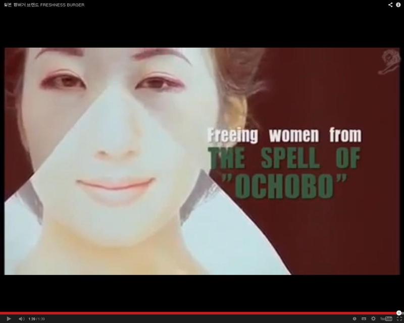
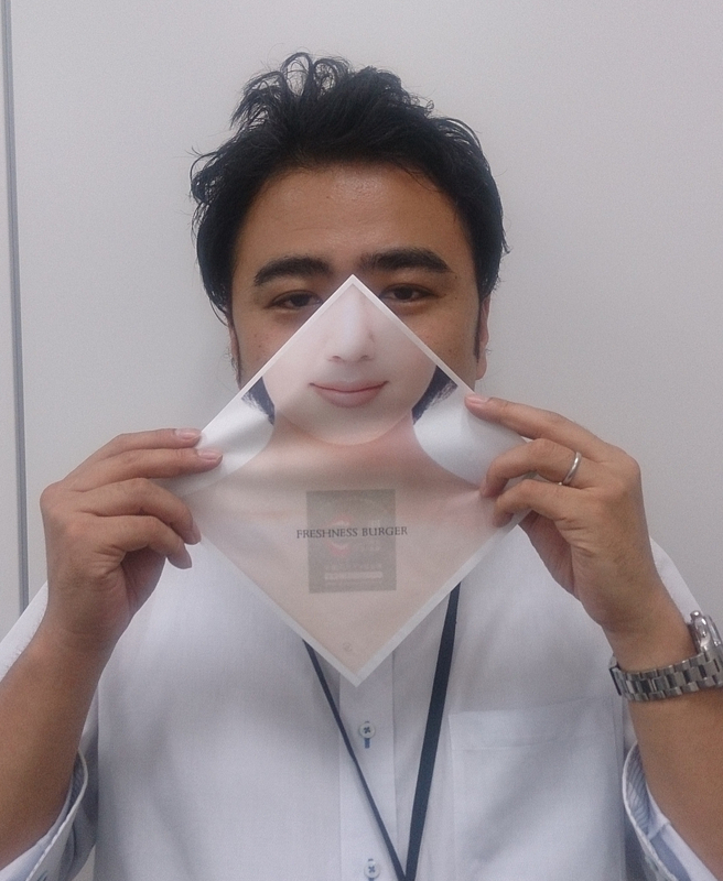
The "BE NATURE! (Be True to Your Desires)" campaign launched in November 2012 featured TV commercials, web dramas, and the in-store experience tool "Liberation Sheet." The burger wrapper features a woman's composed face printed on it. This tool allows users to take big bites of their burger without worrying about others seeing them. To appeal to the main target audience of women for the flagship Classic Burger featuring a thick patty, we observed Japanese women. The key insight was that women often cover their mouths with their hands when laughing, yawning, or eating. The campaign tapped into this psychology, creating a tool that lets women take big bites without worrying about others watching. While the cost was low, the team was most pleased that the pure creativity of the idea was recognized.
Print & Poster Craft Category Gold: Staedtler Japan's "The Ultimate Pencil Old Man"
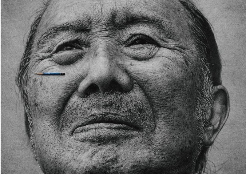
We're delighted to have won in the Print Craft category. Since drawing itself is the product's nature, I believe the key to winning was the closeness between the expression and the product. Thank you to everyone who supported us.
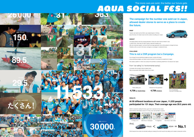
PR Division Gold: Toyota Motor Corporation's Aqua "AQUA SOCIAL FES!!"
Was this article helpful?
Share this article