Note: This website was automatically translated, so some terms or nuances may not be completely accurate.
Why Does Design Move People? ~ Considering the Power of Design Through "Advertising" (Part 1)

Yoshihiro Yagi
Dentsu Inc.
ADVERTISING STUDIES
——At the 2015 AdFest, Honda's corporate branding "Honda. Beautiful Engines.", created by Mr. Yagi, won multiple awards including the top prize Grande in the Design/Booklet category. It also won Bronze in the Design/Flyers category at the "Iron Mind One Show 2013" exhibition organized by the Ad Museum Tokyo, operated by our foundation.Furthermore, in the Outdoor/Poster category, the Print Craft/Photography category, and the Print Craft/Best Use of Photo category, JR East Japan's "Get Back, Tohoku." won Bronze in all three, achieving multiple awards. Congratulations on this truly remarkable achievement (Editor's note: same applies below).
Yagi: I never imagined I would receive such a grand prize. When I was participating as a judge for the One Show, I was truly nervous and tense right there, wondering whether JR East Japan's "Get Back, Tohoku." would win or not.
——This issue of "AD STUDIES" features "What Lies Beyond Marketing" as its theme. Design, encompassing not just advertising communication but also products, represents the direct point of contact with consumers. From this perspective, we're interested in the process by which designers envision what lies beyond marketing and create tangible forms based on that vision.
Design thinking is likely intuitive, and for researchers and marketers, it's an area that's difficult to analyze or verbalize. I wonder if we can somehow verbalize it to identify themes that could become subjects for research. I see this as a challenge, but could you share a glimpse into your creative process, Mr. Yagi?
First, could you tell us about the "Get Back, Tohoku." campaign—its origins and the thought process behind it?
Yagi: "Get Back, Tohoku." started in 2011, so this year marks its fifth anniversary. Before that, there was actually a campaign called "MY FIRST AOMORI." This was a campaign for the opening of the Tokyo-Shin-Aomori line, aiming to introduce people to the lesser-known charm and beauty of Aomori. Right after this campaign, just as we were gearing up for the next phase, the 3.11 earthquake and tsunami struck.For a while, the Shinkansen was suspended, and the region suffered immense damage. Amidst the tense atmosphere where we felt powerless, our team and the client discussed, "Is there anything we can do right now?" We concluded that the greatest support we could offer for recovery was for us to go to Tohoku. That's how we launched the declaration "Get Back, Tohoku." and the campaign began.
Using transportation like bullet trains and local trains as motifs to convey Tohoku's appeal
——This is a poster that truly showcases the design.
——This is truly a poster that conveys the message through design.
Yagi: When we first started, the atmosphere was so subdued that doing something ordinary wouldn't have caught anyone's attention. JR campaigns usually feature beautiful landscapes or food, but given the mood at the time, that kind of imagery wouldn't have grabbed people's attention. So we aimed for something bold and visually striking to wake everyone up.
We used three colors as a metaphor for the Tohoku Shinkansen, designing it to convey the image of the Shinkansen's spirit spreading throughout society. We created a design system so that even if the Shinkansen visual itself wasn't present, its presence could be felt across the series of posters. Pop, energetic, rock... That was the mood.We wanted people to feel that JR East was finally getting serious. I think the Shinkansen is like a kind of hero. The image of the Shinkansen shouting "Get Back, Tohoku." felt incredibly reliable. We developed the design concept using that image of the Shinkansen and its sense of speed as motifs.
Initial reactions were mixed—honestly, opinions were divided. We got a lot of responses from Tohoku saying, "It really energized us," but some people in Tokyo commented, "Isn't this a bit over the top?" Still, I felt we needed to go that far to make an impact.
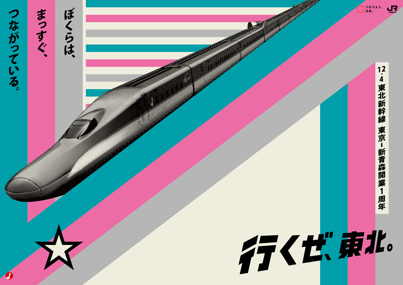
Top: 2011 campaign poster Bottom: 2014 campaign poster
——What factors led to this campaign, which faced such mixed reactions, becoming a long-running one?
Yagi: It ended after the first year, but it's interesting that it continued after that. Within that, there's a strong sense that it was created while communicating with society, or rather, that we were creating it together. So the expression kept changing too. Initially, it was graphical expression, but from the second year, as the Shinkansen and stations were restored, we tried concepts like sending postcards depicting the current scenery of Tohoku to Tokyo. We also tried designs incorporating elements of tourism, like food and hot springs.From the third year onward, we shifted focus to highlighting the railway journey itself, regardless of destination. In that sense, while cherishing the rallying cry "Get Back, Tohoku.", the expressions have quite a range. For us, continuing it like "Let's go to Kyoto!" holds meaning, so we strive each year to avoid becoming formulaic.
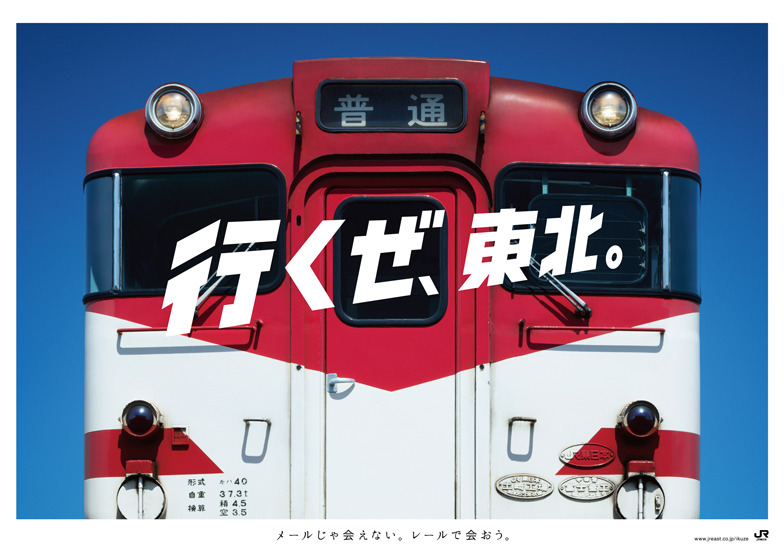
For the most recent series, we featured the trains themselves, using close-up shots of the rolling stock to create highly graphic posters. It felt like a straight shot right down the middle.
We had the chance to shoot at a maintenance depot where they repair and inspect the trains. Seeing the depot staff pour such care into each car made me realize how much we miss out by riding them without knowing that. The Kiha 40 series running on lines like the Hachinohe Line, nicknamed the "Red Oni," has these metal protrusions on the front that look like the horns of a red demon – kind of cute, actually. I really like that kind of character.While bullet trains always get the cool spotlight, I hoped this series would show new railfans that "local lines are incredibly charming too."
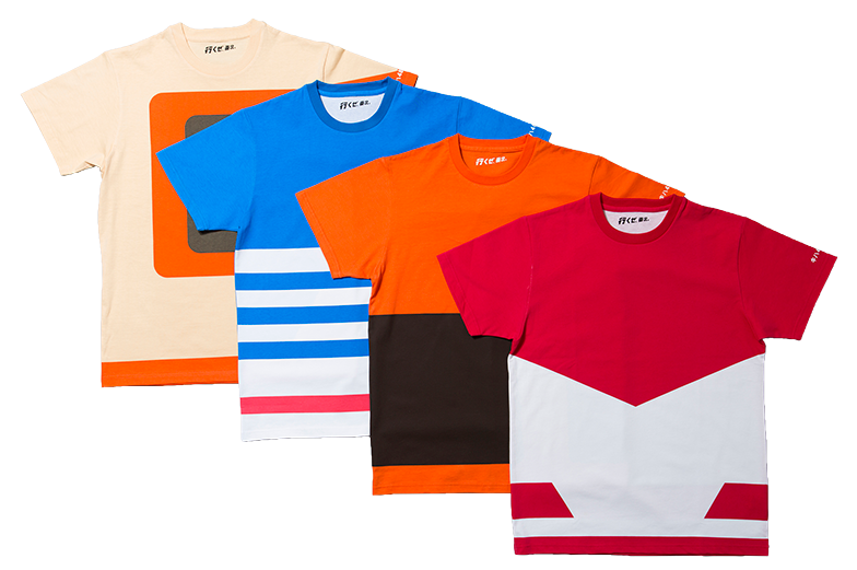
Incidentally, the T-shirts you could win in the contest were the novelty items. I thought this also captured the inherent value of local lines, and they seemed to be quite popular.
——Like "Let's Go to Kyoto," destination campaigns usually try to convey the atmosphere of the destination. But this one aimed to express the essence of the railway itself.
Yagi: After the earthquake, there was a widespread "Let's support Tohoku" sentiment among companies. But as recovery progressed and more information became available, expressions naturally evolved. There should be multiple reasons to visit Tohoku. Food and beautiful scenery are one reason, but isn't traveling by train itself appealing? By focusing on the transportation itself, like we did this time, and highlighting how wonderful it is, I believe we can continually deliver fresh impressions.
But the core mindset behind "Get Back, Tohoku." hasn't fundamentally changed. Through these campaigns, we've gradually gained fans who eagerly anticipate each seasonal campaign's scenery. That's why we can't let them down. Yet, precisely because of that, I feel a bit of pressure to deliver unexpected expressions – to "betray" expectations in a good way.Since "Get Back, Tohoku." has become firmly established among everyone, we try to think of communications that cleverly leverage that. This time, making a train car the main visual was also aimed at surprising people precisely because they'd think, "They wouldn't do that for 'Get Back, Tohoku.'" It's more thrilling that way.
It's like a puzzle where I combine the client's brief with my own wild ideas.
——Yagi-san, I'd like to ask a bit about the process you go through to arrive at the final design.
Yagi: People often assume designers just think intuitively, but we actually start from marketing concepts quite often. As we develop the design from there, we consider whether the ideas we've been nurturing might fit well with the marketing concept.I always want to surprise the world. I constantly have these wild ideas—like, wouldn't people be moved by something like this? Or wouldn't this create new value? I have tons of these fantasies, unrelated to work. I have a whole drawer full of them. Then, when a client gives me a challenge, alongside deepening my research and thinking around the issue, I pull fantasies from that drawer. I try them on the challenge, thinking, "This will definitely work well here." It feels like solving a puzzle.
I believe that combination of puzzle pieces is what "design" truly is. It's like a miraculous invention. Often, these inventions happen by chance. I suspect if you try to think things through in a linear, step-by-step way, you won't arrive at an "invention." It feels like it takes those accidental encounters, those flashes of insight, those wild fantasies and leaps of imagination – only then does something truly new emerge.
——What process leads you to that final "This is it!" feeling or idea?
Yagi: That's the happiest time for a designer. Even when a design is finished, there's often still this lingering feeling that it's not ready to be released. It's about whether it logically holds together or not.Even if the expression is complete, there's often a feeling that something doesn't quite fit or is missing when measured against the client's purpose or the challenge at hand. It's during that period of wrestling with it that finding a single "word" often makes everything click into place. It's a bit hard to explain, but it's like finding the "necessity" for the client or the world. Finding that "word that proves the necessity" is what brings closure, provides an explanation, and finally gives birth to that feeling.
We art directors aren't just doing design; surprisingly, we're searching for the words that define and give meaning to the design itself. I think we devote a significant amount of effort to that. Finding that one word can make everything feel resolved.
When there are words that define "Why must we do this now, in this era?" or "Why is this expression necessary in today's world?", and when the visual makes sense alongside those words, that's when I get the feeling, "This is okay." Artists create art, craft, or even fantasies, but we might be the mediators connecting those to marketing philosophies and corporate management principles.You could say our role is to make business and management more artistic, to make them visible and accessible to people.
*The full text is available on the Hideo Yoshida Memorial Foundation website.
Was this article helpful?
Share this article
Newsletter registration is here
We select and publish important news every day
For inquiries about this article
Author
Yoshihiro Yagi
Dentsu Inc.
CDC
Creative Director / Art Director
Born in Kyoto in 1977. Develops diverse creative work, including corporate and product branding and advertising campaigns, through nonverbal visual communication. Major works include JR East Japan's "Get Back, Tohoku.", HONDA's "Human! FIT", Ezaki Glico's "Pocky THE GIFT", and Menicon's "Magic-1 day Menicon Flat Pack". Numerous awards include Cannes Design Lions Grand Prix, One Show Best in Design, D&AD Yellow Pencil ×6, Tokyo ADC Award, JAGDA New Artist Award, ACC Grand Prix, and the Keizo Saji Award. Member of Tokyo Art Directors Club. Visiting Professor, Kyoto University of the Arts.
ADVERTISING STUDIES
Hideo Yoshida Memorial Foundation
<a href="http://www.yhmf.jp/index.html" target="_blank"><span style="color:#336699">http://www.yhmf.jp/index.html</span></a><br/> The Hideo Yoshida Memorial Foundation publishes the research and public relations journal "AD STUDIES" four times a year. Each issue features special topics on advertising, communication, and marketing. Back issues from the inaugural edition to the latest issue are available on our foundation's homepage.