Note: This website was automatically translated, so some terms or nuances may not be completely accurate.
Why Does Design Move People? —Considering the Power of Design Through "Advertising" (Part 2)

Yoshihiro Yagi
Dentsu Inc.
ADVERTISING STUDIES
The potential of design to transcend words
——For the corporate branding "Honda. Beautiful Engines." that won the top prize at this year's AdFest, how did you come up with that concept?
Yagi: "Honda. Beautiful Engines." began at the 28th São Paulo Motor Show and is a corporate branding initiative leveraging motor shows held worldwide. Motor shows attract journalists from around the world who take the information back to their countries and write articles about it. I thought that was actually a huge opportunity. In Japan, Honda has an image of being energetic, a bit mischievous, and youthful, but that doesn't really translate globally. The idea was to try communicating that through motor shows.
Honda supplies engines not only for motorcycles and automobiles, but also for products like lawnmowers and outboard motors, and recently even for jet engines. Discovering that Honda is the "world's largest engine manufacturer" sparked the idea that we could do something using "engines" as a motif.From the perspective that engines power vehicles, and those vehicles drive society and history, we created the copy "Engines make the world go round." By transforming greasy engines into colorful, pop motion graphics, we expressed Honda's unique perspective on engine development.
Engines often evoke masculine, sweaty, oil-covered images—think displacement, gear ratios, and such. But what if, for example, a girl put an engine inside a teddy bear and it started moving? Wouldn't that be fun? This idea emerged from the thought that if we could create a world where such dreams are possible, Honda's world could expand even further. We thought people would be amazed if such an engine world came to life.

Left: Campaign poster Right: Brand book
——That crystallized into the expression "Honda. Beautiful Engines." This film contains no words whatsoever, composed solely of visuals and music. By expressing it through design like this, I felt it possessed a universality beyond words and allowed imagination to expand.
Yagi: While I work in Japan, I also handle many global projects—cases where Japanese products are launched overseas. Design possesses a universality that transcends words. That's why I feel design holds even greater potential than language does.
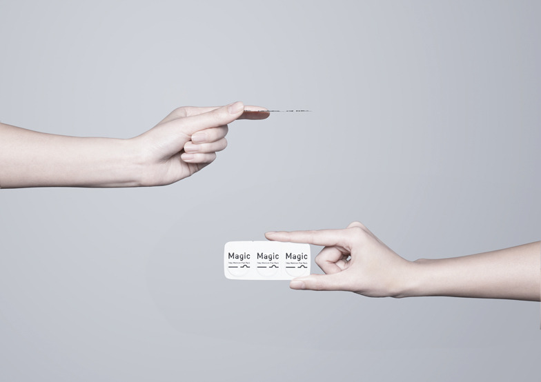
——Could you also tell us about Menicon's Magic product?
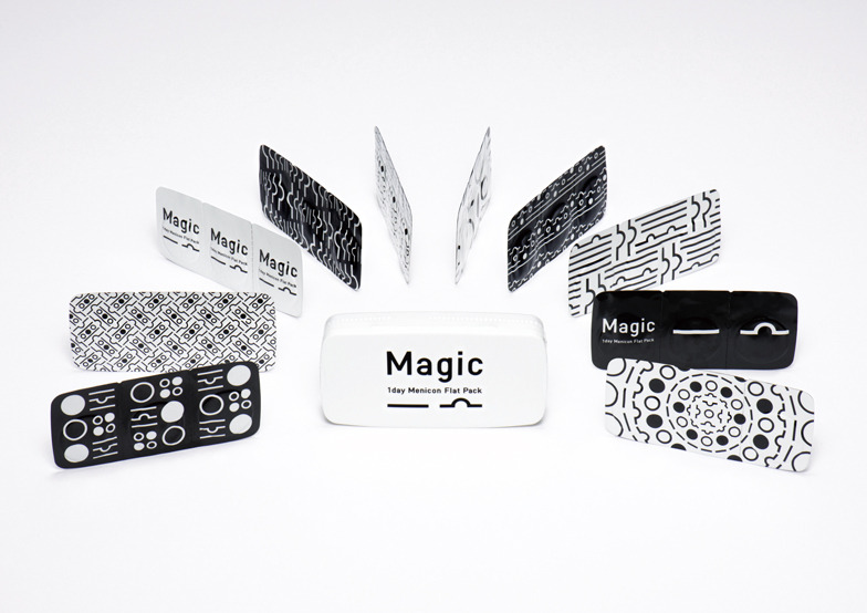
Yagi: Menicon's Magic is a disposable contact lens. Its packaging is about 1mm thick. Although the design was already finalized at the client briefing stage, we started from that proposal. In this case, the 1mm packaging is the defining feature, so it's tempting to focus solely on expressing that. However, we felt that users don't necessarily have any particular complaints about existing contact lenses, and that thinness might not be the core value we should be communicating right now.
This contact lens is packaged with the convex side facing up. Regular disposable lenses are stored in a pool-shaped container with solution, making it tricky to tell which side is up when you take them out.This one, however, eliminates the pool-like structure due to its thinness, making it possible to position the convex side up. This means you don't need to touch the inner surface of the lens, which is more hygienic. It also changes the way you put the lens on. With this, you can insert it immediately. We felt this was the key point that makes it a completely different kind of contact lens.
From there, we developed the concept and rolled out all tools—starting with the package design—through consistent communication. Even though it was a demanding decision for the client, achieving it as a united team was a truly rewarding experience.
Manufacturers, especially engineers, speak passionately about their products. But while overcoming numerous complex technical challenges, their focus sometimes drifts from the core purpose. That's why, upon reevaluation, you sometimes think, "Wait, what?" In that sense, I sometimes feel my job is to use design to realign the strategy back to its fundamental purpose.
Take JR trains, for example. The train itself has an inherent charm, and the same goes for Honda engines. When you develop concepts and designs rooted in that fundamental essence, the output naturally becomes compelling.
Also, while contact lenses are medical devices, making it difficult to change where they're sold, imagine if they were, say, candy. Products that were only available at convenience stores or supermarkets before could start being sold at variety stores or select shops. I believe design holds that kind of potential – the ability to even change the market itself.
Top: Product Branding Bottom: Packaging Design
Transforming the inherent appeal into tangible form through design and conveying it.
—What does "essential nature" mean to you, Mr. Yagi?
Yagi: I believe every company and product has an essential role to play in society and the functions necessary to fulfill that role. If you focus on the wrong function, you lose sight of the necessity and fail to communicate anything to people. It's not just about being beautiful; what matters is whether it aligns with its inherent necessity. That's why I design by imagining that essential role and function. It's about verifying whether it makes logical sense.
I often feel that within manufacturers, the fundamental question of "What does this company provide to society?" or "Why is this product necessary in the world?" is surprisingly overlooked during development. Rediscovering and sharing that understanding makes projects progress incredibly smoothly. It's not just about shaping it into design; it needs to be articulated in conversations with clients. Explaining the finished design—that's probably where I spend the most time.
——When speaking with those involved in design, I often feel they offer remarkably precise, spot-on observations about the fundamental aspects of things or contradictions in strategy. Is there a unique perspective inherent to designers?
Yagi: It's a bit difficult to generalize, but I think it largely stems from designers focusing on the "form" that ultimately becomes the point of contact with consumers. Perhaps through the act of "design" – transforming abstract concepts like "words" into tangible forms – the essence of things becomes visible, or contradictions are noticed.
——Ultimately, I believe what matters most is "communicating effectively with consumers" and "moving their hearts." What do you think is necessary to achieve that?
Yagi: It's about being genuinely moved yourself before releasing it to the world, before showing it to the client. If you're moved, it's likely others will be too. But that requires keeping your own sensibilities neutral—maintaining the ability to be moved by ordinary things as an average person. On top of that, you need to logically connect your own vision of "this would be nice" or "this would be cool" without forcing it.
I believe humans share universal sensibilities, and those fundamental feelings remain constant. But relying solely on that would bore people and lead to fatigue. That's why, whether it's "Get Back, Tohoku." Honda, or Menicon, I aim for unexpected paths and outputs. To achieve that, I consciously strive to be moved by the feelings and opinions of various people, my own personal memories, fantasies, and even marketing data.
——Listening to you, I sensed that the essence of design lies in applying the serendipity of ideas to the necessity of strategy. It's about transforming abstract words into concrete forms. Your phrase "like solving a puzzle" was particularly striking. That image itself feels very sculptural.Rather than a simple dichotomy of intuition versus logic, I believe that skillfully merging this kind of geometric image of "solving a puzzle" with the mindset of marketers and researchers who solve equations could open up new horizons for elucidating the effectiveness of creativity and content. Thank you for your valuable insights.
[End]
*The full text is available on the Hideo Yoshida Memorial Foundation website.
Was this article helpful?
Share this article
Newsletter registration is here
We select and publish important news every day
For inquiries about this article
Author
Yoshihiro Yagi
Dentsu Inc.
CDC
Creative Director / Art Director
Born in Kyoto in 1977. Develops diverse creative work, including corporate and product branding and advertising campaigns, through nonverbal visual communication. Major works include JR East Japan's "Get Back, Tohoku.", HONDA's "Human! FIT", Ezaki Glico's "Pocky THE GIFT", and Menicon's "Magic-1 day Menicon Flat Pack". Numerous awards include Cannes Design Lions Grand Prix, One Show Best in Design, D&AD Yellow Pencil ×6, Tokyo ADC Award, JAGDA New Artist Award, ACC Grand Prix, and the Keizo Saji Award. Member of Tokyo Art Directors Club. Visiting Professor, Kyoto University of the Arts.
ADVERTISING STUDIES
Hideo Yoshida Memorial Foundation
<a href="http://www.yhmf.jp/index.html" target="_blank"><span style="color:#336699">http://www.yhmf.jp/index.html</span></a><br/> The Hideo Yoshida Memorial Foundation publishes the research and public relations journal "AD STUDIES" four times a year. Each issue features special topics on advertising, communication, and marketing. Back issues from the inaugural edition to the latest issue are available on our foundation's homepage.