Note: This website was automatically translated, so some terms or nuances may not be completely accurate.
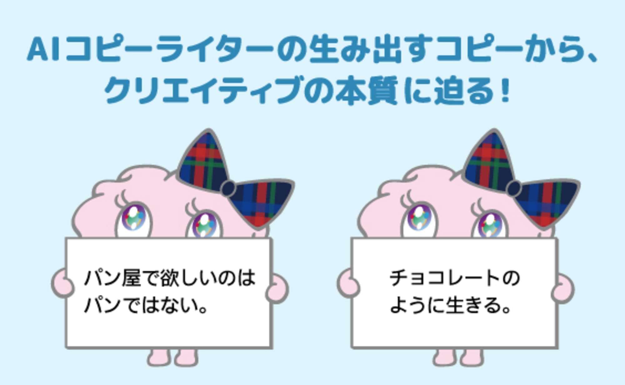
Isn't advertising without words kind of boring? (Part 2)
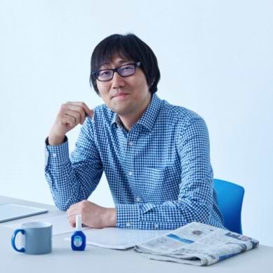
Shinichi Fukusato
OneSky Co., Ltd.
Akihiro Fukube
catch Inc.
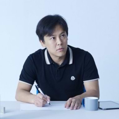
Koichi Kosugi
Hakuhodo Inc.

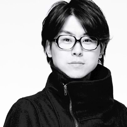
Nagaaki Onoe
Dentsu Inc.
Dentsu Inc. Design Talk hosted an event commemorating the Tokyo Copywriters Club's publication of the 'Copy Yearbook 2016'. Akihiro Fukube of catch is a copywriter behind hit campaigns like Otsuka Pharmaceutical's Calorie Mate "Show them your true strength." Koichi Kosugi from Hakuhodo is an art director known for buzzworthy campaigns like Shiseido featuring Lady Gaga, and he also handled the art direction for the 'Copy Yearbook 2016'. Representing Dentsu Inc. was Nagaaki Onoe, whose work on Nissin Foods' "10-Minute Donbei" and the "Kochikame 40th Anniversary & End Campaign" generated significant buzz, earning him last year's TCC Newcomer Award. Hosting the event was Shinichi Fukusato of One Sky, known for Suntory BOSS's "Alien Jones" series and serving as editor-in-chief of the annual. These four individuals from diverse professions discussed "the power of words."

Without words, you can't search
Fukusato: Mr. Kosugi, as an art director, how do you design the words in advertising?
Kosugi: I'm a designer, but I think about advertising in clear words. I'm afraid that if I don't put it into words and communicate it to the client, it might give the impression of being a bit of a con artist somewhere along the line. For a specific example of copy design work, I'd like to introduce the Shiseido advertisement featuring Lady Gaga.
Our team's copywriter was Takashi Nakahata. When he first submitted his copy drafts, I was surprised to see the copy printed on A3 paper, with only the text sections cut out.

Fukusato: I heard that when Mr. Nakahata was job hunting, he would paste his own copy over the copy in various newspaper ads he found, then submit them. It was to show how much better his copy was than what was actually being used. That might be a similar feeling.
Kosugi: The copy he proposed was "Be yourself. That's your beauty." When considering how to design this copy, I wanted to use a natural, past photo of Lady Gaga since we couldn't shoot her. I conveyed this to the agency. However, all the photos they submitted were highly posed shots of Gaga. So, I negotiated to see if we could use her selfies available online as-is, and we made it happen.
Furthermore, since the target audience for this campaign was young people, I wanted to break away from Shiseido's established brand image as much as possible. To achieve this, I enlarged the logo and removed the camellia mark. Before presenting the proposal to the client, I showed it to a senior colleague who got angry and said, "This is unacceptable." However, only Mr. Nakahata supported me, saying, "This is just right for today's times. Go with it."
For the Suzuki "HUSTLER" project, I designed the copy "The fun kei car is here!" to be as large as possible. I believe the size of copy in design directly reflects the "volume" of the message. Seeing this copy, I felt it instantly divided the kei car category into "fun kei cars" and "non-fun kei cars." So, to ensure that message reached everyone, I laid it out as large as possible on the screen.
Fukusato: When it comes to Hakuhodo's creative process, the image that stuck with me was art directors and copywriters endlessly arguing over whether to include copy or not. I often heard stories like the one about Takuya Onuki. Is that not the case anymore these days? Mr. Fukube, you're also from Hakuhodo, so what's your take?
Fukube: If I'm ever unsure whether to include copy, I always think it's better to include it. Even recently, when I check Twitter to gauge reactions to commercials, people are still reacting to the words. So, without words, even if someone sees the ad and gets curious, they won't know how to search for it. I think you should always include copy, with the intention of increasing hashtags.

Fukusato: That's definitely true. No copy means the ad has no name.
Without words, even the creators get bored.
Fukusato: Well, since I'm hosting today, I'll keep my part very brief.
I know context is important for conveying ad copy, and how to spread it is also crucial. But I think focusing too much on that stuff can make you overthink and get tired.
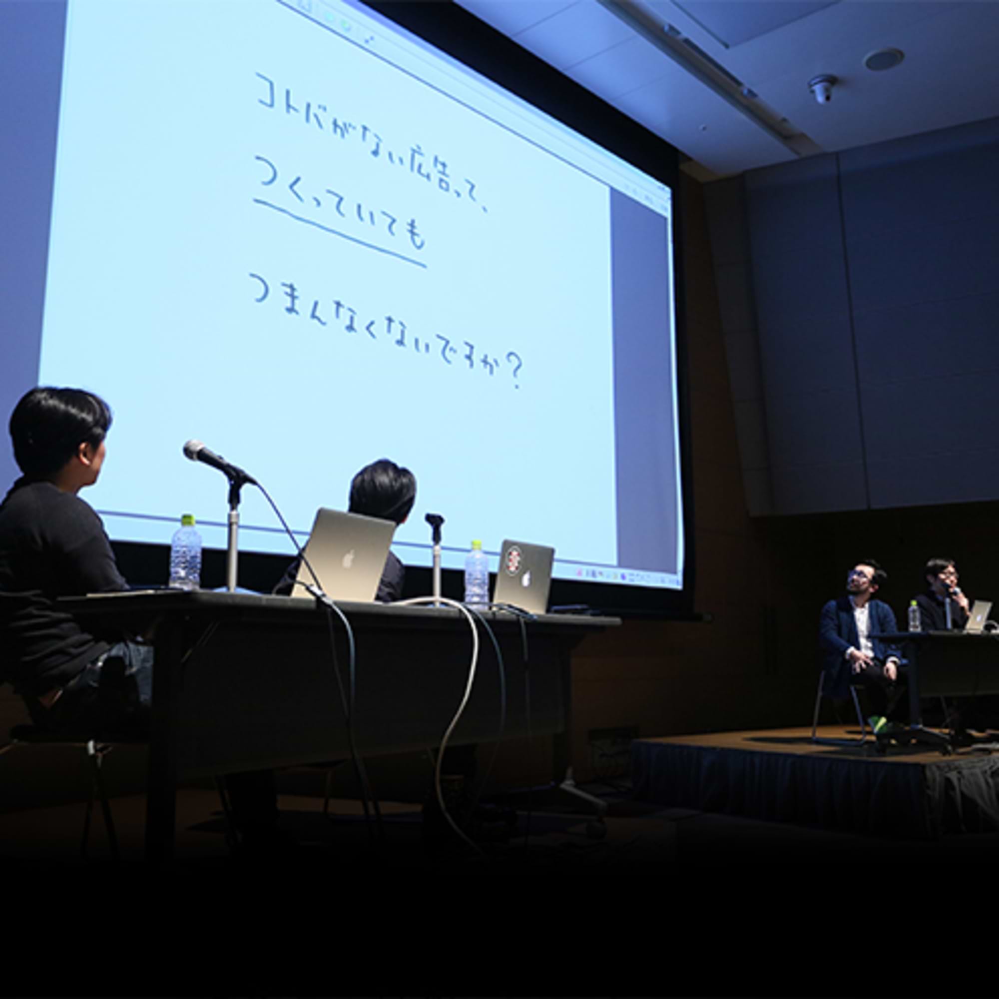
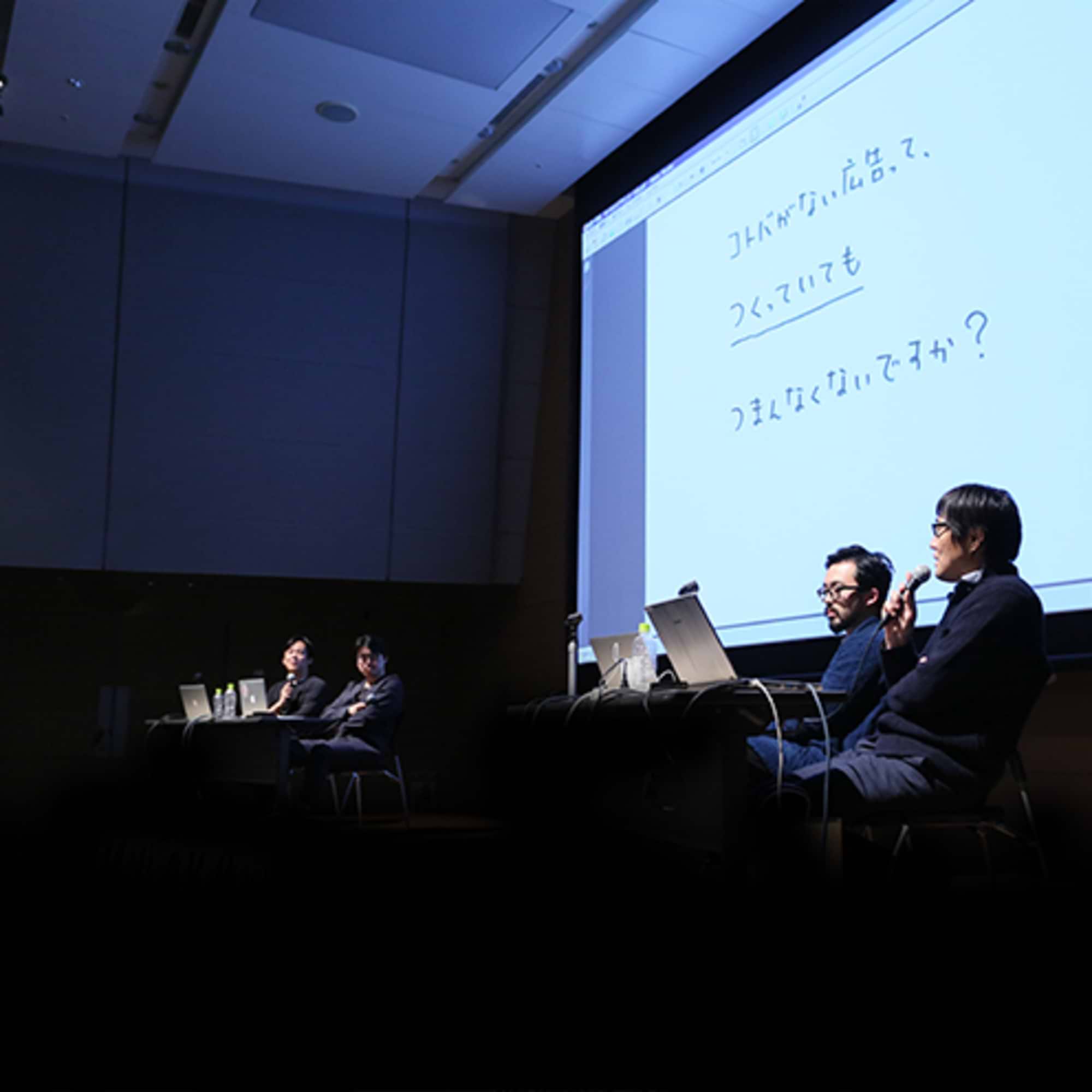
Ads without words might lack meaning for creators or just be boring. Conversely, isn't thinking about the words the most interesting part of making ads? I'd like to talk a bit from that perspective.
The alien Jones series for Suntory's "BOSS" that I've been handling entered its 12th year this April. The catchphrase "This rotten, wonderful world" is crucial as copy conveying the brand's worldview. But in terms of delivering the message in the commercial, the real challenge lies in crafting Alien Jones' monologue—that "On this planet, ~~ is ~~" part. That's what it means to create the words for a BOSS commercial. And that's what makes it fun.
After all, it's an alien speaking. As long as you start with "On this planet," almost anything goes. Even if it's not particularly profound, it sounds like it is. I hate to toot my own horn, but I think it's quite an invention.
For example, if I directly copied my own everyday thoughts like "Why do humans try so hard? It's exhausting," it became the monologue for the "Earth's Stars" edition: "The inhabitants of this planet, when they see a river, build a bridge; when they see a mountain, they dig a tunnel. They find walls for themselves and try to overcome them. Where on earth are they heading?"
Since no one's ever really praised it, I'm basically patting myself on the back now (laughs), but having this framework lets me freely share my thoughts with the world.
Since I've managed to land this job as a copywriter, I think it's perfectly fine to enjoy writing words like this more.
Fukube: I've been doing mostly commercial work lately because commercials are fun. BOSS commercials can really incorporate all kinds of things, right? What I found interesting during our pre-event talk for this talk event was when Fukusato-san stated, "I'm just circling around the eighth station of the mountain, with no intention of climbing higher."
But I think that's incredibly important too. Earlier, Onoe-san mentioned how crucial the user's perspective is on the web. In this day and age, it's easier to speak from a "lower vantage point," right? Though Jones is super "high and mighty" (laughs).
Onoe: Who is speaking about it is crucial, isn't it? Why is this person criticizing this? I feel the root of online backlash lies here.
This is inherent in media structure: TV is top-down, while the web emerged from the bottom up. So when companies communicate, I believe the crucial thing is always to adopt a "bottom-up or sideways perspective" that aligns with the audience's feelings.

Effective Use of the 'Copy Yearbook'
Fukube: Onoe-san mentioned during our meeting that tracing those 15-column ads from old Copy Yearbooks directly onto the web could make them even more interesting, right?
Onoe: When Kishi-san asked me to transcribe the yearbook, I noticed many pieces felt "digital-like." For example, there's Akiyama Akira's Canon copy: "I like things that happen just once." If we were to do something with that now, maybe we should create a camera that only takes one shot? When I looked into it, I found an app overseas that already lets you take only one photo.
Shigesato Itoi's "There is no such job as 'salaryman'." – if you actually removed the word "salaryman" from the Kojien dictionary, it would probably make the news. Things like "The Crab That Vanished" or "The Santa Fe Door Has Arrived at Toshimaen!!" would definitely be a hot topic if done exactly the same way today. What people think and feel doesn't really change that much, so in that sense, the 'Copy Yearbook' is a treasure trove of ideas. I also recommend it for digital training (laugh).
Fukube: Things that strike a chord with people are probably things someone has done in the past.
Kosugi: We have so many media outlets now, but back then they were limited. That's probably why the feelings invested in a single ad were so different. So maybe past copy encapsulates the spirit of the times and the company's intentions, expressing them in a simple way.
Fukusato: That leads us perfectly to the topic of the 'Copy Yearbook'. Essentially, owning the 'Copy Yearbook' means it remains quite useful now and will continue to be so in the future. It's definitely worth buying, even if you have to stretch a bit (laughs). Finally, Mr. Kosugi, who handled this year's Yearbook design, what are the design highlights?

Kosugi: The legendary copywriter, Kirin Kiki, appears throughout the Yearbook. She displays over 30 different expressions in response to various copy pieces, so please take a look.
Fukusato: Thank you very much for today.
<END>
You can also read the interview here on AdTae!
Planning & Production: Dentsu Live Inc. Creative Unit Creative Room 2, Aki Kanahara
Was this article helpful?
Share this article
Newsletter registration is here
We select and publish important news every day
For inquiries about this article
Back Numbers
Author
Shinichi Fukusato
OneSky Co., Ltd.
CM Planner / Copywriter
WanSky CM Planner/Copywriter. Born in Kamakura in 1968. Joined Dentsu Inc. in 1992. Affiliated with WanSky since 2001. Has planned and produced over 1,000 TV commercials to date. Major works include: Georgia "Tomorrow Will Come," Suntory BOSS "Alien Jones," Toyota Motor "Kid Store Manager," "ReBORN," "TOYOTOWN," ENEOS "EneGori-kun," Toyo Suisan "Maruchan Seimen," Aflac "Black Swan," From A "Pan-kun," Yu-Pack "The Ridiculously Serious Guy," and Deresute "Newbie Idol Nakai-san." His books include 'The Planning Technique for the Type Who Watches from Behind the Telephone Pole' (Sendenkaigi) and 'The Book of Ideas and Presentations for People in Trouble' (Nihon Jitsugyo Publishing). He served as Editor-in-Chief for 'Copy Annual 2016'.
Akihiro Fukube
catch Inc.
Creative Director
Born in Hyogo Prefecture in 1976. Joined Hakuhodo in 1998. Became independent in 2013 and established catch. Major works include: Calorie Mate "Deliver the calories.", "Show them your true strength.", "It's a little nutritionist.", Vitamin Carbonated MATCH "Not having youth is also youth.", Gourmet Egg Kiyora "Please cover Kiyora with a blanket.", Author of several picture books including 'A Day with Toys'. Translated and published in China and South Korea.
Koichi Kosugi
Hakuhodo Inc.
Art Director/Graphic Designer
Hakuhodo Art Director/Graphic Designer. Joined Hakuhodo in 2004. Major works include: KIRIN "Ichiban Shibori", Shiseido "50 selfies of Lady Gaga", SUZUKI "HUSTLER", PARCO "Parcoara", CCC "OTONA TSUTAYA", Special Exhibition "Gaudi × Takehiko Inoue", En Japan "En Job Change", Art Direction for Bookstore "B&B", Zucca, Tsukiji Tamazushi "Moji Nigiri", Gaba, Google, Tokyo International Film Festival 2013, etc. Art Director for 'Copy Annual 2016'. Member of ADC, TDC, and JAGDA. Part-time Lecturer at Tama Art University. Publications include "The Work of Koichi Kosugi" (CCC Media House) and "Train Colors" (Asahi Shuppansha), which graphically constructs the colors of railways nationwide.
Nagaaki Onoe
Dentsu Inc.
FC Room
Planner/Creative Director
I specialize in flexible communication design that embraces anything and everything. Recent major projects include: "What if there was a mountain in the middle of Tokyo?", "Everyone's Pinot Game", "Cup Noodle", "Fujiwara Tatsuya CookDo", "#667 Love Letters", and "Sanctuary: Giant Monkey Cherry Blossom Statue". He also serves as the ACC BC Division Jury President and Editor-in-Chief of "Copy Yearbook 2022." Perhaps due to the stress, he suffers frequent gout attacks. He is challenging himself to improve his constitution while getting 8 hours of sleep.