Note: This website was automatically translated, so some terms or nuances may not be completely accurate.
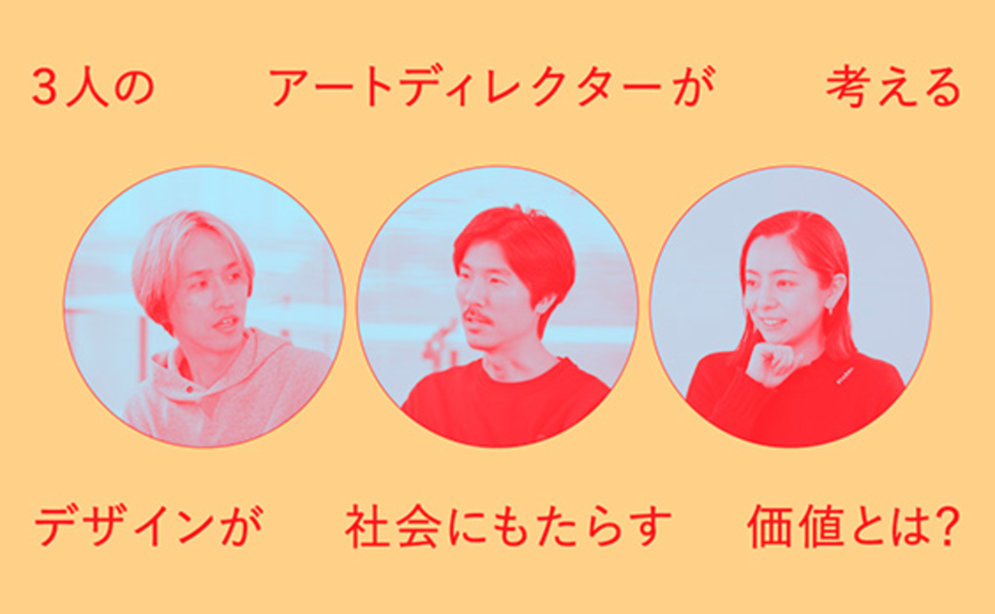
What value does design bring to society? Three art directors share their perspectives.
Dentsu Inc.'s cross-functional creative organization, the Future Creative Center (FCC), is a group of over 80 members supporting future-building initiatives with creativity beyond the realm of advertising. In this series, centered on the theme "Future × Creativity," FCC members discuss their upcoming endeavors.
The scope of art directors' activities is expanding. Beyond design, they are increasingly involved in creating experiential promotions and branding. What value can art directors bring to these areas? Three art directors active at FCC—Taichi Tamaki, Seri Tanaka, and Yuji Higuchi—gathered to explore this question, sharing examples from their own work.
Visuals enable "the entire team to share a vision of the future landscape"
Higuchi: When I hear "the value of an art director," what comes to mind is something Mr. Sawada (Koichi Sawada) once said, which Mr. Tamaki mentioned before: "An art director can travel to future landscapes."
Tamaki: That phrase really stuck with me too. When various ideas come up in planning meetings, an art director can visualize the future where those ideas are implemented—like how an advertisement would look displayed in a city, or how an idea would appear when developed online. They can also imagine people's reactions and expressions in high definition. He described this as "traveling to the future during meetings," and I thought, "That's exactly it!" It felt like my own intuition had been put into words, and I found it incredibly convincing.
Tanaka: So it's not just the art director traveling to the future alone; by visualizing that future themselves, they take the entire team on that journey. That might be one of their key values.
Higuchi: Another point is that by visualizing concepts, art directors can contribute to "moving people's hearts through sight." At FCC, art directors often get involved not just in advertising, but also in planning corporate visions and brand actions, right? In these kinds of projects, isn't the power of design to move people's hearts intuitively incredibly important?
Tokyo's disaster prevention book, "Tokyo Bousai," is a perfect example of this. Design is at the heart of the project, clearly organizing disaster preparedness information. Design is truly serving people and society here.
Related articles on Tokyo Bousai
・Tokyo Bousai

Tamaki: Back in art school, I never imagined I'd be working on experience creation or brand actions. Through these projects at FCC, I gradually started enjoying them, and now I feel like I'm on friendly terms with "new domains."
Tanaka: That feeling of "getting along with new fields" resonates with me too. Projects at FCC often involve encountering professionals and industries from diverse fields I wouldn't meet in my personal life. Within that, I sometimes join discussions with a slightly unique perspective as an art director, almost innocently. It requires thinking in ways I wouldn't use for typical advertising graphic design work, so FCC projects feel like mental workouts.
Examples of Art Directors Creating "Experiences" Beyond Car Advertising
Higuchi: One of my favorite pieces of work by Tamaki-san is the Honda VEZEL brand movie and promotion. It truly made me see the scenery VEZEL takes you to, or rather, it captured the feeling of riding in this car, and it was thrilling.
Tamaki: For the VEZEL brand movie released in 2021, our theme was that we wouldn't shoot the footage ourselves. The photos and videos used in the movie were shot by people of various nationalities and ages. We only specified the equipment to use and some simple rules, then edited the footage everyone freely captured.
Tanaka: Why did you choose to use footage from so many different people?
Tamaki: As people's senses diversify, I thought gathering many people's "likes" would resonate more than just showing what the manufacturer considers "good scenes" or "good features." Perhaps part of the reason people are drifting away from cars is that they can't respond to this diversification of preferences. For example, a photo with a blurred car would normally be rejected. But someone might think that's good. In that way, we trusted and respected the senses of various people. We produced the brand movie with a spirit of co-creation.
Also, while people typically think an art director's job is taking photos or making ads, this was the complete opposite. It was art direction focused on "editing" everyone's likes. I believe editing together so many people's "likes" in the brand movie allowed us to properly envision what the future of car advertising should be and what kind of expression will be effective going forward.
Higuchi: That's a perfect example of creating an experience. Also, what I wanted to ask about is the " Photography Happiness Theory " project you're involved with at Fujifilm.
Tamaki: This project began with the belief that printed photos bring people happiness, aiming to reintroduce that value to the world. I've been developing it alongside Mr. Obuse (Noriyuki Obuse) from FCC.
As the art director, I first created the logo. Since it would become the banner for the project's future design, I put a lot of thought into it. We considered clarity, ease of application, strength, whether it embodied our shared beliefs, and its contemporary feel. This banner is what we'll all run under from now on, so it was incredibly important work.
In this role, I've also been involved in numerous other projects. I constantly accompany clients, helping everyone identify challenges and devise solutions. I offer design-focused perspectives and visualize and organize projects and actions. I strive daily to contribute to projects using the power of an art director—beyond just creating advertising outputs.
Art Directors can think about "planning" and "design" simultaneously
Higuchi: Tanaka-san, you work on a lot of logo design projects, right? What do you think about while creating them?
Tanaka: Logo creation feels like crafting the very heart of the underlying brand or product, and it's work I truly love. For instance, designing a brand logo can even be said to define the brand's personality. Even a single line—just changing its thickness—alters the impression, shifting the brand's character and persona.
The appeal of logos is that they aren't fleeting; they keep evolving on product labels and merchandise. I've had the opportunity to create logos like the Tochigi sake "Senkin" and the exhibition " AMBIENT KYOTO." If a personality emerges from the logo and people come to like that personality, then the products and goods bearing that logo might be cherished for a long time. Creating logos allows me to build lasting relationships with clients I've met, and that's what brings me the greatest joy.

Tamaki: Like AMBIENT KYOTO, Tanaka-san has also been involved in numerous promotional art projects (i.e., creating promotional materials and visuals for exhibitions, stages, plays, etc.). I'd love to hear about the thought process behind that work too.
Tanaka: My key consideration in promotional art is that the main focus must always be the exhibited works. For example, when designing an exhibition poster, it's crucial to highlight the art featured on it; I don't need to assert my own artistic signature through the design. However, within that framework, I translate the exhibition statement and the artist's vision into my own visual language. I reconstruct the graphics through typography, photo placement, and the interplay of colors.
As an example, I handled the promotional art for the 2022 exhibition " Color Field: Swimming in a Sea of Color " at the DIC Kawamura Memorial Museum of Art. Color Field refers to a trend in abstract painting, primarily from the United States. The exhibition featured large-scale paintings, often on canvases measuring 4 to 5 meters per side, where color was used to create an immersive space across the entire surface. Because the works were vastly larger than the human body, they couldn't be taken in at a single glance. The viewer's perspective remained unsettled, creating a sensation of floating and swimming through a sea of color.
The subtitle "Swimming in a Sea of Color" for this exhibition was particularly striking, perfectly capturing the viewing experience, so I drew inspiration from this phrase. For the exhibition title logo, I designed it so the lower half of the text appears to fade away, as if submerged and swimming within the sea of the background color. We also applied the exhibition logo to merchandise, considering flexibility as a visual identity: blue bags feature letters immersed in a blue sea, while red packaging shows letters submerged in a red sea.
Tamaki: Higuchi-san, you work on many projects focused on experience and strategy. Any memorable examples?
Higuchi: Earlier we discussed "how to apply design to society," but beyond that, I recall a case that reaffirmed how visualization can be more effectively applied to everyday work. I was involved in a global project for a mobility company where I focused meticulously on every element of the presentation materials. For example, selecting photos that conveyed the right energy or using animated GIF graphics.
This approach allowed us to clearly convey the vision in our minds. The client also mentioned feeling excited when reviewing the materials. While this aspect is often postponed, sharing a clear visual image early on prevented any misalignment with the intended goal. I feel visuals are a crucial element in shaping perception. It's not directly related to the earlier "travel" example, but I think it's a case where we were able to bridge the gap to the future.
Tamaki: It's a very common expression, but design can communicate with anyone, transcending language and borders. Furthermore, art directors can participate from the project planning stage, making it perhaps the only profession that can simultaneously consider both "planning" and "design." I believe there are few people who can do this even within Dentsu Inc., with its diverse roles, and certainly very few clients can do it either. That's where its rarity lies, and I think it can contribute to creating future value.

Was this article helpful?
Share this article
Newsletter registration is here
We select and publish important news every day
For inquiries about this article
Back Numbers

Author

Taichi Tamaki
Dentsu Inc.
Future Creative Center / Creative Planning Division 5
Creative Director / Art Director
Art direction for film, graphics, and environmental spaces; concept development and design planning for corporate, product, and service branding projects. Recipient of numerous awards including the Tokyo ADC Award, JAGDA Award, JAGDA Newcomer Award 2017, and Japan Typography Annual Grand Prix.
Tanaka Seri
Dentsu Inc.
Future Creative Center / Creative Planning Division 4
Art Director / Graphic Designer
Focusing on graphic design that balances universality with flexible adaptability, I engage in corporate CI and VI development, as well as art direction across fields such as fine arts and music. I also present personal work exploring the serendipity inherent in photography. Recipient of the JAGDA Newcomer Award 2020, Cannes Lions, NY ADC, and other accolades.

Yuji Higuchi
Dentsu Inc.
Future Creative Center / Second CR Planning Bureau
Art Director / Design Strategist
Beyond advertising planning and production, he specializes in mid-to-long-term vision development, brand development, branding to accelerate these efforts, and integrated planning and design from strategy to output. He handles projects ranging from local SMEs and startups to global campaigns. He has received numerous domestic and international awards, including nominations for D&AD, CLIO, ADFEST, ADSTARS, GOOD DESIGN AWARD, and ADC Awards, as well as GOOD DESIGN AWARD.