Note: This website was automatically translated, so some terms or nuances may not be completely accurate.
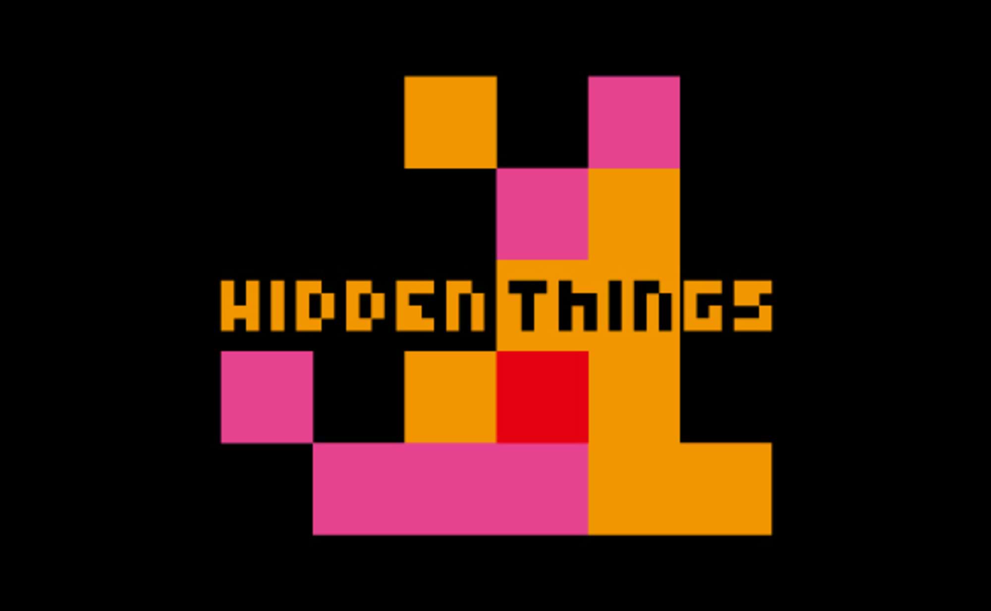
Bringing Japanese taboos closer to home! Fashion brand "HIDDEN THINGS"
In "NEWSPACE," an experimental field pursuing the possibilities of art direction, leading art directors are continuously proposing innovative product-out concepts. The sixth installment features "HIDDEN THINGS," a fashion brand tackling taboos that Japanese people choose to ignore.
What is hidden in contemporary Japanese society? And how did they express these taboo motifs? We asked art director Satoshi Kono, who created this prototype.
I was frustrated by a society where freedom of expression wasn't protected
──Please tell us the background that led to the theme "HIDDEN THINGS."
Recently, with everyone able to post on social media, I've seen more instances of one-sided, negative opinions about things individuals find unpleasant. While sharing opinions is fine, I questioned how often it veers into near-unilateral attacks.
For example, in the US, discussions are lively. Perhaps because education incorporates debate, even when opinions are harsh, they don't attack the person; it feels like fair, rule-based discussions. In contrast, Japanese education seems less effective at fostering the ability to logically construct one's own opinion or think objectively from multiple perspectives. On social media, it feels like only one-sided opinions fly around.
Overseas, it's not uncommon for people's creative expressions to spark lively debate. I think this stems from experiences in art education where we discussed "how we interpreted a work." In Japan, however, there's a tendency to grade things as "good" or "bad," and a prevailing attitude that seems to apply a rule where only beautiful things are acceptable to all works.
As someone who creates things, I feel a sense of crisis when artists and their work are attacked unilaterally, with no consideration for the context behind their creation. They get attacked just for dealing with taboo subjects, or their freedom of expression isn't protected. Every time I see these kinds of things happening all over the world, I get worn down myself.
From this experience, I conceived the idea of using motifs that Japanese people tend to push aside or turn a blind eye to as the basis for my expression.
Hidden Things: Infusing the taboo of sexuality into everyday life through pop aesthetics
──Why did HIDDEN THINGS become a fashion brand centered on "sex"?
I chose it because I believe sex is the most compelling theme among the taboos Japanese people hold. It's a theme relevant to all humanity. Research led me to discover that Japan has higher rates of STIs and unwanted pregnancies compared to other countries. One reason seems to be a lack of sufficient information and knowledge about sex.
By rigidly treating sex as taboo, we've ultimately brought disadvantages upon ourselves. So, shouldn't we stop deliberately avoiding the topic and instead integrate it more naturally into our daily lives?
We chose "HIDDEN THINGS" as a fashion brand name because we wanted to propose this taboo subject of sexuality in a pop, accessible way. Addressing taboos often leads to heaviness, but we didn't want that this time. That's why we selected clothing, an everyday item.
Moreover, clothing possesses contradictory properties regarding sexuality. While it conceals the body (= sexuality) when worn, it can also be the most intimate garment or emphasize gender differences. It is the closest yet most distant presence to sexuality. Above all, I found it ironic and intriguing that what Japanese people wish to avoid is expressed through clothing and infiltrates their daily lives.
Designs that positively allude to "sex"
──What is the brand's visual concept?
First, I wanted people to recognize sex as something positive, so it was crucial to make it charming without causing discomfort. If it's immediately obvious as sexual, some people will distance themselves, and making people uncomfortable defeats the whole purpose. The challenge was hitting that precise balance where the motif is just recognizable.
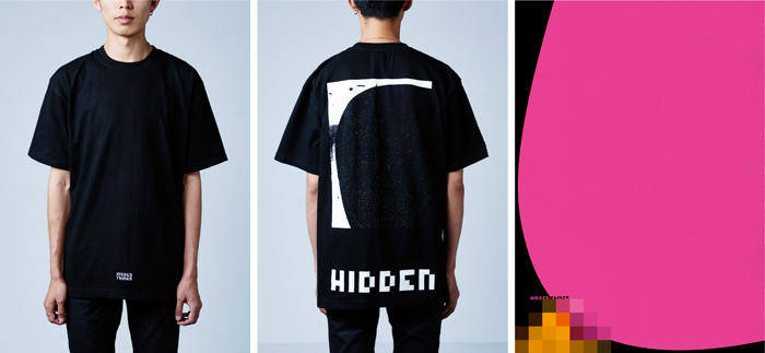
Therefore, we took the "HIDDEN" in the brand name as our theme and used mosaic patterns—typically applied to "things not meant to be seen"—to visualize and metaphorically represent sexuality.
When applying this to clothing, we developed two labels: "48 LABEL" and "XXX LABEL." Each offers T-shirts and posters for home display. Caps, hoodies, and tote bags are currently being redesigned.
True to its name, "48 LABEL" iconizes the 48 positions in a cute, mosaic-inspired way with a pop finish.
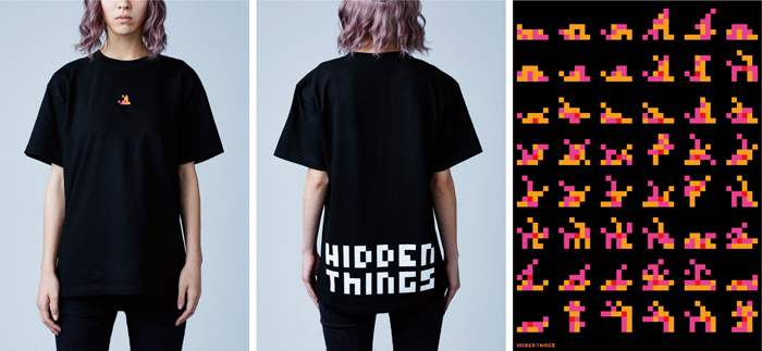
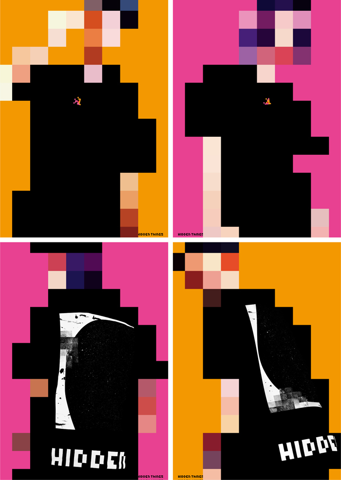
"XXX LABEL" visualizes bodies engaged in sexual acts by adding mosaics to abstract forms, finished with a cool aesthetic. Incidentally, the T-shirts are designed so the logo lands in a perfectly strategic position when worn.
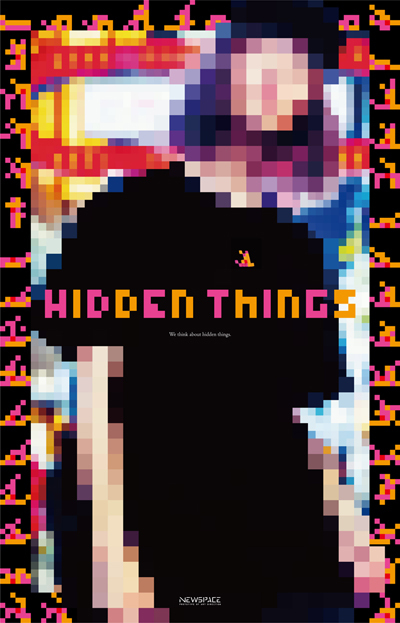
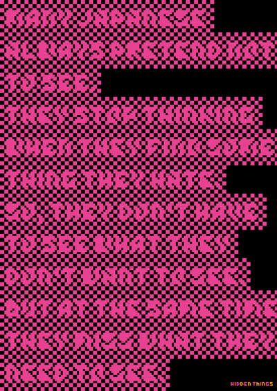
Simultaneously, we produced a concept movie, brand posters, and product posters to convey the brand image. The movie opens with the concept text, but the words are immediately obscured by mosaic patterns, as if censored the moment they appear.
Similarly, the brand poster hides the concept text with mosaic, allowing the words to be faintly discernible.
While fashion posters typically feature photos of models wearing the clothes, to convey the brand's unique character, we boldly applied mosaic effects to the wearers this time. On the other hand, the clothing designs themselves were depicted realistically to ensure they were accurately conveyed.
We plan to sell the products at the "NEWSPACE" exhibition and through mail order. Eventually, we hope to have them stocked in select shops. We'd be delighted if the items became a starting point, making hidden sexuality a slightly more familiar topic for everyone.
Thinking visually, giving things their optimal form
──How do you interpret the "expansion of art direction" advocated by the "NEWSPACE" project?
I believe the "technique of thinking visually" is the true weapon of an art director. People think using language, but sometimes they become too fixated on meaning, creating things that are correct but unappealing. However, art directors can conceive ideas using two thought processes—language and visuals—and give things their optimal form.
Traditionally, an art director's work in advertising has primarily been commissioned, focused on determining what expressions to place within predetermined frameworks. Isn't "expanding art direction" about unleashing the art director's skills more freely, unbound by specific media?
Currently, I work as an art director at Dentsu Inc., taking on projects under the company name. Yet I refuse to rest on this. I believe I must hone my skills daily to become an art director with established artistic identity—someone sought out for their unique perspective and expression.
Participating in "NEWSPACE" has provided a framework for activity, and I hope to continue developing it further. While this time we focused on sexuality as a theme, I believe exploring taboos can lead to various developments.
If you're interested in acquiring items from "HIDDEN THINGS," please contact ぜひinfo@newspace.galleryまでご連絡ください.
Was this article helpful?
Share this article
Newsletter registration is here
We select and publish important news every day
For inquiries about this article
Back Numbers
Author
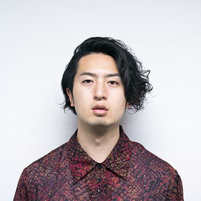
Tomokazu Kono
Dentsu Inc.
Third CR Planning Bureau
Art Director
Since his student days, he has won numerous domestic and international design awards, including the NYADC. Currently, he focuses on graphic design while also working on advertising planning and design, artist branding, and motion graphics. His awards include YOUNG GUNS 16, D&AD Yellow Pencil, NYADC Gold, ONE SHOW Gold, ADFEST Grande Prix, and Cannes Lions Silver Lion.