Note: This website was automatically translated, so some terms or nuances may not be completely accurate.
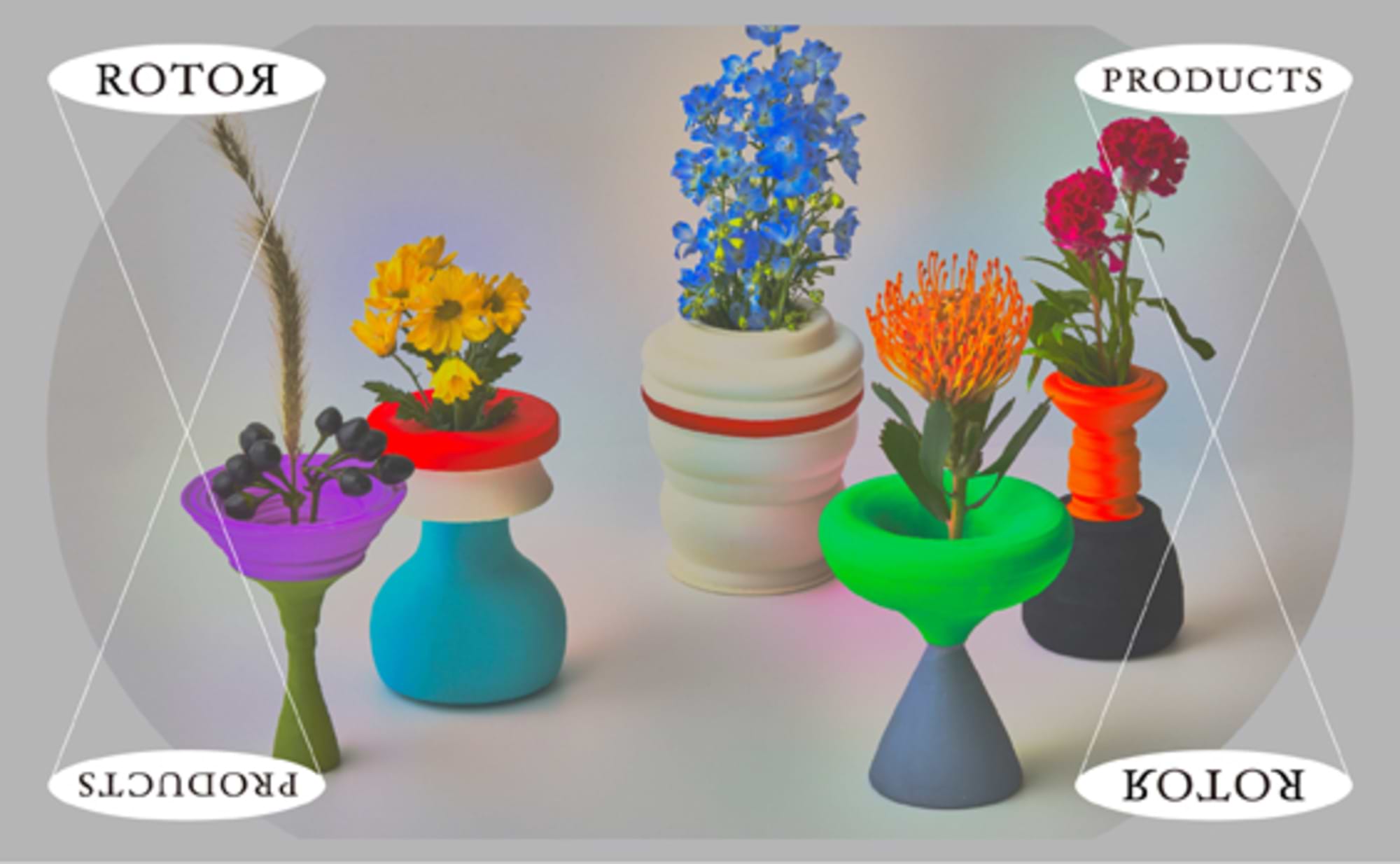
ROTER PRODUCTS: Everyday objects transformed into soft forms through rotation.
The "NEWSPACE" project explores the potential of art direction that transcends flat surfaces. Over six installments, this series has introduced creative prototypes born from the free-thinking of art directors.
The finale features "ROTER PRODUCTS" by art director Hiromi Uzaki. We asked how these uniquely shaped vases were conceived and crafted.
Creating organic geometric forms that I "instinctively love"
—What kind of products are "ROTER PRODUCTS"? And what was the background behind their creation?
ROTER means "rotating body." Based on the hypothesis that "no matter what shape an object has, rotating it and tracing its outline creates a geometric form," I used 3D CAD to shape rotating bodies into vases—that's "ROTER PRODUCTS."
I've always been interested in geometric forms like hexahedrons, spheres, cones, and cylinders, and I personally made accessories using such motifs.
Also, for some reason, I've always been drawn to forms with a plump, rounded shape. I prefer soft curves that are slightly distorted, rather than sharp lines.
Lately, I often use the made-up term "instinctively like." Don't you have things you just like without really knowing why? It's the opposite of the commonly said "instinctively dislike." For this "NEWSPACE" project, I decided to give shape to that "instinctively like" feeling I've always had inside me.
I wondered: Could I somehow create organic expressions or soft lines within geometric forms? The idea I arrived at was to rotate everyday objects to generate new curved surfaces.
Horizontal rotation brings out distinctive forms and dynamic color schemes
—Please tell us about the process of transforming everyday items into unique vases.
In addition to creating the product, I also experimented with making graphic posters using photographs taken while rotating the motif.
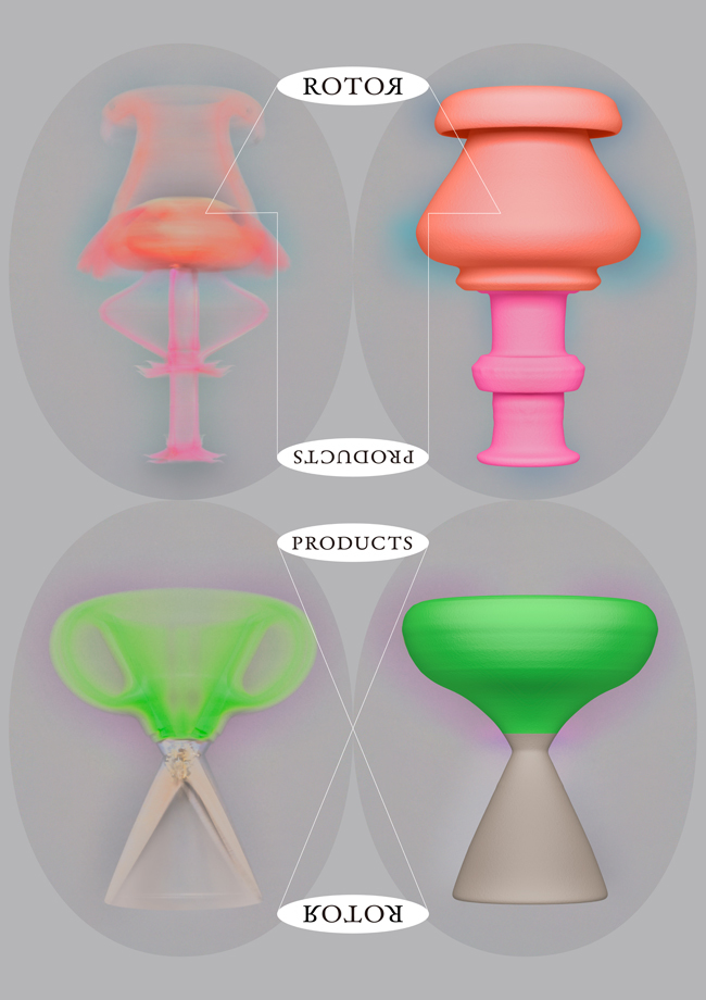
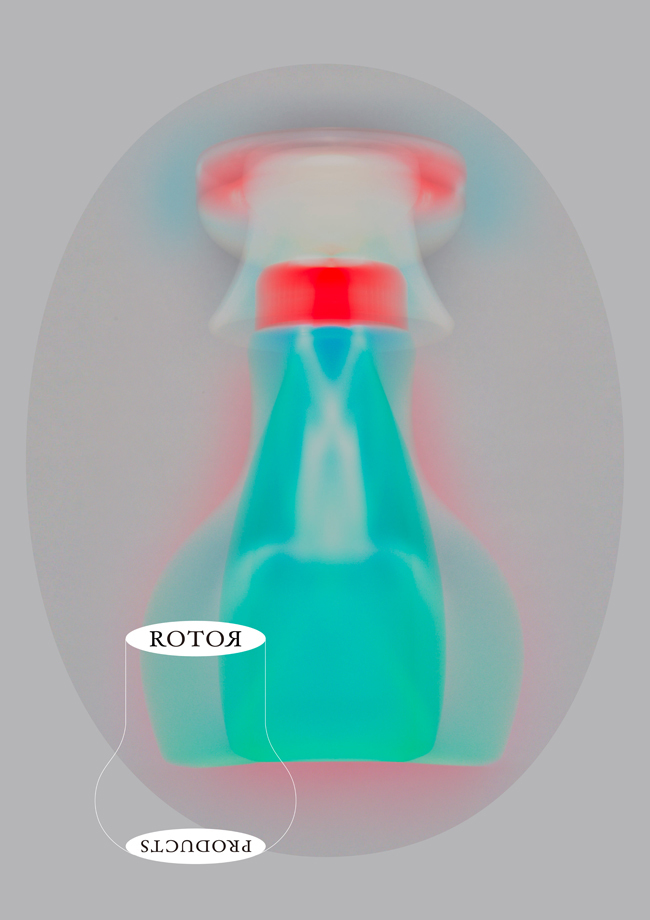
I placed the motifs on a turntable, rotating them while photographing from a fixed point using long exposure settings. The aurora-like colors drifting in the background are created by utilizing the shadows of the motifs cast onto the background during shooting. I turned the inevitable reflections into an asset, transforming them into a visual element.
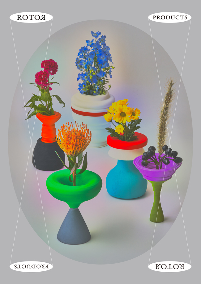
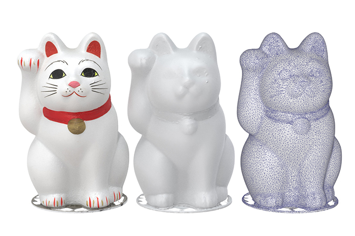
The vase motifs, clockwise from the top, are: a beckoning cat, a detergent spray bottle, a lavender plant, scissors, and a temmusu rice ball (!). We experimented with various items, and these five ultimately remained.
While shape is important, I also wanted to reflect the actual colors of the objects. So, I chose items whose inherent colors were cute, making color another key factor.
● The fluffy form of the beckoning cat figurine created a beautiful curve. The red collar line also serves as an accent.
● I chose the detergent spray bottle for its rounded shape, waistline, and color scheme.
● Initially, I wanted to create a flower series. I thought placing flowers in a rotated flower shape would be cute, but when I actually photographed them, many were too delicate and difficult to shape. I couldn't 3D-model them as envisioned and had to give up. It seems overly delicate items aren't suitable. Only the lavender had enough physical presence, so I made one piece.
● I thought the two-tone appearance of the tempura rice ball would work well.
● I chose the scissors anticipating that rotating them would create a distinct tapered waist.
Here's the process for turning these into actual products using a 3D printer. First, I photographed the motif from about 30 different angles as still images. The 3D data created by stitching these together is shown in the center and right images. I rotated the right data on screen to develop it into a vase-shaped 3D model. This became the basis for creating the vase.
Even in advertising work, it's worth proposing things you personally like.
—What were your thoughts on actually giving form to something you "instinctively loved" through the "NEWSPACE" project?
It was a precious and valuable opportunity to externalize and complete something I'd only imagined in my head.
It sparked new ideas like, "Next, let's try rotating something like that" or "I want to make a lampshade." I also think we could create "ROTER PRODUCTS" from existing items and use them for advertising and sales promotion. It feels like I could start saying, "This is one of the techniques I have," as part of my own field.
In the "NEWSPACE" project, everyone presents unique prototypes. To an outsider, it might seem like, "What on earth are they doing?" But I felt that having this kind of space for free experimentation is a chance to break free from rigid thinking.
Many art directors at Dentsu Inc. are art school graduates, and they haven't just focused on graphic design. It's a shame to limit their potential when they possess such diverse abilities and ideas.
Commissioned work comes with various constraints, but I believe it's worth trying to incorporate what you "instinctively love" into your approach at least once. When we propose ideas from our unique perspective, they are often surprisingly well-received or accepted.
Communicating information + that extra touch of sensibility changes preconceived notions and moves people
—What do you think is the essence of art direction and the work of an art director?
Historically, the scope of an art director's work in advertising agencies has been heavily skewed toward print and graphic design. In my own work, however, I've had increasing opportunities over the past few years to handle branding for new stores and package design.
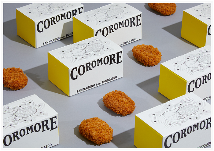
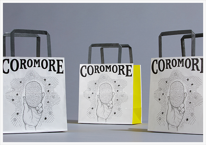
Recently, I handled branding for "COROMORE," a Hokkaido croquette shop that opened in the Tokyu Food Show Edge on B2F of Shibuya Scramble Square, and art direction for a Yahoo! event held on March 11, 2019. The "Yahoo! Disaster Prevention Diversity" event held at Roppongi Hills was nominated for a Tokyo ADC Award.
When considering how to approach creating a disaster preparedness event, I realized from Yahoo! search history that diversity is also needed in disaster preparedness. For example, pets getting injured by debris, or dry biscuits being too hard for elderly people to eat... So, I prepared over 100 illustrated cards depicting disaster preparedness information and goods, proposing a style where visitors could choose and take home what they needed.
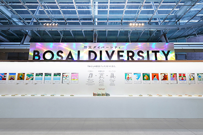
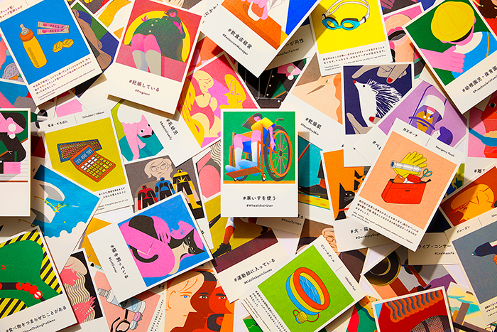
Later, we heard comments like "The cards were so nice I wanted to buy them" or "I enjoyed browsing and ended up learning about disaster preparedness." I felt that was the power of art direction.
Since disasters and disaster prevention can be rather somber topics, I asked the illustrators, "Please draw them with as pop an image as possible." Simply adding a sense of "lovely" or "cute" to something conveying information can heighten interest. Isn't approaching things from that perspective something unique to an art director? Art direction has the power to move someone's feelings. That's what I believe.
If you're interested in "ROTER PRODUCTS," please feel free to contact us here.
Was this article helpful?
Share this article
Newsletter registration is here
We select and publish important news every day
For inquiries about this article
Back Numbers
Author
Hiromi Uzaki
Dentsu Inc.
Third CR Planning Bureau
Art Director
Graduated from Tokyo University of the Arts, Department of Design. Joined Dentsu Inc. in 2014. Art Director. Born in Tokyo and raised in Nakano.