Note: This website was automatically translated, so some terms or nuances may not be completely accurate.
Infographics Expand the Possibilities of Visual Expression

Jun Sakurada
NewsPicks

Ken Akimoto
Dentsu Inc.
What to communicate, how to convey it clearly, and to whom—
Now that data from areas previously difficult to obtain can be collected, it's no exaggeration to say that the methods used to convey this information determine everything.
Infographics are gaining significant attention in this context.
Jun Sakurada of NewsPicks, a leading expert in the field, and Ken Akimoto of Dentsu Inc., who supports problem-solving through data-driven approaches, discussed the importance and potential of visual expression, sharing concrete examples.

Especially when the other party is low on motivation
Infographics are most effective
Sakurada: Infographics (IG) are a method of visually representing information to convey it clearly. While we're currently experiencing information overload, smartphones are now the mainstream device. I believe the demand is shifting towards conveying information clearly in smaller quantities.
Akimoto: Less content makes things look cleaner, but it also tends to be fragmented. I think the smartphone era demands a presentation method that conveys the big picture and key points without being off-putting.
Sakurada: Let me explain IG using IG.
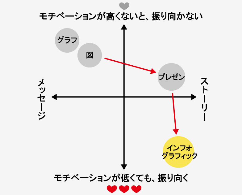
Sakurada: First, there's the axis of whether it's better suited for conveying a single message or a story. Another axis is viewer motivation. Does it require high motivation, or can it be naturally accepted even with low motivation? The IG I want to create now is story-based, something people will view even if their motivation is low. There's a current need to convey stories even to those with low motivation.
Akimoto: This is also heavily tied to media characteristics, right? On a computer, you can express a lot on a single screen, but smartphones rely on scrolling and video usage.
Sakurada: IG used on PCs or in newspapers tends toward single-message, spread-like expressions. But IG on smartphones is closer to a scroll or a world with narrative depth like the Chōjū-giga. Vertical manga are similar.

Enabling people who dislike data to share information clearly
Akimoto: Recently, methods for acquiring data, such as sensors, have evolved, and the volume of information circulating has greatly increased. Numbers and data only become useful when everyone shares them. However, most people don't like looking at data. That's precisely why IG becomes an effective means of expression.

Sakurada: Furthermore, the screens used to convey information are getting smaller, and the platforms for expression are expanding, such as virtual reality. Considering these changes in expression platforms alongside the growth of data, I firmly believe IG is absolutely essential. I think its applications will only increase.
Akimoto: Useful information often exists but goes unnoticed. I want to leverage IG's "power to attract" more effectively. Ideally, IG could spark interest in more people, leading them to delve deeper.
Practice
Infographics on Smartphones
Blue Bottle Coffee opened its first Japanese store in Kiyosumi-Shirakawa, Tokyo, in February 2015. Mr. Akimoto analyzed customer flow patterns using location data (see Web Dentsu Inc. "Analyzing Blue Bottle Coffee Through Location Data"). Mr. Sakurada also participated in this analysis, visualizing the flow patterns on Instagram (see NewsPicks "[Slide Data] Where Did Blue Bottle Draw Its Customers From?"). This visualization method clearly reveals the characteristics of Instagram on smartphones.
Analysis results displayed on a computer
Blue Bottle Coffee opened its first Japanese store in Kiyosumi-Shirakawa, Tokyo, in February 2015. Mr. Akimoto analyzed the flow of people using location data (see Web Dentsu Inc. "Analyzing Blue Bottle Coffee Through Location Data" ). Mr. Sakurada also participated in this analysis, visualizing the flow of people on Instagram (see NewsPicks "[Data in Slides] Where Did Blue Bottle Draw Its Crowds From?"). This visualization method clearly reveals the characteristics of Instagram on smartphones.
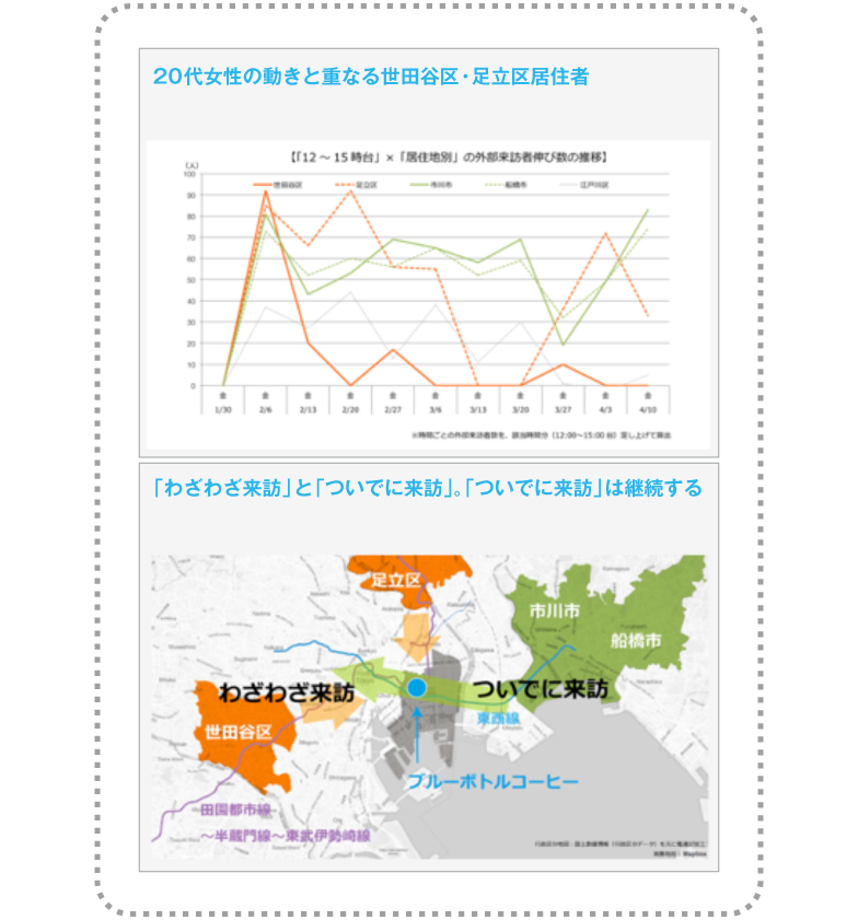
While it excels in listability and offers a wealth of information, displaying it directly on a smartphone can create an overwhelming, hard-to-read impression.

When Sakurada adapted this for mobile via IG...
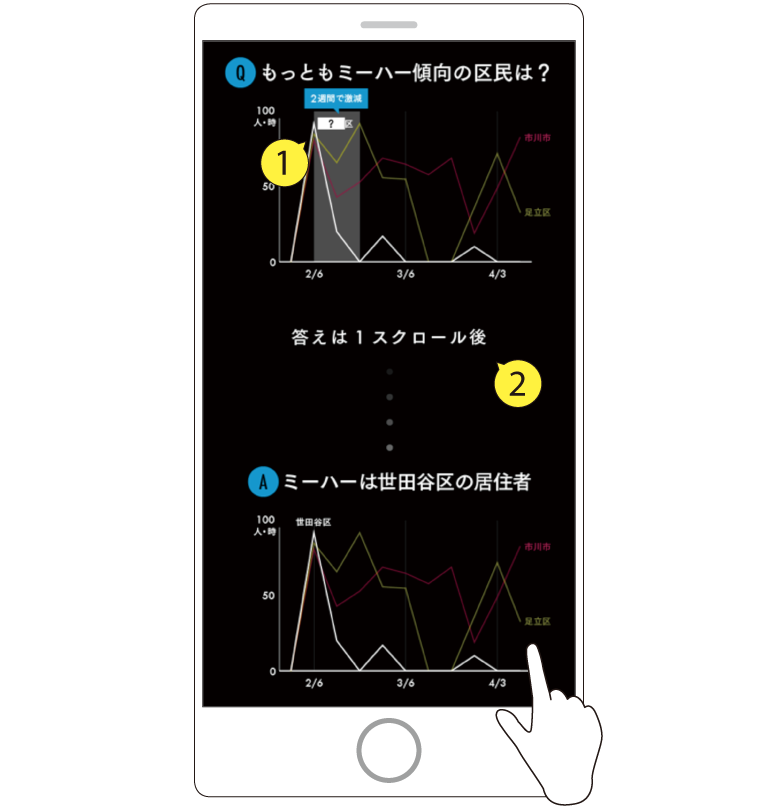
1. The district showing the highest number of external visitors at opening time is represented as a quiz-like "?" to pique the viewer's interest.
2. Encouraging viewers to scroll builds their interest and anticipation for the answer.

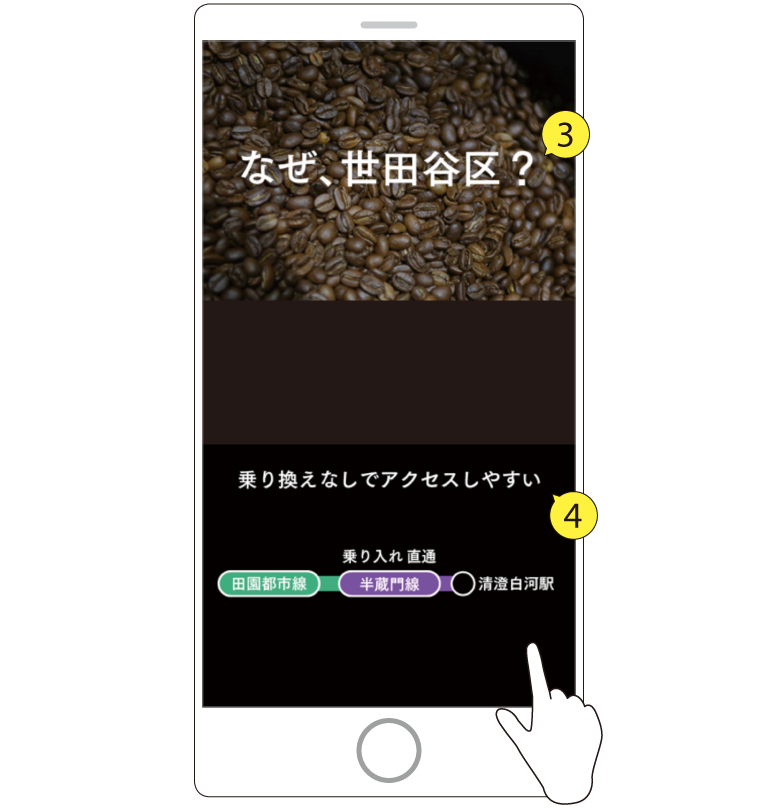
3. A section showing step-by-step why residents from Setagaya visited.
4. Mr. Akimoto's map representation is simplified into graphics. The conclusion comes straight to the point.
Involved in all phases of the project
What is an "Infographic Editor"?

Mr. Sakurada's title is Infographic Editor. There's a reason he deliberately uses "Editor." The core role involves consistent involvement from the planning and setting stage through information gathering and analysis, then creating the story through editing work, and finally translating it into graphics tailored to the media. Rearranging information and distilling it into the most effective design for communication. That's the meaning behind "Editor."
Was this article helpful?
Share this article
Newsletter registration is here
We select and publish important news every day
For inquiries about this article
Author
Jun Sakurada
NewsPicks
Infographic Editor
Visual Thinking (www.visualthinking.jp) Management. Joined NewsPicks in December 2014. Author of "Fun Introduction to Infographics" and other works.
Ken Akimoto
Dentsu Inc.
Data Technology Center Geodata Solutions Department
After working at a major automaker's marketing subsidiary, joined the company in 2001. Expanding domains: Sales → New Business Development → Creative → Data Business. In 2018, launched a department solving client marketing challenges using location data, providing data-driven marketing services with "Data × Communication Design" as its strength. Awarded at ADFEST / Spikes Asia / D&AD / OneShow / JAA Consumer-Selected Advertising Contest / ACC Tokyo Creative Awards.