Note: This website was automatically translated, so some terms or nuances may not be completely accurate.
"Location data" reveals completely different faces at each station! OOH evolves with GroundTruth's mobile data
"Data marketing," "data-driven," "big data," "data management platform"... While the advertising industry sees data-related terms emerging one after another, OOH (Out-of-Home = outdoor advertising/transportation advertising) is no exception. In this series, Kei Hamada from an OOH agency will explore the evolution and potential of outdoor and transportation advertising, centered around audience data.
What data do you want to capture?
My answer is clear. I want data on how I spend my time—specifically, why I end up leaving late every morning despite having a target time to drop my son off at daycare, and what I'm doing after he wakes up!
I want to visualize my son's usage patterns and my own behavioral patterns.
- "Sitting at the table, staring blankly at the omelet in front of him for a long time without starting to eat" (son)
- "While waiting for the hair iron to heat up at the sink, I end up mindlessly checking my phone and time just slips away" (myself)
I can predict these things, but in reality, it might actually take the longest for my son to get out of bed, or I might be taking too long choosing clothes.
Seeing these unconscious actions as "data" makes me think, "Oh, so that's where I can cut down?" But honestly, my days are too hectic to spare the time for that... (laughs).
This has all been a bit of a tangent, but what kind of data would you want to track? What would you want to quantify and improve?
It might not come to mind right away, but once you realize, "Wow, you can even track this with data!"—that moment changes everything.
It’s all about data.
The OOH world is no exception.
This time, let's explore what insights we can gain by using "mobile data" – something previously untapped in the OOH industry.
*All data below is based on location data from mobile devices provided by GroundTruth.
*Reference: http://www.dentsu.co.jp/news/release/2018/0314-009486.html
Is ○○ Station frequented by many hardworking salarymen?
Suddenly, a question.
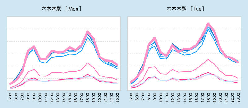
■Question 1: The following visualizes the "weekday to weekend foot traffic" at a station in Tokyo by time slot. Which station is it?
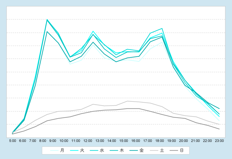
Key features: First, the flow from Monday to Friday is nearly identical. Second, the volume drops dramatically on weekends.
...!
Yes, it's a station in an office district! The answer is "Otemachi Station. "
Didn't you think, "Ah, that makes sense," when you heard Otemachi? It's an area dominated by financial institutions and, in a way, many conservative corporate headquarters. Yet, their weekday patterns are as predictable as clockwork. Makes perfect sense, right?
By the way, as a side note, if I enter one of the big office buildings in this area on a weekday wearing my usual work outfit—jeans—I really stand out (lol).
■【Question 2】: So, which station is this?
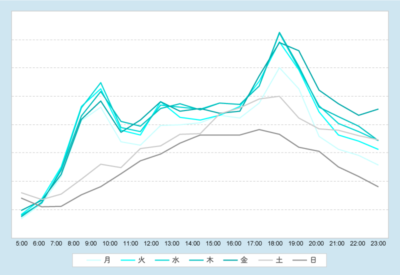
Unlike Otemachi Station, there's variation even within weekdays, and weekend crowds are close to weekday levels. And look at these two spots—they're distinctive!
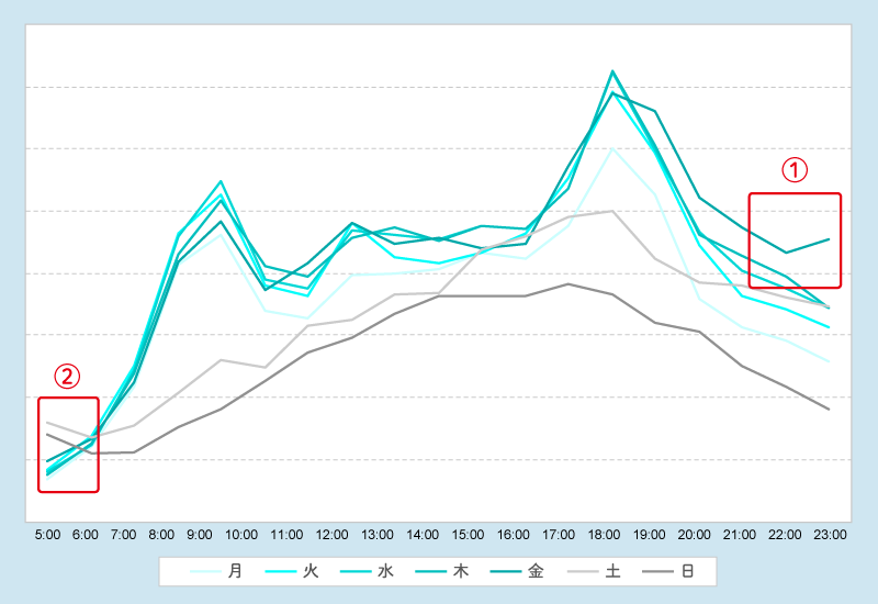
① Near the last train time, Friday nights show a clear increase in people.
② Look! Early mornings show a slight increase only on weekends! Morning-after hangovers?
Think about where you go out drinking on Friday nights. That might be the answer.
The correct answer is "Roppongi Station. "
Doesn't that make perfect sense? It's a trend fitting for Roppongi Station, known for its nightlife.
This data comes from GroundTruth, a global leader in mobile geolocation data collection. Using their proprietary Blueprint technology, they precisely delineated station boundaries and extracted people's location data.
Data that turns "vague notions" into "certainty," data that reveals the unknown
When we talk about "data utilization," we often think of it as a means to reveal "things we didn't know before." But the answer is both yes and no.
In fact, it's often about turning "vague intuitions" (that gut feeling—advertising folks love that term, right? lol) into certainty.
When gut feelings are proven with "numbers." And being able to build campaigns with confidence based on those numbers—that's one of the true values of data.
Until now, in Japan's OOH world, there was no way to obtain data like the "day-of-the-week/time-of-day movement patterns" I mentioned earlier. The sheer number of target stations and lines made it difficult to collect sufficient sample sizes for all stations and lines using panel surveys.
However, using mobile data now allows us to instantly uncover such detailed data without any survey effort. This data acquisition is made possible by improvements in "location tracking technology" using GPS and Wi-Fi, combined with the increase in "location data users" driven by smartphone proliferation.
Now, we've shown data by day of the week and time of day, but what about from the perspective of "demographics" such as gender and age?
Take a look at the next graph. Using the mobile data mentioned earlier, we calculated the "gender ratio" for Otemachi Station and Roppongi Station.
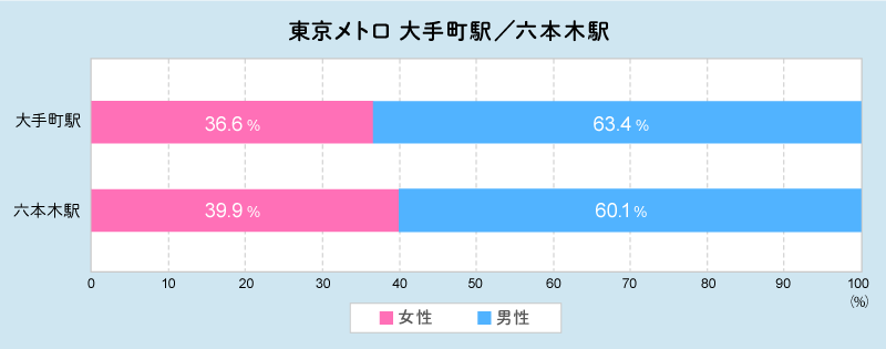
At first glance, Otemachi and Roppongi stations appear quite similar, giving the impression they are simply "stations with a higher proportion of males."
But take a look at the next graph. It visualizes the flow of people at Roppongi Station by gender and age group for each day of the week from Monday to Friday.
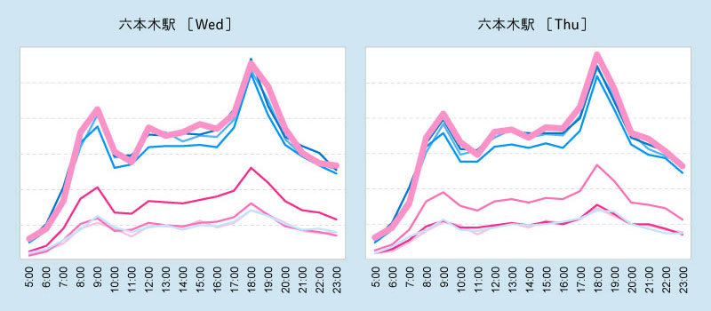
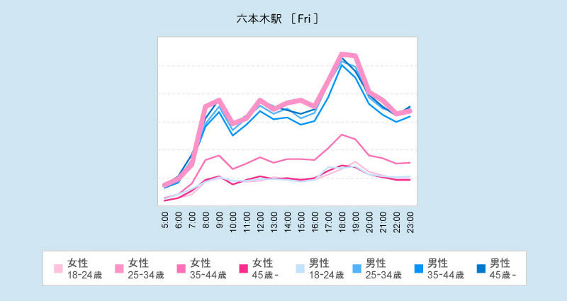
Huh? The graph consistently at the top for almost every day of the week is, surprisingly, "Women aged 25-34." My personal impression was that "Roppongi Station seems to have a lot of young men," but the data shows that during weekday daytime hours, young women are actually the most numerous!
This trend becomes even more pronounced on weekends, with "Women aged 25-34" standing head and shoulders above the rest.
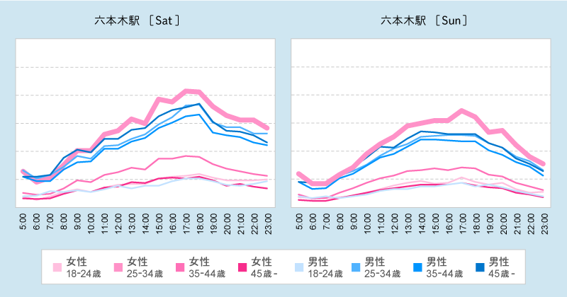
I bet many people are thinking, "That's a bit different from what I expected!" If we convert this to a bar chart, it looks like the image below. At Roppongi Station, "Women aged 25-34" account for 19.9%, forming the largest volume group.

Things that are hard to notice in a simple horizontal bar chart by gender become visible when you break it down into detailed line charts by time slot.
Traditional OOH planning often assumes
- "Transportation ads target men"
- "Roppongi Station has a high male presence"
- "Therefore, let's promote products targeting men (primarily aged 25-34)."
However, when comparing only the 25-34 age group based on actual mobile data, women actually outnumber men. This suggests that promoting products aimed at men and promoting products aimed at women are likely equally effective.
Rather than relying on broad gender categories, examining demographics like age reveals which "target group" is actually larger, enabling truly efficient planning.
Data that provides a shared understanding
At this point, some might be thinking, "Well, I always thought Roppongi had a lot of young women..." Exactly—this perception varies from person to person.
Some people might have thought, based solely on their own impressions, "Roppongi Station has a lot of women," while others, like me, might have thought, "There are a lot of young men." Using big data from mobile devices and other sources allows us to arrive at a "answer" that becomes a shared understanding for everyone. This is fantastic for marketing.
Furthermore, what were the "purposes" of the women arriving at Roppongi Station earlier? By tracking the facilities they visited next and their dwell times there, we can increasingly discern whether Roppongi is their workplace station, or if they came for tea with friends, shopping, and so on.
While there may be debates about representativeness, it's impossible to ever fully capture "complete data" for every station without gaps. So, instead of relying on traditional "surveys," why not try planning using the trends from big data like mobile data? This offers a different perspective on OOH.
Data that turns assumptions into certainty, data that reveals the unknown, and data that builds shared understanding. Viewing OOH through this lens of actual numerical data gives it a slightly different character than the traditional, gut-feel-based approach.
Hehehe, what do you think? For those of you running campaigns now, hasn't your imagination started to run wild? Just thinking that OOH's position within integrated marketing might change gets me excited!
Moreover, the true strength of mobile data lies in its ability to link with web and TV data. It transcends the closed world of OOH alone, enabling full-funnel planning and ad delivery!!
Next time, we'll discuss the possibilities of cross-media planning between OOH and other media, and the potential for measuring its effectiveness.
Was this article helpful?
Share this article
Newsletter registration is here
We select and publish important news every day
For inquiries about this article
Author

Hamada Katsura
Dentsu Inc.
Out-of-Home Media Division
Project Manager, Tech & Data Intelligence Department. With 10 years of OOH experience since joining the company. Involved in the Japan launch of Posterscope (headquartered in the UK), the OOH specialist agency of the Dentsu Inc. Aegis Network, since 2015.