Note: This website was automatically translated, so some terms or nuances may not be completely accurate.
Creating "Comfort": Designing the Future. (Part 2)

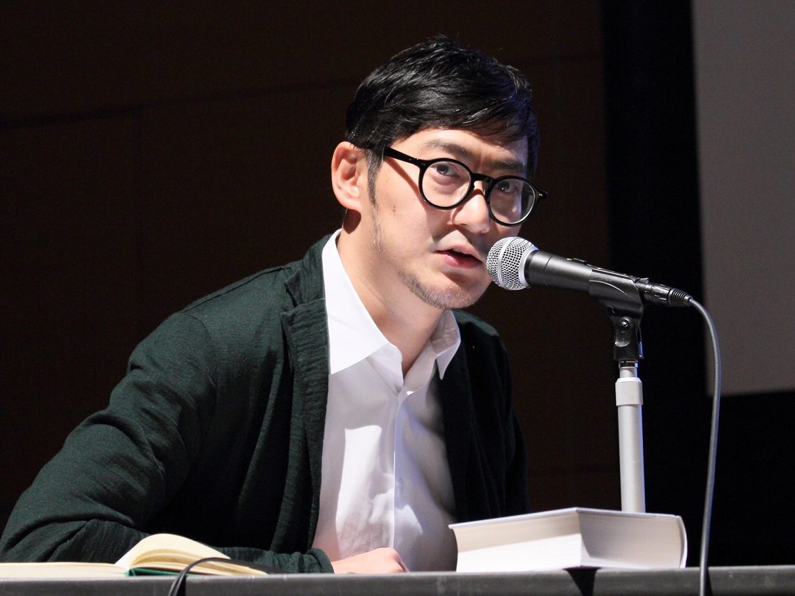
Yoshiaki Irobe
Nippon Design Center, Inc. Irobu Design Laboratory

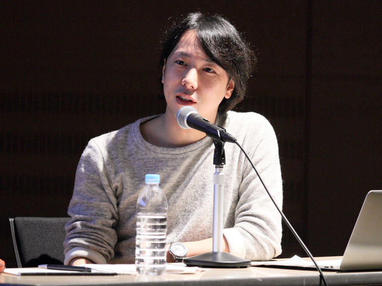
Yoshihiro Yagi
Dentsu Inc.
The theme of the 128th Dentsu Inc. Design Talk held on January 15th was "Creating Comfort: Design for the Future." Graphic designer Yoshiaki Irobe of Nippon Design Center has consistently provided art direction across a wide range of fields, from VI and SP tools to packaging, exhibition graphics, and signage planning, spanning both two-dimensional and three-dimensional work. At the "Tokyo Design 2020 Forum," he presented a pilot project for a signage plan in the city (Ginza), advancing his thinking toward public spaces that unconsciously influence people's feelings and alter their moods. Dentsu Inc. Art Director Yoshihiro Yagi has long been attentive to Mr. Irobe's work. We present the second part of the talk on "Future Design" as envisioned by these two outstanding art directors.
Planning & Production: Aki Kanahara, Dentsu Inc. Event & Space Design Bureau
"Sprinkle-Style" Urban Planning That Changes the Atmosphere of a City
Irobe: Lately, I've also been working on public design. With the 2020 Olympics approaching, I believe now is the time to rethink public design. The "Ginza District Public Signage Pilot Project" we conducted in Tokyo's Ginza district was a project themed around "signage that is easy for foreigners to understand." The Chuo Ward Office consulted us, saying, "We want to color-code the areas from 1-chome to 8-chome, but how can we actually implement that as signage?" Ginza is a "signage paradise" and can feel cluttered. Rather than placing large structures, I thought smaller, yet conspicuous elements would be more fitting. That's when I conceived the idea of attaching signs to streetlights, like clothing tags. After all, Ginza is also a fashion district. I reasoned that even small, soft elements like tags could function effectively if placed near eye level. By ensuring continuity in the coloring, we also achieved a sense of overall unity.

Yagi: I used to think design didn't really intervene in the cityscape, but that's not the case at all.
Irobe: Let me introduce another urban design project. This was presented at an event proposing designs for the Tokyo 2020 Olympics. It's called the "Sprinkle-Style Urban Adjustment Plan." My focus was on block indicators. When it comes to the Olympics, attention often focuses on stadium or emblem designs. But I wondered if there could be a bottom-up approach to shaping the city's image. I considered transforming the city through the accumulation of small points. It's an idea of using block indicators to express a place's identity, like France using block indicator designs to define a city's character or Portugal utilizing traditional tiles. By improving these tiny particles of the city's atmosphere, we might enhance the city's overall atmosphere.
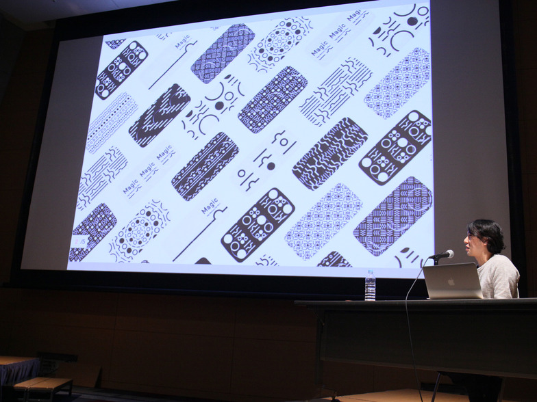
Yagi: Even something as small as a block sign plate, when accumulated across the entire city, gains significant area and meaning. Advertising too can produce major effects when individual placements accumulate, so I deeply resonate with this. I believe design is about "restoring inherent value." It's less about recreating and more about helping things become what they should be. I think Mr. Irobe's work embodies this perfectly. It's precisely in areas where expectations are low that design's power shines. A case in point is my work on Menicon's contact lens "Magic-1day Menicon Flat Pack." The initial client brief was simply, "We want to advertise our newly developed 1mm-thin contact lenses." However, I thought the real user benefit lay in the packaging – specifically, that it allowed users to insert the lens without touching the surface that contacts the eye. So, I designed both the packaging and the advertising around that. I don't think people have high expectations for contact lens packaging. But if you design it with a different value in mind, you might change how people behave, and even transform the sales floor.
Irobe: Packaging is superficial, yet it changes people's mindset, right? I really resonate with that approach of altering that "mindset" and imparting a different kind of brilliance to something.
Yagi: It's fascinating how design can transform value. I think your work embodies that perfectly. But why do you focus so intently on "graphic design" in the first place?
Irobe: Graphic design has a history. Graphic designers use the same tools and fonts, share ideas, and accumulate knowledge within this field. I find that situation enjoyable. I always want to confront the accumulated work of many people who came before and demonstrate how graphic design can be useful in society.
Yagi: I feel there's this perception that design is somehow a "domain untouchable by non-specialists," and I think that's a shame. It's not that only designers should design. Even in advertising agencies, I believe the output becomes much stronger when design permeates everyone's work.
Irobe: It's great when design naturally becomes something everyone can engage with.
You can read the full interview here on Adtai!
Was this article helpful?
Share this article
Newsletter registration is here
We select and publish important news every day
For inquiries about this article
Back Numbers

Author
Yoshiaki Irobe
Nippon Design Center, Inc. Irobu Design Laboratory
Graphic Designer / Art Director
Born in Chiba Prefecture in 1974. Completed the Master's Program in Fine Arts at Tokyo University of the Arts. Director of the Irobe Design Laboratory at Nippon Design Center. Major projects include the VI and signage plan for the Kawamura Memorial Museum of Art, the Ginza District Public Signage Pilot Experiment, art direction for "TAKEO PAPER SHOW 2011─Books," and graphic tools for the Liquitex Art Prize. Engages in a wide range of design work based on graphics, including CI/VI, graphic tools, books, editorial design, packaging, branding, and signage planning. Recipient of numerous domestic and international design awards, including the SDA Grand Prize, JAGDA New Designer Award, JAGDA Award, Tokyo ADC Award, and ONE SHOW DESIGN Gold Award. Part-time lecturer at Tokyo University of the Arts since 2011. He served as a judge for the 2014 Good Design Award and the annual "GRAPHIC DESIGN IN JAPAN 2015."
Yoshihiro Yagi
Dentsu Inc.
CDC
Creative Director / Art Director
Born in Kyoto in 1977. Develops diverse creative work, including corporate and product branding and advertising campaigns, through nonverbal visual communication. Major works include JR East Japan's "Get Back, Tohoku.", HONDA's "Human! FIT", Ezaki Glico's "Pocky THE GIFT", and Menicon's "Magic-1 day Menicon Flat Pack". Numerous awards include Cannes Design Lions Grand Prix, One Show Best in Design, D&AD Yellow Pencil ×6, Tokyo ADC Award, JAGDA New Artist Award, ACC Grand Prix, and the Keizo Saji Award. Member of Tokyo Art Directors Club. Visiting Professor, Kyoto University of the Arts.