Note: This website was automatically translated, so some terms or nuances may not be completely accurate.
Designing the Future: Creating "Comfort". (Part 1)
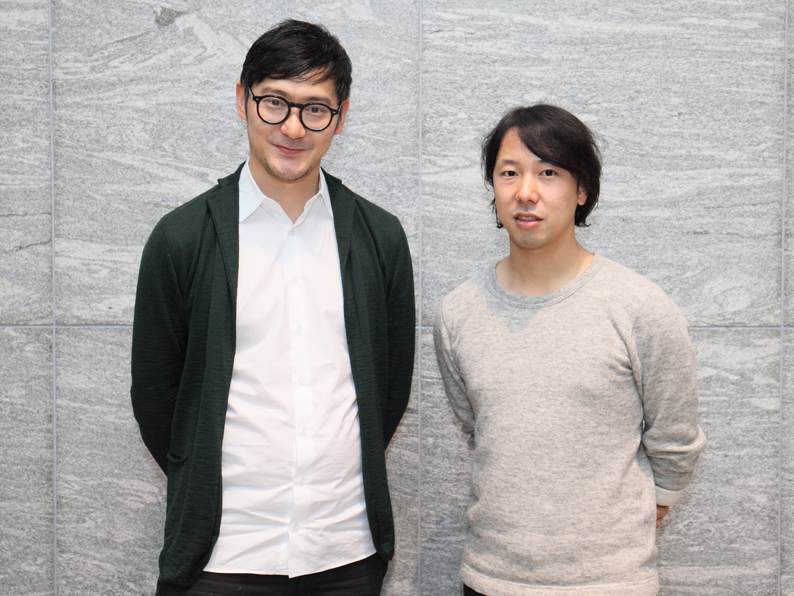
Yoshiaki Irobe
Nippon Design Center, Inc. Irobu Design Laboratory

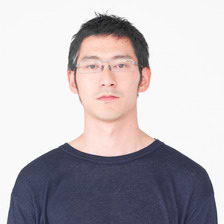
Yoshihiro Yagi
Dentsu Inc.
The theme of the 128th Dentsu Inc. Design Talk held on January 15 was "Designing the Future: Creating Comfort." Graphic designer Yoshiaki Irobe of Nippon Design Center has consistently provided art direction across a wide spectrum, from two-dimensional to three-dimensional work, including VI, SP tools, packaging, exhibition graphics, and signage planning.At the "Tokyo Design 2020 Forum," he presented a pilot project for a signage plan in the city (Ginza), developing his thinking toward public spaces that unconsciously influence people's feelings, altering their moods and dispositions. Dentsu Inc. Art Director Yoshihiro Yagi has long been attentive to Mr. Irobe's work. We present this two-part talk exploring "Future Design" as envisioned by these two outstanding art directors.
Planning & Production: Aki Kanahara, Dentsu Inc. Event & Space Design Bureau
Shaping the Whole Through the Accumulation of Details
Irobe: Graphic design—people think they know it, but they really don't. That's the impression many have, right? Logos, typefaces, book design, color schemes, store interiors, advertising, motion graphics, packaging, diagrams... its scope is surprisingly wide-ranging. Graphic designers start with the simple desire to "make something beautiful," but they also receive various specific requests like "attract customers," "build a brand," or "clearly guide people through a space."Our job is to respond to these requests through design while also engaging people emotionally. Art and design are often compared, but I believe design is about "answering." Design to make people aware, design to make them like something, design to make them buy, design to make them visit, design to make things understandable, design to help them grasp rules... My style is to consistently face each and every one of these "for the purpose of" requests and respond to them sincerely, one at a time.
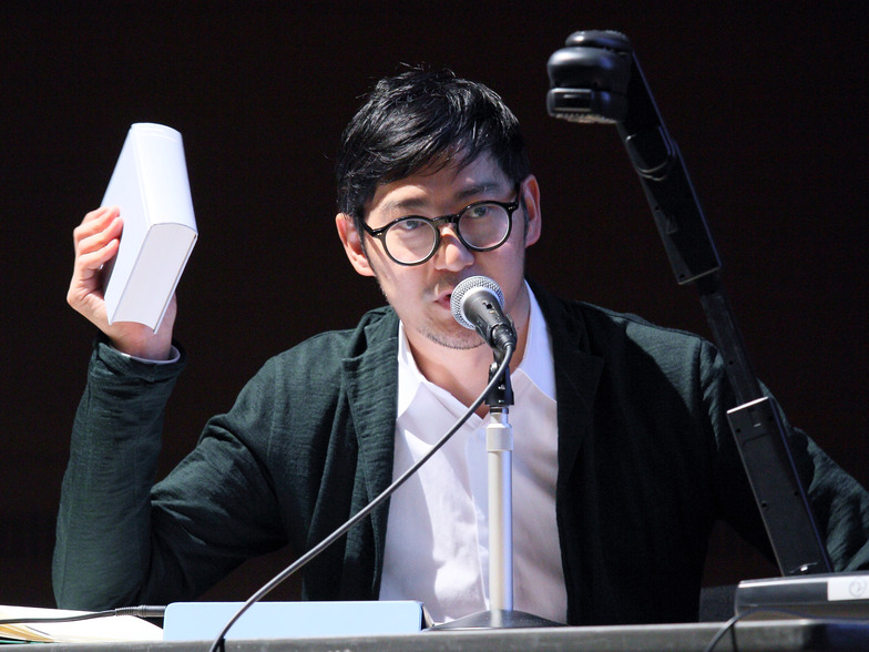
Yagi: Mr. Irobe is one of the talents I've consistently followed. As a fellow designer, I'm deeply interested in your approach and process. Could you share a few examples of your work?
Irobe: When creating the logo for the Kawamura Memorial Museum of Art in Sakura City, Chiba Prefecture, I proposed designing the interior signage simultaneously. By embedding distinctive signs throughout the space and scattering them, we could elevate the overall quality of the environment. I see the logo as communication with people outside the museum, while the signage is communication with visitors inside.I explained that communication with the people who actually come is even more important. If we could create a consistent quality through continuity with the logo, it would elevate the overall quality of the space.
Yagi: Mr. Irobe's work is incredibly meticulous and high-resolution. I get the impression that these elements accumulate, gradually forming a larger silhouette. I've also heard that he creates typefaces for every project. Even if only three characters are used, he creates the entire alphabet from A to Z... For Mr. Irobe, how much weight do details carry?
Irobe: The tricky part is that focusing too much on details can lose sight of the whole. But I sometimes build the whole from the details. Especially in places like museums, building the whole by stacking up fine details is more effective.
Yagi: Art directors at ad agencies start with overall direction. In advertising, details often get pushed to the back burner, so I always feel like you're on the opposite shore. But when we unexpectedly end up on the same playing field at award shows, I think, "Oh, I need to think this deeply or I'll be embarrassed."
Irobe: Details are surprisingly full of design hints. So I make a point of going out to gather them. Like visiting museums to observe the surroundings and people's movements...
Yagi: It's true that hints leading to big concepts can sometimes be found in the details. It's strange how things often come together better when you go back and forth between the big picture and the details. When judging the design category at international advertising awards, I notice Japan tends to be praised for its details, but what we really want is both dynamism and delicacy.
Even a poster that disappears in a week should be created with a long-term perspective
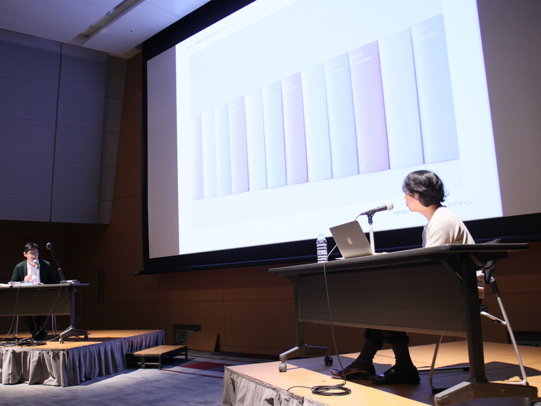
Irobe: The book 'nendo: in the box', showcasing the work of Ooki Sato from design studio nendo, features photographs of interior models crafted with astonishing precision. To match the content of these models, the book itself was made smaller. At nendo, they create interiors using color as a material. Therefore, this book also uses the key colors from the project, offering it in three color variations. It was designed with the image of the book becoming part of the interior when displayed in the studio.
Yagi: Mr. Irobe, you break things down first and think about design from the structure, right? It seems you approach books not just as something to read, but architecturally.
Irobe: I imagine a book as a building that houses information like photographs and text.
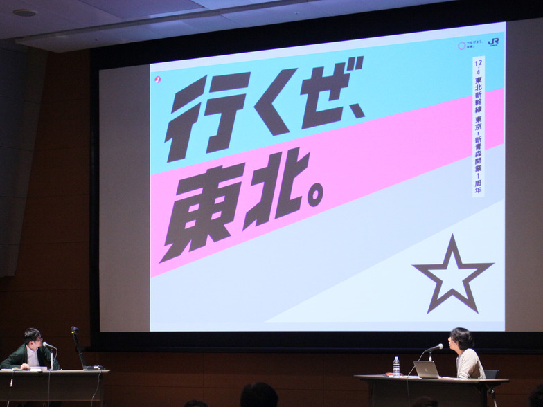
Yagi: That's why such ideas emerge, leading to designs that endure over time. Much advertising work disappears within months. But design requires a long-term perspective. With JR East's "Get Back, Tohoku." which we've continued for three years, we're less focused on creating posters and more on wanting to change the landscape.
Irobe: I've seen "Get Back, Tohoku." many times. It's great how it builds a consistent worldview while occasionally introducing unexpected elements. It feels like it's become a kind of public institution. I always look forward to it.
Yagi: Even if a poster disappears after a week, it builds up over time. That's why I always want to maintain a long-term perspective. Doing so helps me come up with the next move and might even improve the quality of the advertising.
Irobe: Advertising is really good at laying the groundwork for the next move, isn't it? I'm the same way. I persistently think about the meaning of a book, trying to leave something behind that isn't just read and forgotten. I feel that persistence in the "Get Back, Tohoku." campaign too.
Yagi: Recently, I created posters and T-shirts themed around local train lines. I completely changed the photography style too.
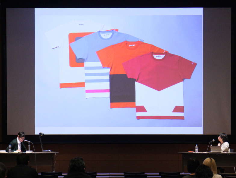
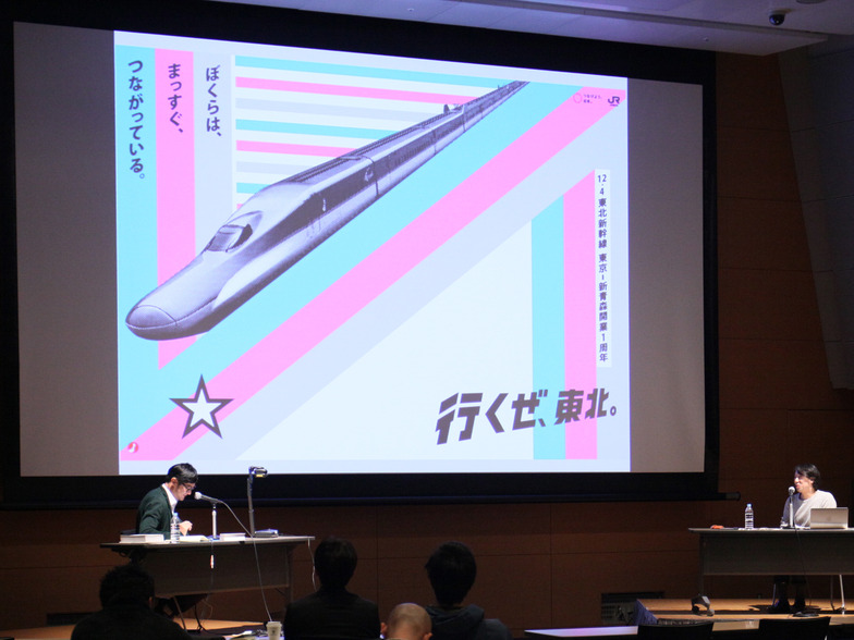
Irobe: Why did you shift from graphics-focused to photo-focused halfway through, when it started out graphic-heavy?
Yagi: We started right after the earthquake, in this power-saving mode with a gloomy atmosphere. I felt taking photos like "Isn't Tohoku's scenery beautiful?" just didn't fit. So I decided to make posters that would hit you hard, change your perspective, and give you energy. Looking back now, I'm amazed I pulled it off. It was only possible because it was that time.
Irobu: I vividly remember feeling that something new had emerged.
※Part 2 scheduled for publication on Saturday, March 7
You can also read the interview here on AdTie!
Was this article helpful?
Share this article
Newsletter registration is here
We select and publish important news every day
For inquiries about this article
Back Numbers
Author
Yoshiaki Irobe
Nippon Design Center, Inc. Irobu Design Laboratory
Graphic Designer / Art Director
Born in Chiba Prefecture in 1974. Completed the Master's Program in Fine Arts at Tokyo University of the Arts. Director of the Irobe Design Laboratory at Nippon Design Center. Major projects include the VI and signage plan for the Kawamura Memorial Museum of Art, the Ginza District Public Signage Pilot Experiment, art direction for "TAKEO PAPER SHOW 2011─Books," and graphic tools for the Liquitex Art Prize. Engages in a wide range of design work based on graphics, including CI/VI, graphic tools, books, editorial design, packaging, branding, and signage planning. Recipient of numerous domestic and international design awards, including the SDA Grand Prize, JAGDA New Designer Award, JAGDA Award, Tokyo ADC Award, and ONE SHOW DESIGN Gold Award. Part-time lecturer at Tokyo University of the Arts since 2011. He served as a judge for the 2014 Good Design Award and the annual "GRAPHIC DESIGN IN JAPAN 2015."
Yoshihiro Yagi
Dentsu Inc.
CDC
Creative Director / Art Director
Born in Kyoto in 1977. Develops diverse creative work, including corporate and product branding and advertising campaigns, through nonverbal visual communication. Major works include JR East Japan's "Get Back, Tohoku.", HONDA's "Human! FIT", Ezaki Glico's "Pocky THE GIFT", and Menicon's "Magic-1 day Menicon Flat Pack". Numerous awards include Cannes Design Lions Grand Prix, One Show Best in Design, D&AD Yellow Pencil ×6, Tokyo ADC Award, JAGDA New Artist Award, ACC Grand Prix, and the Keizo Saji Award. Member of Tokyo Art Directors Club. Visiting Professor, Kyoto University of the Arts.