Note: This website was automatically translated, so some terms or nuances may not be completely accurate.
The 7 Principles of Good Apps ⑥: Easy to Use Without Instruction

Masashi Yamasaki
Fuller Co., Ltd.
As many companies pursue DX initiatives, the shift toward mobile as the primary customer touchpoint is accelerating. In this series, we interview Fuller Inc., which collaborates with Dentsu Inc. on app development. Fuller's President Masashi Yamasaki, who has been tracking apps since the dawn of the iPhone, shares his "Seven Principles for Great Apps" (see the previous article here ). This time, he explains "Principle 6: Intuitive to Use Without Instruction."
(Planning: Dentsu Inc. 8MK Bureau, Makoto Sasagawa, Yosuke Otsubo, Yuki Sugiyama)
Fulla Inc.
Fulla supports corporate business initiatives in the digital domain, with app design and development as one of its core services. They meticulously analyze apps and their markets, handling everything from strategy development to product creation and growth. Their creative teams—comprising engineers, designers, data scientists, and directors—produce outstanding apps for diverse companies.
Can users intuitively understand how to use it without relying on text?
Providing help guides and manuals is one way to improve usability in product development. However, if you aim for a better app, expecting users to read lengthy help guides or manuals to master it is unrealistic.
Generally, app users don't read lengthy in-app text. No matter how carefully the instructions are written, if users can't understand without reading, they'll perceive it as a "difficult-to-use app." Therefore, we should design apps so that after downloading, users can intuitively grasp the operation methods and features and master them. In other words, aim for "apps you can use without being taught."
Small tweaks can significantly reduce user burden
Here are four examples incorporating intuitive expressions that make apps "usable without instruction." The first example involves creating "areas where horizontal scrolling is possible." For instance, app stores, like the image above, show a portion of the next content to indicate horizontal scrolling is available (more content exists on the side). While "areas where horizontal scrolling is possible" are now commonplace in many apps, they were revolutionary when first introduced.
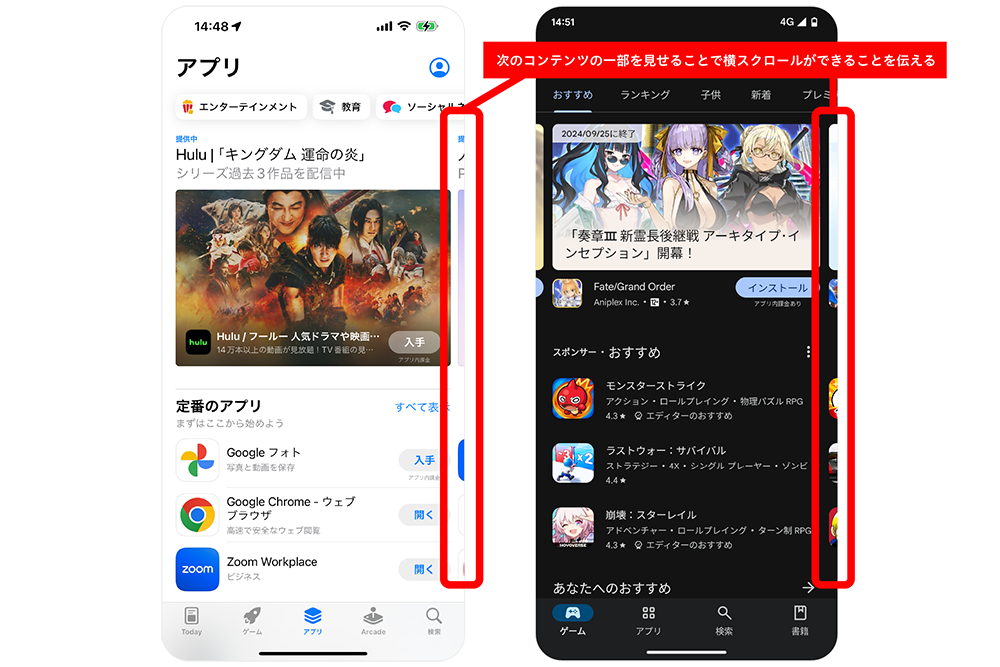
Rather than explicitly telling users each time that horizontal scrolling is possible, it makes users aware that more content exists, encouraging them to scroll horizontally unconsciously.
Just as you don't consciously notice the "horizontal scrolling area," truly great design is often subtle. Aiming for this kind of design is essential for creating good apps.
The second example is StockX, an app for trading brand-name shoes and apparel. Within its catalog pages displaying shoes, tapping an image of a product you want to learn more about opens its detail page. At this moment, the shoe image features a slight rotation animation.

This animation intuitively shows users they can rotate the shoe image. Indeed, sliding your finger across the image makes the shoe rotate 360 degrees, revealing detailed design features.
Without the animation, users might not easily realize they can rotate the shoe image. In that case, text like "Slide your finger across the shoe image to rotate it 360 degrees" would be necessary. Making users read text adds a burden. Including the animation reduces this burden.
The third example is Apple's "Final Cut Pro for iPad." This app optimizes the Final Cut series—previously offered as professional video editing software for Mac—for the iPad. While preserving the strengths of the Final Cut series, the interface has been redesigned for touch operation on the iPad's large screen. The goal is to create an app that's easy to use not only for professionals but for a wide range of users.

The reason for featuring this app is to introduce the "jog wheel" interface. Located on the right edge of the screen, this semi-circular interface with markings is designed for precise editing of video timelines.
Although it has a completely new look, it follows the same color scheme rules as the editing interface in Apple's default Photos app. The scale is black and white, while the selected section and the confirmation button turn yellow (the areas circled in red in the image). This means even first-time users familiar with iOS can easily imagine how to operate it.
Even when introducing a new interface, applying existing rules that help users intuitively imagine how to use it minimizes the need for explanation and enables intuitive operation.
The fourth example is "Be My Eyes." This app connects visually impaired or low-vision individuals needing assistance with registered volunteers via real-time video calls. Volunteers receiving the call provide visual assistance, such as reading appliance labels, confirming clothing coordination, checking food expiration dates, or finding dropped items.
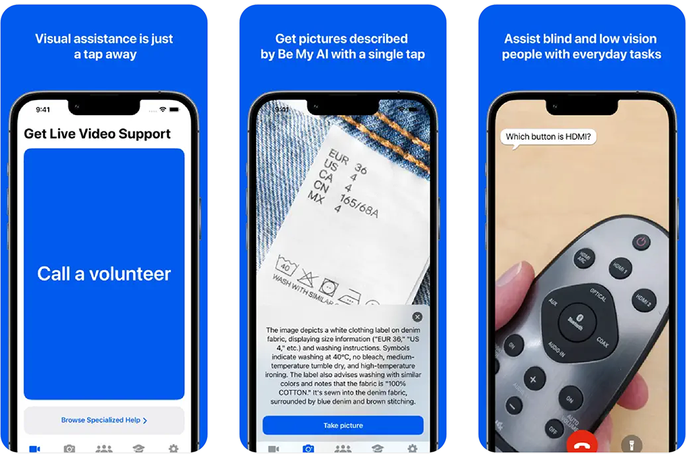
For this service to work, users must perform a highly challenging action: accepting video calls from strangers via the app. To accurately convey this difficult-to-explain action, the app offers a tutorial that simulates the experience of receiving an actual call.
Following the tutorial's instructions to turn off the smartphone triggers a notification from the app. Responding to this notification plays a prepared video, simulating the experience of receiving an incoming call. Through concise, clear text and this call-receiving simulation, users prepare themselves to accept the call.
This case study shows that while text is sometimes unavoidable for overly complex content, there are methods to let users experience the actual usage.
Getting objective feedback through user testing is crucial
Earlier, we mentioned that app users tend not to read text. Indeed, comparing apps and websites, apps typically contain far less text per page. If you must include text and the amount seems likely to increase, we recommend reevaluating whether that text is truly necessary. Less text is better. Aim to achieve the user's goal with the absolute minimum required content.
Also, when considering text content, be mindful to avoid jargon (insider terms or industry-specific language). When deeply immersed in app development, it's easy to lose an objective perspective on how first-time users will perceive things. If users encounter even a slight confusion over difficult terminology or uncommon words, their likelihood of continuing to use the app drops significantly.
Therefore, in app development, it's essential to constantly view your service objectively: verify text isn't too long, check for unfamiliar terms, and explore ways to eliminate text altogether.
However, it's difficult for those deeply involved in a project to suddenly adopt an objective viewpoint. An effective, simple way to gain this perspective is to have others try the app and gather their impressions. While feedback from anyone is valuable, it's even better to have the app's target users try it—moms for a mom-focused app, children for a kid-focused app—and collect their feedback. Crucially, don't just let them play around; have them use the app in scenarios that mimic real-world usage.
Use the feedback gathered to improve the app so that your intended users can operate it without needing text explanations. "Being able to use it without being taught" is a crucial factor for getting users to keep using the app, so please keep this firmly in mind.
Next time, we'll introduce "Condition 7 for a Good App: The Desired Worldview is Visually Conveyed."
For more on the "7 Principles of a Good App," check out these articles!
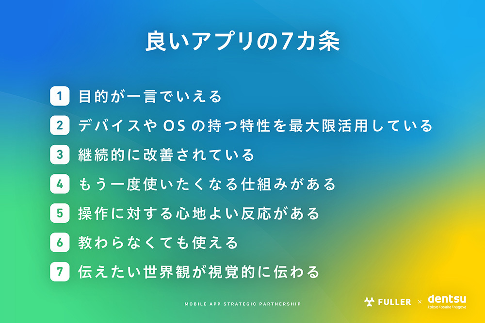
①: The purpose can be stated in one sentence
②: It maximizes the unique features of the device and OS
③: It undergoes continuous improvement
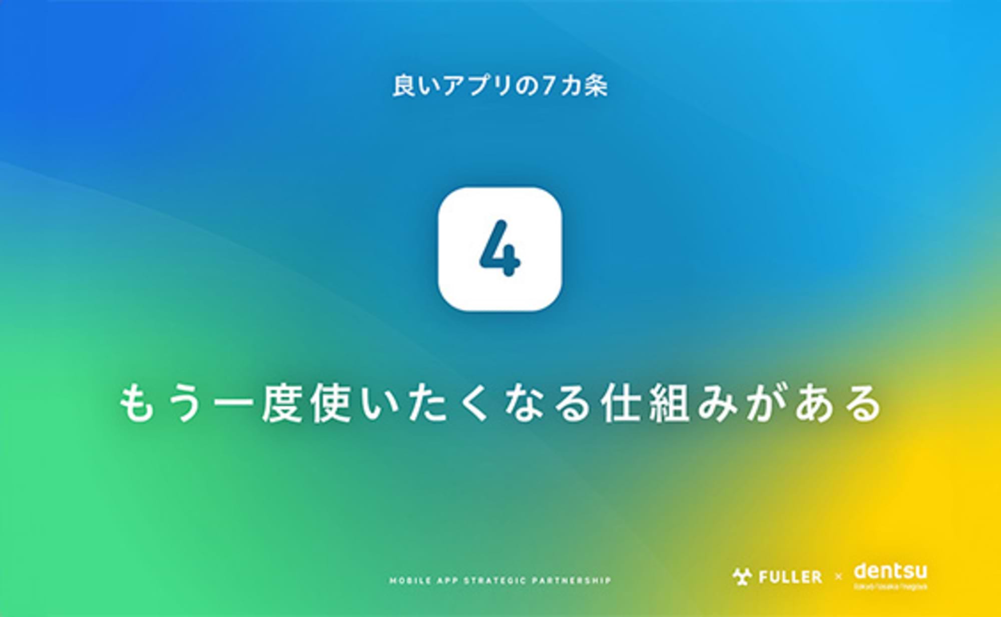
④: It has mechanisms that make you want to use it again
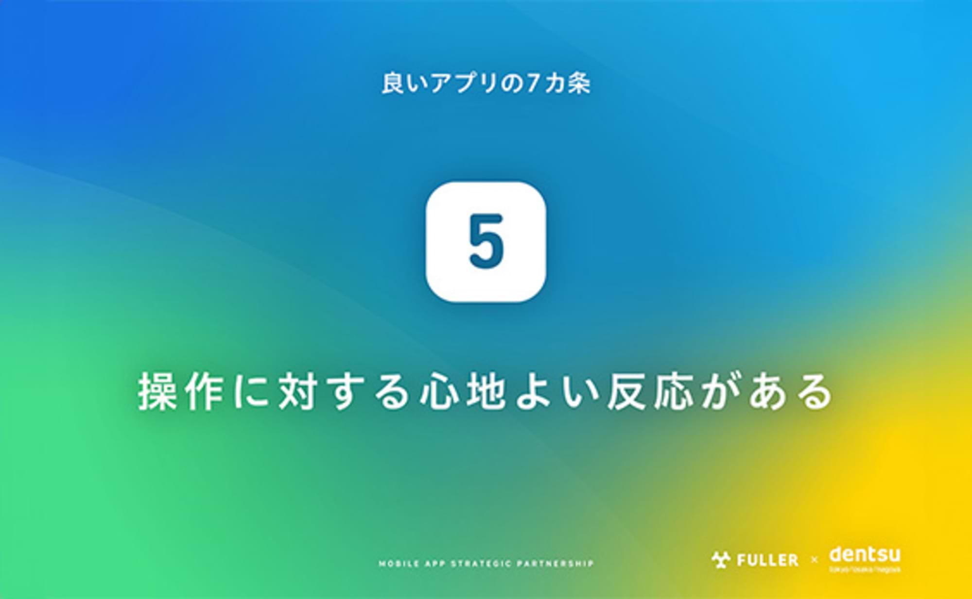
⑤: It provides pleasant feedback for actions
⑥: It can be used without instruction (this article)
⑦: The worldview you want to convey is visually communicated (coming soon)

Was this article helpful?
Share this article
Newsletter registration is here
We select and publish important news every day
For inquiries about this article
Back Numbers
Author
Masashi Yamasaki
Fuller Co., Ltd.
President and CEO
Born in 1988. Hailing from Niigata Prefecture. Graduated from Niigata Prefectural Niigata High School and the Department of Design, Faculty of Engineering, Chiba University. After working as a UI designer at Fujitsu, joined Fuura in 2015. Served as Executive Officer CDO (Chief Design Officer) and Executive Officer COO (Chief Operating Officer) at Fuura, and assumed the position of President and Representative Director in September 2020. As a designer, has received the "iF DESIGN AWARD" and the "Good Design Award". His dream is to elevate the global standards for design value.